


theFireBlanket wrote:Matches Malone wrote:I wouldn't call it bland so much as I would say minimalist and sleek. Over the top uniforms are just too much.
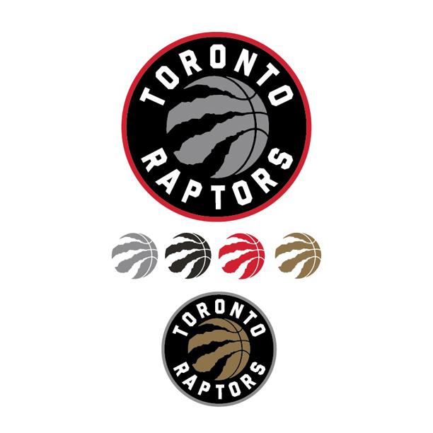
It's possible to have minimal qualities without following a similar archetype. The reason that any of these uniforms will especially start to appear to 'bland' to more people is when other franchises begin following a pattern: IE: NO and possibly Toronto. I hope that the Bucks don't plan on going the same route without any distinction.
circle is definitely better than the stupid triangle fad though. the triangle makes things way to bulky. it's an eye sore.
i really like olympiakos' logo. (not including the stars) perfect blend of sleekness and detail.
and ajax to a lesser extent

shields are cool too, but that's a football (soccer) thing much more than nba imo.
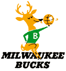
bucks could easily incorporate either horns or a buck (much different than the current one) and new colors with that type of template, and have a much sexier image. golden state has incorporated that type of look too, and they're constantly considered one of the better looking unis/logo.