


Rebranding the Toronto Raptors (Updated designs on p. 7)
Moderators: HiJiNX, niQ, Morris_Shatford, DG88, Reeko, lebron stopper, 7 Footer, Duffman100
Re: Case Study: Rebranding the Toronto Raptors
-
RxOxP

- Junior
- Posts: 359
- And1: 114
- Joined: Jul 19, 2012
-

Re: Case Study: Rebranding the Toronto Raptors
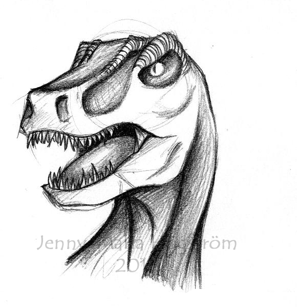
The logo is ugly but the skyline idea is brilliant.
Raptors Fan For Life Re: Case Study: Rebranding the Toronto Raptors
-
onions17

- Starter
- Posts: 2,419
- And1: 637
- Joined: Apr 05, 2006
Re: Case Study: Rebranding the Toronto Raptors
nice work man. i agree that the face could use some work. we need some crazy ideas - like the skylines in the mouth - to be able to come up with some innovative designs.

Q00 wrote:When scoring over 100 pts and giving up under 100 pts, they are 11-0
Clearly defense is the difference between winning and losing for this team.
Re: Case Study: Rebranding the Toronto Raptors
-
RINSE
- Head Coach
- Posts: 7,359
- And1: 1,652
- Joined: Feb 06, 2003
- Location: Toronto
-
Re: Case Study: Rebranding the Toronto Raptors
Toronto Aliens?
Re: Case Study: Rebranding the Toronto Raptors
-
babysham
- Freshman
- Posts: 58
- And1: 0
- Joined: Sep 02, 2004
Re: Case Study: Rebranding the Toronto Raptors
Good effort. The skyline idea is sick. I have to agree with most of the other posters though....the face looks like an alien, not a Raptor.
Re: Case Study: Rebranding the Toronto Raptors
-
Hit Em Up

- Assistant Coach
- Posts: 4,429
- And1: 8,778
- Joined: Jul 23, 2008
-

Re: Case Study: Rebranding the Toronto Raptors
-
Hyperglide

- Pro Prospect
- Posts: 873
- And1: 277
- Joined: Jul 26, 2009
- Location: Rawkin' it in the GWN
-


Re: Case Study: Rebranding the Toronto Raptors
Skyline looks cool but the logo looks like it's from a YTV cartoon and is to bland and boring . The nose is wrong and it doesn't look menacing at all. I would rather keep the original logo over that one.
Again good idea with the skyline though.
Again good idea with the skyline though.

Re: Case Study: Rebranding the Toronto Raptors
-
VC-INJURY

- Sixth Man
- Posts: 1,886
- And1: 1,417
- Joined: Nov 18, 2009
Re: Case Study: Rebranding the Toronto Raptors
looks like an alien/10
The current raps logo sucks because it's basically 2 colors. No need to reinvent the wheel here people. Just bring this back.

The current raps logo sucks because it's basically 2 colors. No need to reinvent the wheel here people. Just bring this back.

Re: Case Study: Rebranding the Toronto Raptors
-
TorontoRapture

- Sixth Man
- Posts: 1,911
- And1: 978
- Joined: Jul 04, 2008
-
Re: Case Study: Rebranding the Toronto Raptors
Purple fever forever.VC-INJURY wrote:looks like an alien/10
The current raps logo sucks because it's basically 2 colors. No need to reinvent the wheel here people. Just bring this back.

Re: Case Study: Rebranding the Toronto Raptors
-
Thelonious

- Assistant Coach
- Posts: 3,791
- And1: 253
- Joined: Jun 26, 2010
- Location: Brussels
-

Re: Case Study: Rebranding the Toronto Raptors
My 2 cents: Bottom teeth need a visual separation from the bottom gum/jaw, so the buildings/bottom teeth would need to be white, or to start white from the bottom turning red at the top end (like dripping blood for example)

Re: Case Study: Rebranding the Toronto Raptors
-
Troubadour

- RealGM
- Posts: 14,202
- And1: 8,192
- Joined: Jun 18, 2007
- Location: Toronto
-
Re: Case Study: Rebranding the Toronto Raptors
N1QUE24 wrote:Troubadour wrote:"Bags under eyes because we can't take losing any longer."
Horrible logo
Thanks, what would you say needs improving?
A good starting place would be not consciously making the logo to reflect a losing history
Re: Case Study: Rebranding the Toronto Raptors
-
RoLo
- Senior
- Posts: 702
- And1: 1,252
- Joined: Jan 30, 2011
Re: Case Study: Rebranding the Toronto Raptors
Troubadour wrote:N1QUE24 wrote:Troubadour wrote:"Bags under eyes because we can't take losing any longer."
Horrible logo
Thanks, what would you say needs improving?
A good starting place would be not consciously making the logo to reflect a losing history
Could you be anymore of a dick? If you've got nothing nice to say..
Re: Case Study: Rebranding the Toronto Raptors
-
N1QUE24
- Banned User
- Posts: 4,895
- And1: 288
- Joined: Feb 14, 2005
Re: Case Study: Rebranding the Toronto Raptors
Troubadour wrote:N1QUE24 wrote:Troubadour wrote:"Bags under eyes because we can't take losing any longer."
Horrible logo
Thanks, what would you say needs improving?
A good starting place would be not consciously making the logo to reflect a losing history
lol it was a poor joke, nothing more and nothing less.
Re: Case Study: Rebranding the Toronto Raptors
-
ballislife

- Lead Assistant
- Posts: 4,992
- And1: 2,005
- Joined: Apr 27, 2010
-
Re: Case Study: Rebranding the Toronto Raptors
Thelonious wrote:My 2 cents: Bottom teeth need a visual separation from the bottom gum/jaw, so the buildings/bottom teeth would need to be white, or to start white from the bottom turning red at the top end (like dripping blood for example)
That's exactly what needs to happen.

Re: Case Study: Rebranding the Toronto Raptors
-
MkDon

- Junior
- Posts: 414
- And1: 1,413
- Joined: Nov 14, 2012
- Location: Raptor Land
-

Re: Case Study: Rebranding the Toronto Raptors
VC-INJURY wrote:looks like an alien/10
The current raps logo sucks because it's basically 2 colors. No need to reinvent the wheel here people. Just bring this back.
My thoughts exactly. Why would anyone change a thing of beauty like this in the first place? Some say it's cartoonish, but so is the Celtics logo, yet no one is thinking about changing it or taking it of from the floor at the Garden.

And about the idea of changing the name, i want this team to win championship some day as Raptors not some other name.

Re: Case Study: Rebranding the Toronto Raptors
-
N1QUE24
- Banned User
- Posts: 4,895
- And1: 288
- Joined: Feb 14, 2005
Re: Case Study: Rebranding the Toronto Raptors
I appreciate the feedback everyone, I've tweaked the design and here are the results. (thanks especially to __venom__ for his alternate version of the logo I've incorporated some elements of his design).
I've added a sharp boomerang shape just above the snout of the Raptor to add some much needed depth. Most of the feedback I received was people thinking it resembles too much like an alien, I think now it looks more like a Raptor (added pupils to the eyes as well). Also tweaked the skyline and removed some buildings so it's less congested. I'm thinking about adding a basketball outline as a backdrop to the skyline similar to the old Supersonics logo, what do you guys think, would that work (?).
To those who are not big on the cartoon look, this redesign is unlikely to change your mind and I apologize for that.
Re: (Updated) Case Study: Rebranding the Toronto Raptors (v1
-
TdotRap4Lyfe

- General Manager
- Posts: 7,885
- And1: 5,079
- Joined: Feb 02, 2013
- Location: Toronto
-

Re: (Updated) Case Study: Rebranding the Toronto Raptors (v1
I like the skyline in the jaw feature, but frankly the "Raptor" head looks like a Lizard. Keep working on it, overall good design.

Credits to Jstock12
Re: (Updated) Case Study: Rebranding the Toronto Raptors (v1
-
VC-INJURY
- Sixth Man
- Posts: 1,886
- And1: 1,417
- Joined: Nov 18, 2009
Re: (Updated) Case Study: Rebranding the Toronto Raptors (v1
Logo just looks soft. The skyline in the bottom of the mouth is not subtle. It makes the Raptor look less fierce because the tower is so thin.
Like the poster above said, it still looks like a lizard. It looks like it would be the child/baby of the raptor used in the current logo.
Like the poster above said, it still looks like a lizard. It looks like it would be the child/baby of the raptor used in the current logo.
Re: (Updated) Case Study: Rebranding the Toronto Raptors (v1
-
whysoserious

- RealGM
- Posts: 30,555
- And1: 8,634
- Joined: Jun 19, 2004
-

Re: (Updated) Case Study: Rebranding the Toronto Raptors (v1
I do like where you're going with it Nique. As a few people mentioned, the simplicity of the Raptor head tends to make it look more like other animals and not definitively a Raptor.
I do like how you incorporated the skyline. I think you'll always need a 3/4 or side profile of the Raptor to make it work.
I do like how you incorporated the skyline. I think you'll always need a 3/4 or side profile of the Raptor to make it work.
Re: (Updated) Case Study: Rebranding the Toronto Raptors (v1
-
YoungD23

- Sixth Man
- Posts: 1,896
- And1: 1,069
- Joined: Jun 15, 2008
- Location: 6ix
-
Re: (Updated) Case Study: Rebranding the Toronto Raptors (v1
whysoserious wrote:I do like where you're going with it Nique. As a few people mentioned, the simplicity of the Raptor head tends to make it look more like other animals and not definitively a Raptor.
I do like how you incorporated the skyline. I think you'll always need a 3/4 or side profile of the Raptor to make it work.
This. The Skyline idea is very nice. I'd tweak the head around a bit to make it look more like a Raptor.
Re: (Updated) Case Study: Rebranding the Toronto Raptors (v1
-
TheRealBlizzy
- Banned User
- Posts: 1,081
- And1: 478
- Joined: Apr 17, 2013
- Location: Toronto
Re: (Updated) Case Study: Rebranding the Toronto Raptors (v1
If anyone sober or non sober thinks any sort of logo looking like the OP's would IMPROVE our team branding, LOL.
Keep the raptor claw we have now, that **** is **** Alien Vs Predator Ugly.
Keep the raptor claw we have now, that **** is **** Alien Vs Predator Ugly.