Page 1 of 1
Brewers uniforms
Posted: Tue Apr 10, 2018 8:52 am
by Prickle
A couple questions regarding the uniforms:
First, what happened to the ball and glove/dark blue uniforms they wore the past two years? In 2016, they wore them 91 times (which was great), but last year they wore them only 30 times. They've yet to wear them this year.
So, what's the deal? Remember, these are the only unis that have "Milwaukee" across the chest instead of "Brewers." Not to mention that they just look better. I've never been a fan of the glittery gold trim on the normal jerseys, so the dark blue and YELLOW trim is way more aesthetically pleasing, as far as I'm concerned. And of course the ball and glove logo is simply leaps and bounds better than the generic "M" logo. So again, why are they using this jersey/hat combination less and less?
Also, while I'm thankful I've seen less of (and hopefully the last of) that god awful gold jersey they used to run out there quite often, I must say I miss the old school royal blue jerseys and ball/glove hats with yellow faceplates. They didn't use these very often (and not at all last year), but I loved them. Traditional team colors that just popped on-screen, and I would imagine in-person as well. They used them in 2014 and 2016 and that's it.
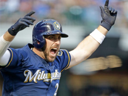
Here are the two uniforms I'm speaking of....

Re: Brewers uniforms
Posted: Tue Apr 10, 2018 9:21 am
by Prickle
I've never been a big fan of the current uniform set, so if it were up to me, I'd completely ditch the "barley M" logo altogether, and slowly transition back to the old logo. I mean, they've already started, why not finish it? I had been saying for years that the current dark blue would work with the ball/glove logo, and it does, and they finally did it. I know that this "old logo vs new logo" debate is nothing new, and it's been going on since the early '90s. But there's a reason fans still love the old logo and colors - they're just simply superior to everything else the team has put out since. Blue and yellow plus the ball and glove logo just LOOKS BETTER. It always has. And something about it just screams "Brewers!"
There is really no way that a rebrand back to that logo/uniform set could fail, so why fight it? I say use the dark blue or grey uniforms with dark blue ball/glove hat on the road, and then for home games alternate between the classic white pinstripes they wear on Fridays, and the royal blue/yellow uniforms I posted previously. Dark, subdued colors on the road, and bright vibrant colors at home. I like it.
Re: Brewers uniforms
Posted: Tue Apr 10, 2018 12:18 pm
by Gianstoppable
Prickle wrote:I've never been a big fan of the current uniform set, so if it were up to me, I'd completely ditch the "barley M" logo altogether, and slowly transition back to the old logo. I mean, they've already started, why not finish it? I had been saying for years that the current dark blue would work with the ball/glove logo, and it does, and they finally did it. I know that this "old logo vs new logo" debate is nothing new, and it's been going on since the early '90s. But there's a reason fans still love the old logo and colors - they're just simply superior to everything else the team has put out since. Blue and yellow plus the ball and glove logo just LOOKS BETTER. It always has. And something about it just screams "Brewers!"
There is really no way that a rebrand back to that logo/uniform set could fail, so why fight it? I say use the dark blue or grey uniforms with dark blue ball/glove hat on the road, and then for home games alternate between the classic white pinstripes they wear on Fridays, and the royal blue/yellow uniforms I posted previously. Dark, subdued colors on the road, and bright vibrant colors at home. I like it.
Never should have left the Ball and Glove in the 1st place, greatest logo in sports, IMO
Re: Brewers uniforms
Posted: Tue Apr 10, 2018 1:54 pm
by StickeeFingaz
I think the “Brewers” across the white and grey uniforms are some of the worst uniforms in baseball. That “Brewers” script is so gaudy and ugly.
Ball and glove logo with block letter Brewers/Milwaukee is the way to go.
Sent from my iPhone using Tapatalk
Re: Brewers uniforms
Posted: Tue Apr 10, 2018 3:58 pm
by humanrefutation
I love the pinstriped ball and glove jerseys. Some of the best jerseys in sports, IMO.
Re: Brewers uniforms
Posted: Tue Apr 10, 2018 10:00 pm
by blazza18
The darker blue with the ball and glove logo and the pinstripe jerseys are our only two good ones.
Re: Brewers uniforms
Posted: Wed Apr 11, 2018 12:06 am
by MickeyDavis
Never been a fan of ball and glove logo.
Re: Brewers uniforms
Posted: Wed Apr 11, 2018 3:13 am
by Thunder Muscle
I actually always liked the M with the barley hat but do feel the uniform font are reaching their shelf life.
I like the ball & glove as an alternative, especially the Friday night pinstripe ones.
I don't know why, but the logo/uniforms we had in the mid-90s have kind of grown on me.
Re: Brewers uniforms
Posted: Wed Apr 11, 2018 4:07 am
by trwi7
MickeyDavis wrote:Never been a fan of ball and glove logo.
You know exactly how to give me an erection.
Re: Brewers uniforms
Posted: Wed Apr 11, 2018 6:00 am
by blazza18
Keep it in the DM's fellas.
Re: Brewers uniforms
Posted: Wed Apr 11, 2018 7:22 am
by Prickle
MickeyDavis wrote:Never been a fan of ball and glove logo.
Surely, you can't be serious.
Re: Brewers uniforms
Posted: Wed Apr 11, 2018 7:44 am
by Prickle
Thunder Muscle wrote:I actually always liked the M with the barley hat but do feel the uniform font are reaching their shelf life.
I like the ball & glove as an alternative, especially the Friday night pinstripe ones.
I don't know why, but the logo/uniforms we had in the mid-90s have kind of grown on me.
I hope you're not talking about the "Notre Dame" MB logo. If so, I guess...to each their own.
I think the current set has benefited from the fact that the previous uniforms/logo were atrocious (the aforementioned Notre Dame logo). They only looked great by default. I agree that they've reached their shelf life. The "M and barley" hat is easily the best looking since the ball/glove, but the uniforms/script has really run its course and seems dated. (Not to mention that horrible glittery gold trim. Yuck!)
The thing about the ball/glove logo and classic pinstripe uniforms is, they seemingly don't have a shelf life. They will ALWAYS be relevant. Never mind the fact that these will always be the fan favorites in Milwaukee, but the most telling evidence is that people outside of Milwaukee, who aren't even fans of the Brewers, buy and wear these hats and apparel. Why? Because it's classic and it's an all-time great logo. You'll never see someone who's not a Brewers fan sporting the "M and barley" hats. Just saying...