Page 1 of 1
Detroit Pistons NBA Logo Redesign
Posted: Tue Jun 25, 2013 2:52 am
by Kilo
This is a bit old, but I didn't see it before. I sorta dig the look -
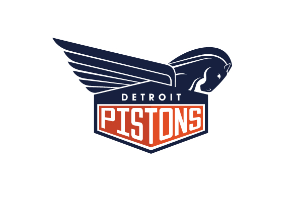 http://www.michael-weinstein.com/nba-lo ... t-pistons/
I like the art deco look, and like the hood ornament Pegasus idea as it ties in the horse head/horse power and also the winged aspect also present in the Detroit Red Wing logo.
Re: Detroit Pistons NBA Logo Redesign
Posted: Tue Jun 25, 2013 3:06 am
by ComboGuardCity
Looks like the detroit pelican
Re: Detroit Pistons NBA Logo Redesign
Posted: Tue Jun 25, 2013 3:14 am
by ImHeisenberg
Hate it. Reminds me of the Pelicans logo, which has too much going on.
Re: Detroit Pistons NBA Logo Redesign
Posted: Tue Jun 25, 2013 3:41 am
by roc
Detroit Pegasus?
Re: Detroit Pistons NBA Logo Redesign
Posted: Tue Jun 25, 2013 4:45 am
by dVs33
the pegasus should be front on and symmetrical to match the font.
Either way i'm not a fan.
i think a modern take would be more appropriate if they do look to change the logo. This represents the past glories of Detroit, where the city needs to look to the future IMO
Re: Detroit Pistons NBA Logo Redesign
Posted: Tue Jun 25, 2013 8:48 am
by ElectricMayhem
I like it, but needs more teal. *duck*
Re: Detroit Pistons NBA Logo Redesign
Posted: Tue Jun 25, 2013 11:30 am
by Sheedpocalypse
Somehow I love the current logo much, much more than this ...
Re: Detroit Pistons NBA Logo Redesign
Posted: Tue Jun 25, 2013 12:34 pm
by Minas
We need a logo redesign but the one in the OP looks crap IMO. There was a thread from a few weeks ago with some good options.
Re: Detroit Pistons NBA Logo Redesign
Posted: Tue Jun 25, 2013 2:28 pm
by DBC10
We need flatter and minimalism. That's a good start, but the Pegasus thing looks weird.
Sent from my Nexus 4
Re: Detroit Pistons NBA Logo Redesign
Posted: Tue Jun 25, 2013 7:06 pm
by The_Irony

It's a shame this logo wasn't the primary logo, or the logo in the middle of the court. Less is more and this is the best logo the team's ever had.
the design of the wording should be changed too.
Re: Detroit Pistons NBA Logo Redesign
Posted: Tue Jun 25, 2013 7:22 pm
by Sheedpocalypse
Apart from the flames. Does remind me of horrible tribal redneck tattoos and are tacky as hell...
Re: Detroit Pistons NBA Logo Redesign
Posted: Tue Jun 25, 2013 7:52 pm
by Cowology
Eh, kinda indifferent to the logo design, but I prefer brighter colors to the dark red/blue.
Re: Detroit Pistons NBA Logo Redesign
Posted: Thu Jun 27, 2013 2:21 am
by roc
Re: Detroit Pistons NBA Logo Redesign
Posted: Thu Jun 27, 2013 2:23 am
by Piston Pete
Bring back the tin man logo!!
Re: Detroit Pistons NBA Logo Redesign
Posted: Thu Jun 27, 2013 2:47 am
by dVs33
i definitely prefer horse to a pegasus
Re: Detroit Pistons NBA Logo Redesign
Posted: Thu Jun 27, 2013 7:20 am
by Jodi
Re: Detroit Pistons NBA Logo Redesign
Posted: Fri Jun 28, 2013 2:21 am
by roc
Kind of like the Sonics style...
............