Page 1 of 9
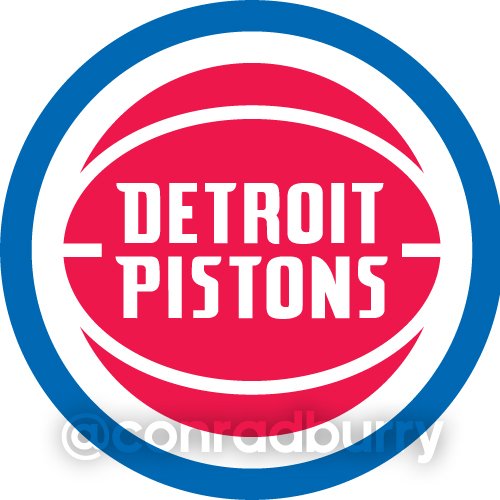
New Pistons Logo for 2017! TBD...
Posted: Fri Feb 12, 2016 4:52 pm
by russkopp
[tweet]https://twitter.com/conradburry/status/698154708624474114[/tweet]
I wonder what their plan is? I like our logo, it's a little bare bones but it's classic.
Re: New Pistons Logo for 2017! TBD...
Posted: Fri Feb 12, 2016 4:57 pm
by MotownMadness
We just need to change up the font to make it look real clean like the Raptors and Bucks did.
Re: New Pistons Logo for 2017! TBD...
Posted: Fri Feb 12, 2016 5:05 pm
by Kilo
Boom! But REALLY need to get rid of the bubble font.
It's too bad the simple ball look has been used so much recently, because a "Piston" is a damn hard thing to logo.
Re: New Pistons Logo for 2017! TBD...
Posted: Fri Feb 12, 2016 5:10 pm
by Todd3
Just go with the classic bad boys logo/font.

Re: New Pistons Logo for 2017! TBD...
Posted: Fri Feb 12, 2016 5:15 pm
by Kilo
Is it just a logo change or is it a complete uniform overhaul? Could the Blue and Grey be the new Piston colors?
Re: New Pistons Logo for 2017! TBD...
Posted: Fri Feb 12, 2016 5:21 pm
by MrBigShot
Could use new jerseys too. Nothing fancy, better font alone would go a long way.
Re: New Pistons Logo for 2017! TBD...
Posted: Fri Feb 12, 2016 5:29 pm
by Kilo
I hope it just isn't this - taken from the same guys twitter. As is also pointed out in his time line the "Detroit Grind" shirts worn in the pre-season commercial basically used it already -
Re: New Pistons Logo for 2017! TBD...
Posted: Fri Feb 12, 2016 6:55 pm
by Moses ShamMoses
I'm all for a more classic look...bad boy era logo. The current logo is cheesy.
Re: New Pistons Logo for 2017! TBD...
Posted: Fri Feb 12, 2016 7:58 pm
by mattao313
Pass on the bad boy era logo, a little to simplistic and old school to me.
Re: New Pistons Logo for 2017! TBD...
Posted: Fri Feb 12, 2016 8:00 pm
by coordinator0
Good. I'm not sure there's a whole lot to build around for the "Pistons" nickname in terms of imagery, but the current logo is just too basic and bland.
Re: New Pistons Logo for 2017! TBD...
Posted: Fri Feb 12, 2016 8:04 pm
by A-Wins
Definitely down for a new logo.
Re: New Pistons Logo for 2017! TBD...
Posted: Fri Feb 12, 2016 9:52 pm
by tradez401
to be honest i would like to see a completely different logo n jerseys just keep the red white n blue colors
Re: New Pistons Logo for 2017! TBD...
Posted: Fri Feb 12, 2016 10:11 pm
by thesack12
There aren't too many more fitting team names pertaining to the area they are from than the Pistons. Its part of (although small) the reason why I became a Pistons fan. Same thing with why I became a 49ers fan.
I'm not a fan of common monikers like animals and such. The mascot should fit and be specific to the area.
Anywho, I wouldn't mind a logo that pops more. I didn't like the color of the uniforms, but the teal era logo was always my favorite. That horse head with the fire coming out of the pipes, was badass. I would like to see them maybe bring the pipes back and incorporate them into the new logo somehow. The ball is too stock for me, I would like to see something that is more specific to what (real) pistons are.
Re: New Pistons Logo for 2017! TBD...
Posted: Fri Feb 12, 2016 10:46 pm
by DBC10
Our current logo absolutely sucks.
The design philosophy was so incredibly terrible and not future proof at all.
Re: New Pistons Logo for 2017! TBD...
Posted: Fri Feb 12, 2016 10:59 pm
by Navas
MrBigShot wrote:Could use new jerseys too. Nothing fancy, better font alone would go a long way.
When I worked for the Pistons a few years ago I saw several uniform designs that was in storage. Wonder if they pulled any of those up.
Sent from my iPad using RealGM Forums
Re: New Pistons Logo for 2017! TBD...
Posted: Fri Feb 12, 2016 11:01 pm
by Navas
DBC10 wrote:Our current logo absolutely sucks.
The design philosophy was so incredibly terrible and not future proof at all.
Would you rather a horse or a goofy looking cartoon rocket?
Compared to some of the 90s designs*, are logo is not bad.
*: The 90s were just one of the worst decades for design.
Sent from my iPad using RealGM Forums
Re: New Pistons Logo for 2017! TBD...
Posted: Fri Feb 12, 2016 11:01 pm
by Kilo
What about something like a bottom half of a ball with the top half of a chromed out Americana muscle car engine? Possibly with an "easter egg" of the car engine outline/silhouette being the Downtown Detroit skyline.
Re: New Pistons Logo for 2017! TBD...
Posted: Fri Feb 12, 2016 11:16 pm
by DBC10
Navas wrote:DBC10 wrote:Our current logo absolutely sucks.
The design philosophy was so incredibly terrible and not future proof at all.
Would you rather a horse or a goofy looking cartoon rocket?
Compared to some of the 90s designs*, are logo is not bad.
*: The 90s were just one of the worst decades for design.
Sent from my iPad using RealGM Forums
True. My main gripe is how archaic the font is for the logo itself. The outdated basketball is also a nuisance too though.
Re: New Pistons Logo for 2017! TBD...
Posted: Fri Feb 12, 2016 11:20 pm
by Blkbrd671
I am scared Tom Gores going to make it look like sh*. Detroits Blue collar town, hope he remembers that when he's adding his LA flash
Re: New Pistons Logo for 2017! TBD...
Posted: Fri Feb 12, 2016 11:46 pm
by DBC10
Blkbrd671 wrote:I am scared Tom Gores going to make it look like sh*. Detroits Blue collar town, hope he remembers that when he's adding his LA flash
Probably going for a dirty Martini and palm trees for a logo