Re: Clippers getting a new logo next year?
Posted: Tue Apr 21, 2015 12:36 am
i must be the exception cause the only one i don't like is the red one.
Sports is our Business
https://forums.realgm.com/boards/
https://forums.realgm.com/boards/viewtopic.php?f=18&t=1371443
kylem4711 wrote:whats her email


The visual similarities between the Lakers' and Clippers' logos are striking: italicized letterforms backed up by an outlined basketball, even the scale of elements within each logo; all invite inevitable comparison. One would think that a clean break is desperately needed, especially when we consider the divergent cultures and track records that surround each franchise over the past three decades.
..
...
The team held a “name the team” contest, won by Frank Kowalski of San Diego. His logic behind “Clippers” was solid: a “fast, slender sailing ship designed for speed.” Some of the names that didn’t make the cut included the Grunions, Skunks, Starships, Seagulls, Oarsmen and Koalas. Two notable names that stood out were the San Diego Gob and the San Diego Zoo (just imagine the logo possibilities in either case.)
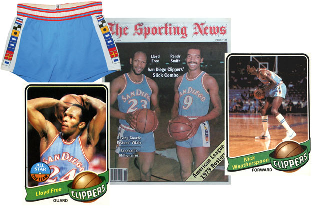
The San Diego Clippers employed a colorful and graphically simple logo, one that they used for their first few years out west. Their uniforms were noteworthy for their baby-blue color scheme and shorts with a series of nautical flags that spelled out “Clippers.”
Ranma wrote:
If there was any doubt before, this should take care of all that. The Los Angeles Clippers registered a series of trademarks with the United States Patent and Trademark Office showing a series of new teams logos and wordmarks. The trademarks were registered on April 21, 2015 a day after a second round of leaks became public.
...
Now that we know these to be what the Clippers will be using next season what do you think? I'm not impressed, the logo is fairly bland and has absolutely nothing to do with the name of the team (not that the current set does either).
Not to mention it's a fairly straight rip of the old EA Sports' NBA Live logo:
Fan concepts are clearly superior to what the team is going with:
MrHill wrote:I frequent the Creamer site almost daily (in particular the message boards), and few of the posters there are professional graphic artists...the few Clipper identity concepts I've seen there are light-years better than the stuff that Ballmer and company commissioned.
I'm still holding out hope that there are more concepts out there that Ballmer and Gillian are looking at, and there's a better result that what's been presented.
Clemenza wrote:You guys have some nice artwork skills but even though we're named the Clippers after the ships in San Diego- LA really doesn't have much to do with sailing and ships for that matter. And yeah we right on the Pacific and have numerous marinas and a harbor, the ship thing doesn't really rep LA.

Ranma wrote:Chris Creamer, SportsLogos.net (4/27/15)If there was any doubt before, this should take care of all that. The Los Angeles Clippers registered a series of trademarks with the United States Patent and Trademark Office showing a series of new teams logos and wordmarks. The trademarks were registered on April 21, 2015 a day after a second round of leaks became public.
...
Now that we know these to be what the Clippers will be using next season what do you think? I'm not impressed, the logo is fairly bland and has absolutely nothing to do with the name of the team (not that the current set does either).
Not to mention it's a fairly straight rip of the old EA Sports' NBA Live logo:
Fan concepts are clearly superior to what the team is going with:
LA Clippers Trademark New Leaked Logos
I'm not talking about the actual name of the team and there's no Lakers logo with a lake and mountains as a backdrop or LA ..Ranma wrote:Clemenza wrote:You guys have some nice artwork skills but even though we're named the Clippers after the ships in San Diego- LA really doesn't have much to do with sailing and ships for that matter. And yeah we right on the Pacific and have numerous marinas and a harbor, the ship thing doesn't really rep LA.
Well, two storied franchises in Los Angeles still have names retained from their original respective locations that have no relation to the local area. The Dodgers referred to the trolley dodgers who got out of the way of the rail-bound carriages that zipped around the Brooklyn area while the Lakers were in reference to the many lakes around the Minneapolis geographic area. Also, I'm pretty sure that Los Angeles was never under the rule of a monarch when the L.A. Kings were established.


Clemenza wrote:I'm not talking about the actual name of the team and there's no Lakers logo with a lake and mountains as a backdrop or LA ..
Dodger logo with a trolley-subway car on it. The artwork the guys have done is nice and pro quality but anchors and steering wheels/helms doesn't fit imo
Maybe its just me but I love the current Clipper logo. Always have always will. Even though it is similar to the Lakers logo, I just never had a problem with it. Its kind of a LA thing.. The Kings, Clippers, Dodgers, Lakers have all had the cursive, letters with the streaking marks mix mashed in some sort of fashion.
kylem4711 wrote:MrHill wrote:I frequent the Creamer site almost daily (in particular the message boards), and few of the posters there are professional graphic artists...the few Clipper identity concepts I've seen there are light-years better than the stuff that Ballmer and company commissioned.
I'm still holding out hope that there are more concepts out there that Ballmer and Gillian are looking at, and there's a better result that what's been presented.
you dont have any examples?