Page 1 of 1
New Logos Thread
Posted: Sat Jul 14, 2007 4:23 pm
by Flagrant Foul
Posted: Mon Jul 16, 2007 2:52 pm
by juucer
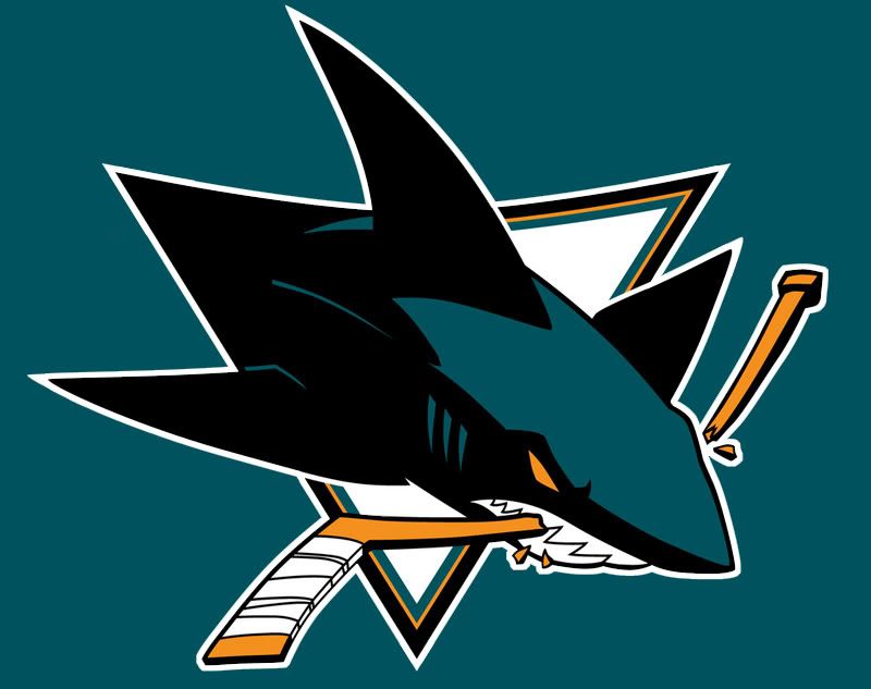
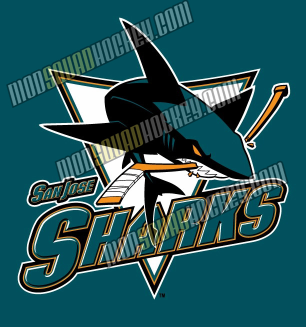
I actually like the new spin the Sharks put on their logo... it's a subtle change but much more modern.
Posted: Mon Jul 16, 2007 4:17 pm
by whysoserious
I'm glad the Capital's are back. It just fits better.
The one thing I will say though is that I'm kinda getting sick of all these teams in all sports constantly changing their logos, names and colours and adding third jersey's as quick cash grabs.
Posted: Thu Jul 19, 2007 2:19 am
by Viperstrike
i like how the sharks logo looks.