Page 1 of 4
New Season, New Court
Posted: Thu Aug 22, 2019 6:35 pm
by Def Swami
They must really love this logo and font. 10 years in and the primary and secondary logos have not changed.
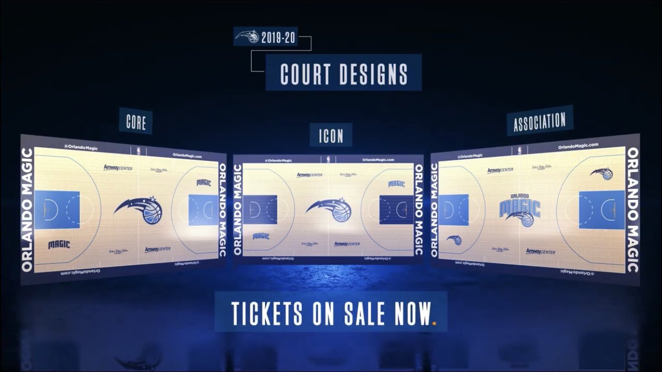
On the bright side, I do like the Core and especially the Icon courts. The secondary logo has always been better than the primary.
Hopefully there is a separate court for the City Uniforms in the works too.
Re: New Season, New Court
Posted: Thu Aug 22, 2019 6:52 pm
by rcklsscognition
Must have a ton of these sitting in a warehouse somewhere and they're hopeful the playoff run last year will sell of their remaining stock? I don't get it. So many missed opportunities. Nike takes over the jerseys, fail to do anything. 25th or 30th anniversary, fail again to change. Oh, made the playoffs? Run it back. Pathetic.
Re: New Season, New Court
Posted: Thu Aug 22, 2019 7:57 pm
by AddiFB
Meh...
Icon one is kinda nice though
Re: New Season, New Court
Posted: Thu Aug 22, 2019 8:48 pm
by orlando_joe
black or blue uni white pinstripe with the black in the paint I like
Re: New Season, New Court
Posted: Thu Aug 22, 2019 10:05 pm
by Magic_Johnny12
Yawnnnnnnnnnnnnn
Re: New Season, New Court
Posted: Fri Aug 23, 2019 1:36 am
by MagicStarwipe
They're all so similar to each other that I fail to see the point of it.
Re: New Season, New Court
Posted: Fri Aug 23, 2019 1:44 am
by sChOlaRlY_Magi
Glad it's not just me...
Re: New Season, New Court
Posted: Fri Aug 23, 2019 11:31 am
by paperboymafia
I like the Icon one by far the best but safe to say im underwhelmed at this point as the other two are just so similar.
Within a few game we'll all be wondering what's actually changed.
Re: New Season, New Court
Posted: Fri Aug 23, 2019 1:37 pm
by rcklsscognition

Not sure if real.
Re: New Season, New Court
Posted: Fri Aug 23, 2019 2:06 pm
by paperboymafia
rcklsscognition wrote:Not sure if real.
Let's get loud...for your...Phoeni...uh ORLAAAANDO...
Re: New Season, New Court
Posted: Fri Aug 23, 2019 2:09 pm
by rcklsscognition
Well, we've got sun here too must have been their pitch. I cannot believe they just changed the blue to orange on the ball logo and called it a day.
Re: New Season, New Court
Posted: Fri Aug 23, 2019 3:38 pm
by orlando1214
Hopefully, the jersey is a bit more creative than the court. It's not horrible, but such little effort was put into it.
Re: New Season, New Court
Posted: Fri Aug 23, 2019 5:29 pm
by UCFJayBird
MagicStarwipe wrote:They're all so similar to each other that I fail to see the point of it.
It legit took me a minute to discern the differences.

Re: New Season, New Court
Posted: Fri Aug 23, 2019 6:50 pm
by MagicMadness
What is the point of orange and black?
Is it because of our old orange groves? If so, why black as the secondary color? Is it a Halloween court design?
On a separate note, we need a new main logo. Or at least, a new font for 'Orlando Magic' on the logo. Bland then, bland now.
Re: New Season, New Court
Posted: Fri Aug 23, 2019 7:05 pm
by VFX
I understand the orange, but why dark gray/back? Should have been neon green or blue or something as the secondary. Also, the center court logo is boring per usual. We need a rebrand.
Re: New Season, New Court
Posted: Fri Aug 23, 2019 11:13 pm
by Def Swami
It's bad. The entire design team and marketing department sucks. They all take a massive L for the primary court designs, the city court, the jerseys, and the lame slogans. There are amateurs online who can come up with far better designs.
It's so uninspired and boring. Outside of the color orange representing Orange County, there's nothing that reflects any part of the city in this City court design. There's no reason to run with an ugly charcoal color. Why not yellow? Or green? Or blue? Or almost any other color. They're not even trying by just changing the secondary logo to have an orange tint. And if the theme is "orange", why is there so much black and charcoal????
I give up. They had the best jerseys, logo, and color scheme in major league sports and refuse to capitalize on it. They couldn't even a "Classic Court" for our Classic nights last year like EVERY other team got. They're terrible. And I don't believe they'll ever figure it out.
If you want to see some of the other City Courts, take a look. The Hawks (at least they feature the actual fruit!), Clippers, Raptors, Kings, Heat, Jazz, and Warriors are among the best. And the Classic Courts of the Raptors and Grizzlies and Hornets are really cool.
https://imgur.com/a/tWlbdMB
Re: New Season, New Court
Posted: Sat Aug 24, 2019 4:00 am
by NSB_Magic
Def Swami wrote:It's bad. The entire design team and marketing department sucks. They all take a massive L for the primary court designs, the city court, the jerseys, and the lame slogans. There are amateurs online who can come up with far better designs.
It's so uninspired and boring. Outside of the color orange representing Orange County, there's nothing that reflects any part of the city in this City court design. There's no reason to run with an ugly charcoal color. Why not yellow? Or green? Or blue? Or almost any other color. They're not even trying by just changing the secondary logo to have an orange tint. And if the theme is "orange", why is there so much black and charcoal????
I give up. They had the best jerseys, logo, and color scheme in major league sports and refuse to capitalize on it. They couldn't even a "Classic Court" for our Classic nights last year like EVERY other team got. They're terrible. And I don't believe they'll ever figure it out.
If you want to see some of the other City Courts, take a look. The Hawks (at least they feature the actual fruit!), Clippers, Raptors, Kings, Heat, Jazz, and Warriors are among the best. And the Classic Courts of the Raptors and Grizzlies and Hornets are really cool.
https://imgur.com/a/tWlbdMB
Preach. It’s embarrassingly bad.. they think the players don’t realize it too? Hard enough being in small market. They need to clean house in that department... been bad for years
Re: New Season, New Court
Posted: Sat Aug 24, 2019 9:15 am
by pepe1991
I think concept of "magic" opens a doors for lot of creativity. Yet there is non on displey here


I find current logo, slogan and overall marketing kind a boring. I really like collors of a team, but everything else is just meh, feels like bunch of guys in their 60s are in charge of marketing and they just wait until retire.
Re: New Season, New Court
Posted: Sat Aug 24, 2019 3:46 pm
by OrlandO
pepe1991 wrote:I think concept of "magic" opens a doors for lot of creativity. Yet there is non on displey here
I find current logo, slogan and overall marketing kind a boring. I really like collors of a team, but everything else is just meh, feels like bunch of guys in their 60s are in charge of marketing and they just wait until retire.
Re: New Season, New Court
Posted: Sat Aug 24, 2019 3:56 pm
by AdamTheGreek
The court would be better if 'ORL' was replaced with an actual logo of some type.