Page 1 of 3
OT: OKC Unveils Logo and Name
Posted: Wed Sep 3, 2008 10:00 pm
by Force9024
Re: OT: OKC Unveils Logo and Name
Posted: Wed Sep 3, 2008 10:14 pm
by AdamTheGreek
Worst surprise ever, and what a horrific logo.

Re: OT: OKC Unveils Logo and Name
Posted: Wed Sep 3, 2008 10:19 pm
by MagicMadness
Logo sucks.
Re: OT: OKC Unveils Logo and Name
Posted: Wed Sep 3, 2008 10:20 pm
by OrlandoMagic
And you guys were picking on the Timber Wolves new look? Im sure OKC will set an NBA record with lowest merchandise sold.
Re: OT: OKC Unveils Logo and Name
Posted: Wed Sep 3, 2008 10:24 pm
by Magic.City.23.
That logo looks 10 yrs old....
Re: OT: OKC Unveils Logo and Name
Posted: Wed Sep 3, 2008 10:24 pm
by Optimus_Steel
Its terrible. Its not even an professional indoor handball team worthy logo. I think KFC when I read the OKC part lol.
And a ironical slap in the face, when you click on the OKC website, when its loading it says Seattle Supersonics for a split second, ouch.
Not only that but they stole our Magic blue.
Re: OT: OKC Unveils Logo and Name
Posted: Wed Sep 3, 2008 10:34 pm
by MagicMadness
Their logo just looks so generic. Like what you'd see if you were playing NBA 2K9 and they just made up a logo to put in it's place because the team hadn't unveiled their REAL logo yet.
Re: OT: OKC Unveils Logo and Name
Posted: Wed Sep 3, 2008 10:36 pm
by craig01
The logo stinks and the name is terrible (but could have been worse).
Re: OT: OKC Unveils Logo and Name
Posted: Wed Sep 3, 2008 10:43 pm
by paperboymafia
thats just bad
Re: OT: OKC Unveils Logo and Name
Posted: Wed Sep 3, 2008 10:54 pm
by Force9024
Looks like they tried to mock the warriors lightning thing but put their own twist on it
Re: OT: OKC Unveils Logo and Name
Posted: Wed Sep 3, 2008 10:56 pm
by FFBlitzace
WCW Thunder > OKC Thunder

Re: OT: OKC Unveils Logo and Name
Posted: Wed Sep 3, 2008 11:22 pm
by Devin 1L
Lame.
Sad thing is that I've seen an incredible design by some dude that would have been perfect.
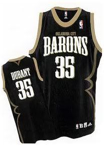
First mistake was naming them the Thunder (Barons would have been great), then they go an top it off with a stupid logo. Meh.
Re: OT: OKC Unveils Logo and Name
Posted: Thu Sep 4, 2008 12:01 am
by Force9024
I hope they don't screw up the jerseys too. They better at the very least not screw up the jerseys. Even though the Logo is one of the biggest if not THE BIGGEST part to your team. But if they screw up the jerseys and make em look embarrassing they're marketing is going to be HORRENDOUS. Noone will want the jerseys, noone will want the logo.. this could be horrible for Durant marketing wise. Some would have rocked the Durant Sonics jersey cuz it wasn't bad. This..

.
Re: OT: OKC Unveils Logo and Name
Posted: Thu Sep 4, 2008 12:06 am
by ocoeeballa
This logo resembles 1990's-era WNBA logos, like Detroit Shock or Cleveland Rockers. What a pathetic logo. On top of that they steal the Warriors' colors, mascot name, and logo style.
When are the jerseys unveiled?
Re: OT: OKC Unveils Logo and Name
Posted: Thu Sep 4, 2008 12:18 am
by Orange Ave.
Love the name Thunder, maybe second favorite to Magic. But the logo, unbelievable. Even this is better.

Re: OT: OKC Unveils Logo and Name
Posted: Thu Sep 4, 2008 12:33 am
by Force9024
http://www.newsok.com/article/3289525/Team uniforms, home and road, won’t be announced until late September
So we'll probably see them pop up around the same time our jerseys do.
It's unfortunate we didn't see this as the name and jersey..
That would of been sick if u ask me...
Re: OT: OKC Unveils Logo and Name
Posted: Thu Sep 4, 2008 12:59 am
by Devin 1L
If they just felt they had to go with the Thunder, this would have been a much better option, in my opinion:

That concept, with a different color scheme so that you don't look just like the Cavs, and you've got a good looking logo.
Re: OT: OKC Unveils Logo and Name
Posted: Thu Sep 4, 2008 1:02 am
by Force9024
Those definitely would have been a good looking logo. You had your primary logo, your secondary logo, and your alternate logo, which is good for small products and good for hats. Idk.. They better have something up there sleeves if they wanna draw a lot of people to the crowds.
Re: OT: OKC Unveils Logo and Name
Posted: Thu Sep 4, 2008 1:06 am
by AdamTheGreek
EPIC FAILURE:

Re: OT: OKC Unveils Logo and Name
Posted: Thu Sep 4, 2008 1:08 am
by FFBlitzace
Girl in front of Mason: "LOL, this logo blows ass."
