Raps in 4 wrote:greekman wrote:the team is in desperate need of talent. like siakam level talent
This team was a lottery team while Siakam was here too, in case you forgot.
how many games did they play together ?


Moderators: Morris_Shatford, niQ, Duffman100, tsherkin, Reeko, lebron stopper, DG88, HiJiNX, 7 Footer
Raps in 4 wrote:greekman wrote:the team is in desperate need of talent. like siakam level talent
This team was a lottery team while Siakam was here too, in case you forgot.

Raptors Realtor wrote:YogurtProducer wrote:WaltFrazier wrote:Tear it down and go for a true rebrand:
https://ftw.usatoday.com/wp-content/uploads/sites/90/2016/11/raptors-blue.jpg?w=1000&h=600&crop=1
I always had a soft spot for those huskie jerseys with the handwritten wordscript on front.cant find the jersey anymore
Same... Before you even posted this I went on a hunt for them...
[url][/url]


Raptors Realtor wrote:YogurtProducer wrote:WaltFrazier wrote:Tear it down and go for a true rebrand:
https://ftw.usatoday.com/wp-content/uploads/sites/90/2016/11/raptors-blue.jpg?w=1000&h=600&crop=1
I always had a soft spot for those huskie jerseys with the handwritten wordscript on front.
Same... Before you even posted this I went on a hunt for them...
[url]


wegotthabeet wrote:
[img]
Los Manos wrote:Raptors Realtor wrote:YogurtProducer wrote:I always had a soft spot for those huskie jerseys with the handwritten wordscript on front.
Same... Before you even posted this I went on a hunt for them...
[url]
This is a blast from the past. Can't even remember when I designed them but it must be over a decade now. I remember the criticism of the husky face logo and it was entirely fair as I did this in the early days of GoT first airing.
That hand drawn script has held up though since putting pen to paper. I don't think I ever bothered to go back and draw it properly as a vector. The uniforms were clean and I always liked the belt loop design of the oroginal 1946 shorts.
No idea what direction they might go with a for 30 year rebrand. At this point, I'd just like a design team to ignore the past and set a clean new look for the future. However with fashion trends now locked in the grips of 90's nostalgia, I wouldn't be at all surprised to see a massive dino slapped on the front.
YogurtProducer wrote:wegotthabeet wrote:
[img]
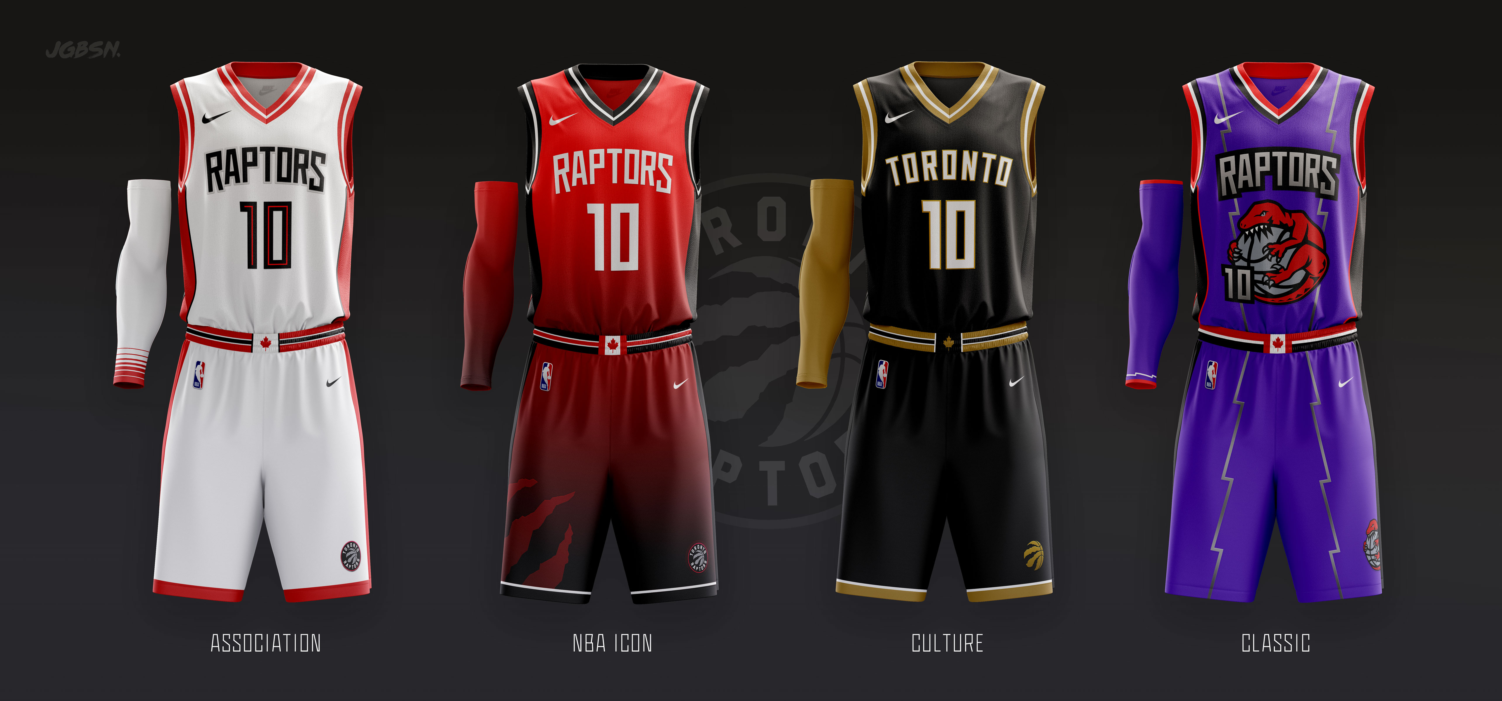
This just kind of further cements that every Raptors jersey should have those pin stripes. People can argue about the Purple or Black/Gold or Blue or Red... but that pinstriping to me is "Raptors"
YogurtProducer wrote:Los Manos wrote:Raptors Realtor wrote:
Same... Before you even posted this I went on a hunt for them...
[url]
This is a blast from the past. Can't even remember when I designed them but it must be over a decade now. I remember the criticism of the husky face logo and it was entirely fair as I did this in the early days of GoT first airing.
That hand drawn script has held up though since putting pen to paper. I don't think I ever bothered to go back and draw it properly as a vector. The uniforms were clean and I always liked the belt loop design of the oroginal 1946 shorts.
No idea what direction they might go with a for 30 year rebrand. At this point, I'd just like a design team to ignore the past and set a clean new look for the future. However with fashion trends now locked in the grips of 90's nostalgia, I wouldn't be at all surprised to see a massive dino slapped on the front.
You designed those? Awesome work man.
How much would it cost us to see this same design with a "Raptors" script instead
wegotthabeet wrote:YogurtProducer wrote:wegotthabeet wrote:
[img]
This just kind of further cements that every Raptors jersey should have those pin stripes. People can argue about the Purple or Black/Gold or Blue or Red... but that pinstriping to me is "Raptors"
[img]
this, but with the zig zag pinstripes would be so nice. maybe with some silver + black trim.
combining the Raptors 1st + 2nd jerseys basically.


Los Manos wrote:Raptors Realtor wrote:YogurtProducer wrote:I always had a soft spot for those huskie jerseys with the handwritten wordscript on front.
Same... Before you even posted this I went on a hunt for them...
[url]
This is a blast from the past. Can't even remember when I designed them but it must be over a decade now. I remember the criticism of the husky face logo and it was entirely fair as I did this in the early days of GoT first airing.
That hand drawn script has held up though since putting pen to paper. I don't think I ever bothered to go back and draw it properly as a vector. The uniforms were clean and I always liked the belt loop design of the oroginal 1946 shorts.
No idea what direction they might go with a for 30 year rebrand. At this point, I'd just like a design team to ignore the past and set a clean new look for the future. However with fashion trends now locked in the grips of 90's nostalgia, I wouldn't be at all surprised to see a massive dino slapped on the front.
YogurtProducer wrote:wegotthabeet wrote:YogurtProducer wrote:
This just kind of further cements that every Raptors jersey should have those pin stripes. People can argue about the Purple or Black/Gold or Blue or Red... but that pinstriping to me is "Raptors"
[img]
this, but with the zig zag pinstripes would be so nice. maybe with some silver + black trim.
combining the Raptors 1st + 2nd jerseys basically.
Something about the font on that one just does not work for me.

wegotthabeet wrote:[url]
[img]
[img]
[img]
https://www.reddit.com/media?url=https%3A%2F%2Fi.redd.it%2Fh62w3aue6s861.jpg
https://www.reddit.com/media?url=https%3A%2F%2Fpreview.redd.it%2F61kdsm9ph8r91.jpg%3Fwidth%3D1080%26crop%3Dsmart%26auto%3Dwebp%26s%3D66417eaf5c565bed6a5dbc67872ca4a7c8ef8e9c
https://www.reddit.com/media?url=https%3A%2F%2Fi.redd.it%2Fko939du9mbv61.jpg
https://www.reddit.com/media?url=https%3A%2F%2Fpreview.redd.it%2Fy5bkho4vlf061.jpg%3Fwidth%3D640%26crop%3Dsmart%26auto%3Dwebp%26s%3Dbdaaeee6c7fd84abce3a5fb668a9e512508f4a93

YogurtProducer wrote:wegotthabeet wrote:YogurtProducer wrote:
This just kind of further cements that every Raptors jersey should have those pin stripes. People can argue about the Purple or Black/Gold or Blue or Red... but that pinstriping to me is "Raptors"
[img]
this, but with the zig zag pinstripes would be so nice. maybe with some silver + black trim.
combining the Raptors 1st + 2nd jerseys basically.
Something about the font on that one just does not work for me.
Antinomy wrote:Bucks are going to win the next 2 games (convincingly). This place is gonna be a wasteland
In the words of Charles Barkley: I Guar-RUN-tee.
You are all welcome to sig me.

Antinomy wrote:Bucks are going to win the next 2 games (convincingly). This place is gonna be a wasteland
In the words of Charles Barkley: I Guar-RUN-tee.
You are all welcome to sig me.

YogurtProducer wrote:wegotthabeet wrote:
[img]
This just kind of further cements that every Raptors jersey should have those pin stripes. People can argue about the Purple or Black/Gold or Blue or Red... but that pinstriping to me is "Raptors"


Change the gold to a red and maybe add some black or white in there and that is A++Coco Costanza wrote:A while back, I did this recoloring of one of the city jerseys, with a darker purple, and gold. Not sure it works, but I do think gold works with purple more than red, which clashes.