Page 1 of 3
[Updated-Huskies Uni]Uniform Contest: Requested Uni, Comment
Posted: Thu Jun 6, 2013 1:58 am
by Purple+Black
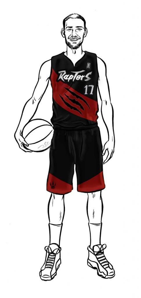
Saw a lot of requests for uni's following this pattern in the star thread, so just want some quick opinions from realGM before I submit these.
Let me know what to add/remove
Credit to goodjoey for the of the shading on shorts*Credit to Andy Tsang for the Huskies logo*Changed the font to the root font used for "Toronto Subway", because the subway font itself didn't look good with these jerseys, as the jerseys look futuristic and the font looked older.
Huskies Away:

Huskies Home:

1:

2:

Originals:

Re: Uniform Contest: What needs to change?
Posted: Thu Jun 6, 2013 2:06 am
by ballislife

Add a similar font to that on the writing and numbers. that jersey looks sick though. The font is too simple.. make it similar to the old jerseys and those would be amazing jerseys.
Re: Uniform Contest: What needs to change?
Posted: Thu Jun 6, 2013 2:14 am
by ballislife
I love that Raptor head logo... if you could cut out the tongue it think it would make it a bit better.
Re: Uniform Contest: What needs to change?
Posted: Thu Jun 6, 2013 2:15 am
by MEDIC
Really like them both Hansari.
Dinosaur is a little big for me in the first one, but it still looks good.
Looks like you took a little bit of the best of everything from our thread & incorporated it.
Good job.
Edit: I wonder what it would look like with that Raptor head replacing the "R" in Toronto.
Re: Uniform Contest: Requested Uni, Comment
Posted: Thu Jun 6, 2013 2:49 am
by SHFT
I know there is talk about re branding...but what do you guys think the chances are we change the name?
Re: Uniform Contest: Requested Uni, Comment
Posted: Thu Jun 6, 2013 3:01 am
by SuperSant
Re: Uniform Contest: Requested Uni, Comment
Posted: Thu Jun 6, 2013 3:14 am
by UnderdogRaptors
the 2nd one looks so fresh, good job
Re: Uniform Contest: What needs to change?
Posted: Thu Jun 6, 2013 3:29 am
by RaptorPride
Yea change the font to the old one
Re: Uniform Contest: What needs to change?
Posted: Thu Jun 6, 2013 3:45 am
by Purple+Black
MEDIC wrote:Really like them both Hansari.
Dinosaur is a little big for me in the first one, but it still looks good.
Looks like you took a little bit of the best of everything from our thread & incorporated it.
Good job.
Edit: I wonder what it would look like with that Raptor head replacing the "R" in Toronto.
Your idea is interesting, it would clean it up a little and be better use of the space.. It does look like the letter somewhat
Uniform Contest: Requested Uni, Comment
Posted: Thu Jun 6, 2013 10:55 am
by Double Helix
I like aspects of the second one. Not too keen on the font for some reason though.
Has anyone tried this font yet:
http://en.m.wikipedia.org/wiki/Toronto_Subway_FontAgain, I think it just has a classic, timeless look to it that will always feel like and remind us of Toronto. It was made in 1954. If you can't find it a variation on Futura (created in 1927) will probably suffice.
It will seem timeless outside of Toronto (Like Brooklyn's does) but personal to people who recognize the font in the GTA.
Re: Uniform Contest: Requested Uni, Comment
Posted: Thu Jun 6, 2013 12:07 pm
by RedX
Here are some thoughts:
- Maybe try a couple more fonts for the name and number
- Try the number in a white outline
- The kerning on Toronto feels a little too tight. I would give it a bit of breathing room.
- I like how the head of the raptor sneeks in there. Try and see if you can do a bit of a customized wordmark between the name and that logo. For example: The bottom left side of the head and neck don't feel necessary, the head coming over the type is really the cool part. Try moving the icon more to the right so it sits somewhere above the 'OR' and don't let it peak through the letters at the bottom, just try the head alone (with a bit of the neck next to it) peeking over the type. The little pieces that sneak through the bottom make it look messy.
- Did you design/create the white one? If you did I would mimic how the logo was treated on the shorts, and go with just the type as is for "TORONTO'. If you didn't... you shouldn't be copying it at all

love the logo

Re: Uniform Contest: Requested Uni, Comment
Posted: Thu Jun 6, 2013 12:15 pm
by Komodo
Hansari wrote:Saw a lot of requests for uni's following this pattern in the star thread, so just want some quick opinions from realGM before I submit these.
Let me know what to add/remove
2:
I like this one. Love the Raptor logo on the left. It should be our primary logo.
Re: Uniform Contest: Requested Uni, Comment
Posted: Thu Jun 6, 2013 12:16 pm
by VC-INJURY

These are my personal favourites. If they did a slight updated version of these jerseys in the red, black and purple they would be great!
OP like the other poster above said, try and incorporate this style of font onto the jerseys. Also, the Raptor logo on the 1st jersey is too much. 2nd one is the best.
Re: Uniform Contest: Requested Uni, Comment
Posted: Thu Jun 6, 2013 6:37 pm
by Purple+Black
Thx for all the feedback, trying some stuff now to see how they turn up
Re: Uniform Contest: Requested Uni, Comment
Posted: Thu Jun 6, 2013 6:43 pm
by Mediocrity
Hansari wrote:Saw a lot of requests for uni's following this pattern in the star thread, so just want some quick opinions from realGM before I submit these.
Let me know what to add/remove
1:
2:
Originals:
They look awesome. Do you think it would be better to have Raptors instead of Toronto on the front?
Re: Uniform Contest: Requested Uni, Comment
Posted: Thu Jun 6, 2013 7:07 pm
by TheGoodDoctor
Make the originals blue and white and we might be onto something.
Re: Uniform Contest: Requested Uni, Comment
Posted: Thu Jun 6, 2013 7:11 pm
by Raptorfan2012
TheGoodDoctor wrote:Make the originals blue and white and we might be onto something.
Nah, the only way I want to see Blue and White is if we become the Huskies. Otherwise, I love the Red, White, and Black for the Raptors. The first uniform looks pretty good too.
Re: Uniform Contest: Requested Uni, Comment
Posted: Thu Jun 6, 2013 7:18 pm
by notagenius
#2 looks the best
definitely send that in!
Re: Uniform Contest: Requested Uni, Comment
Posted: Thu Jun 6, 2013 7:32 pm
by goodjoey
lol, not tryna harp on you or anything, but you should be giving credit where credit is due.
that shading seems eerily similar...
Re: Uniform Contest: Requested Uni, Comment
Posted: Thu Jun 6, 2013 7:41 pm
by TheGoodDoctor
^^^Actually don't mind that uniform if we stayed red, white and black.
It blends the old "Raptors" brand from the first season with the "new" colours we've adopted.
