Page 1 of 7
Jersey/Logo Attempts (Turbozone) - Updated
Posted: Tue Jun 11, 2013 2:27 am
by Turbo_Zone
Re: Jersey/Logo Attempts (Turbozone)
Posted: Tue Jun 11, 2013 2:31 am
by Wo1verine
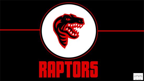
Here's probably my favorite of the bunch!
Look forward to your second session!
Re: Jersey/Logo Attempts (Turbozone)
Posted: Tue Jun 11, 2013 2:32 am
by StatLine
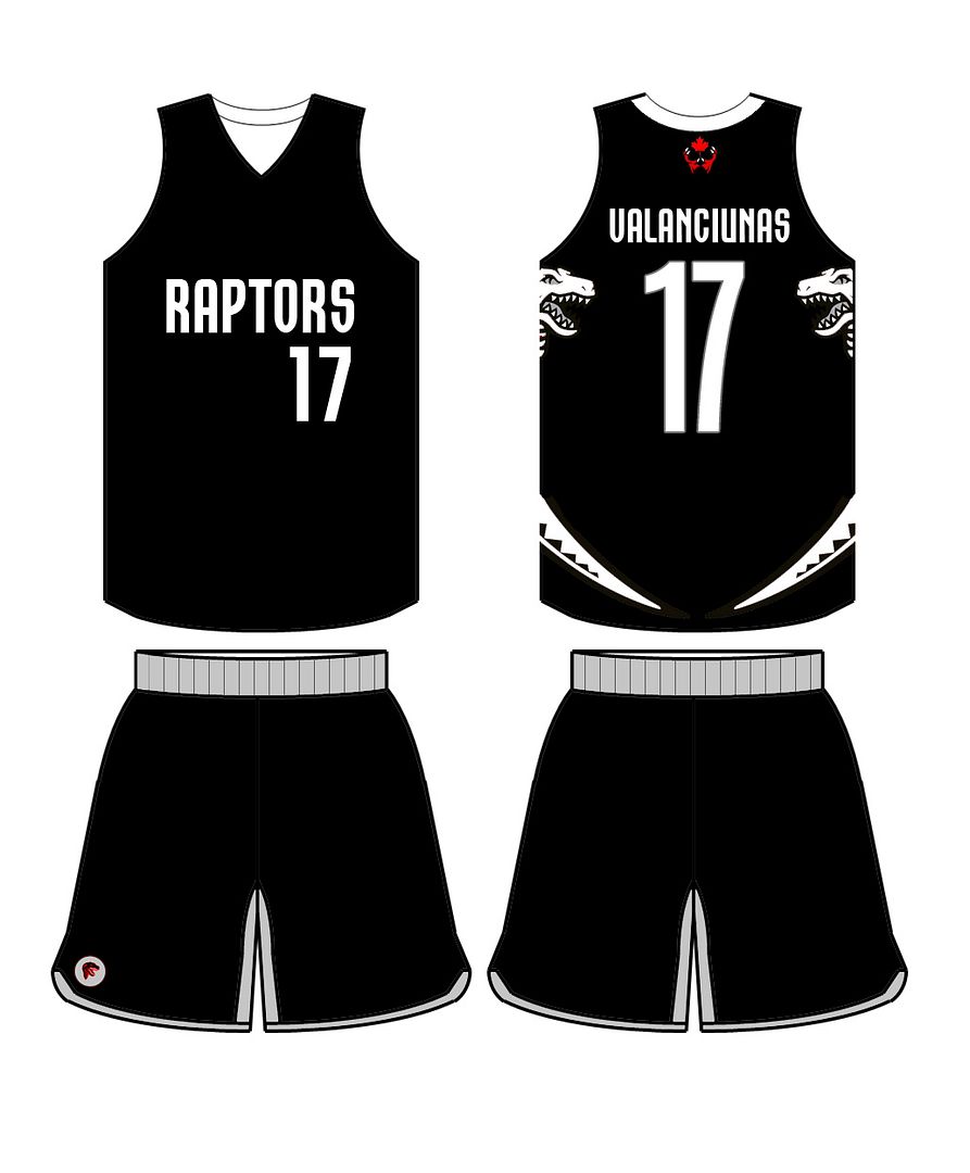
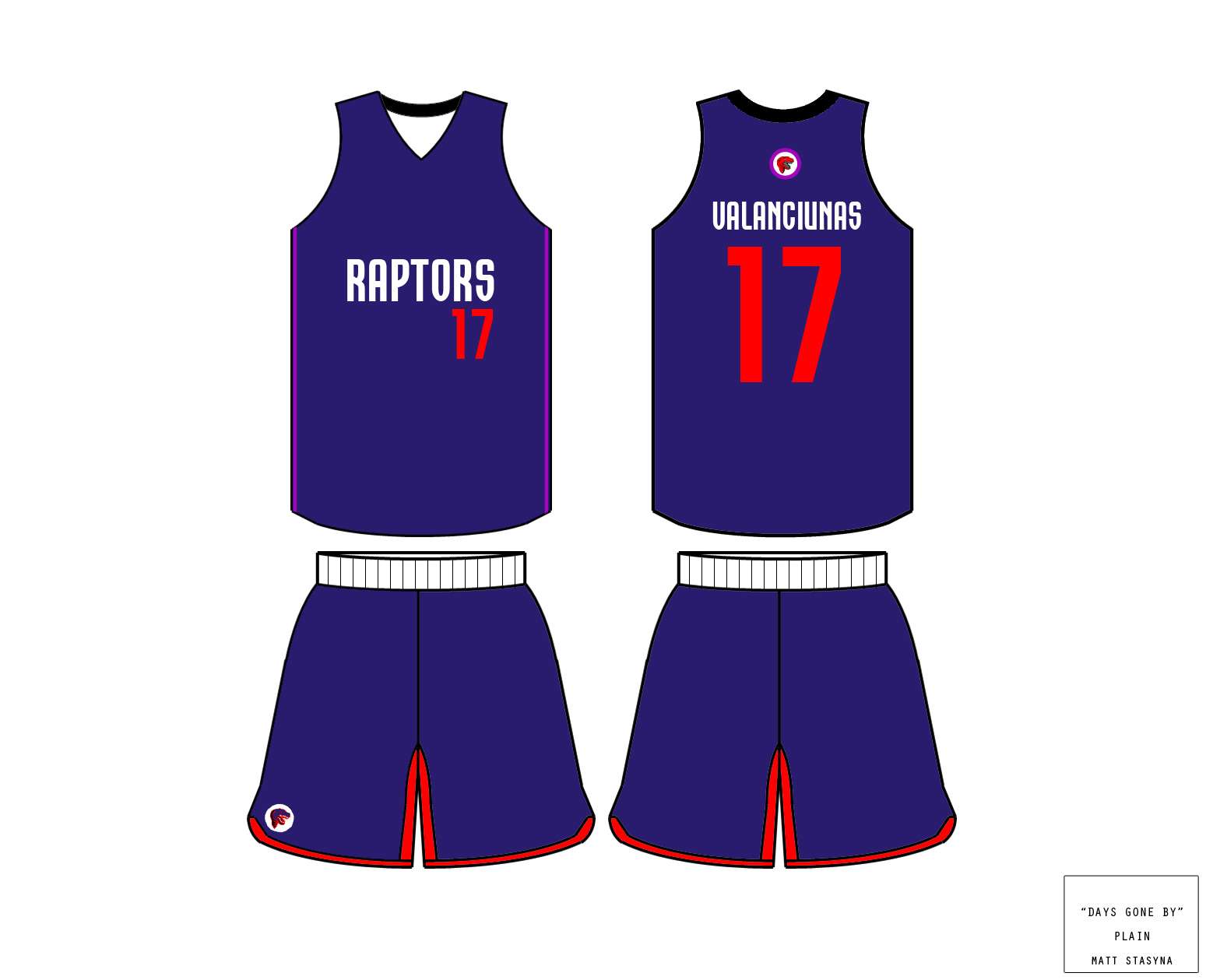
I like the navy blue jerseys
Re: Jersey/Logo Attempts (Turbozone)
Posted: Tue Jun 11, 2013 2:36 am
by niQ
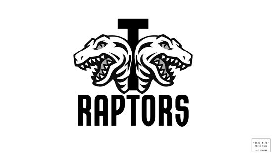
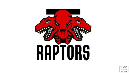
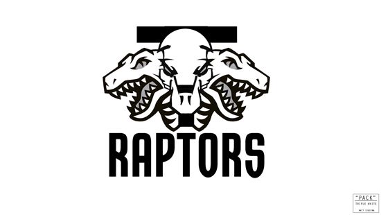
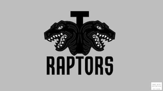
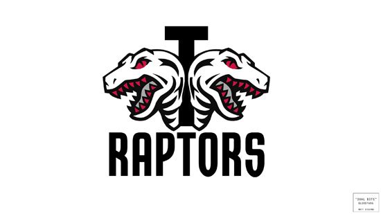
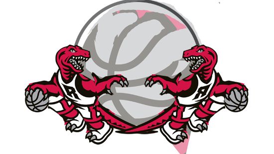
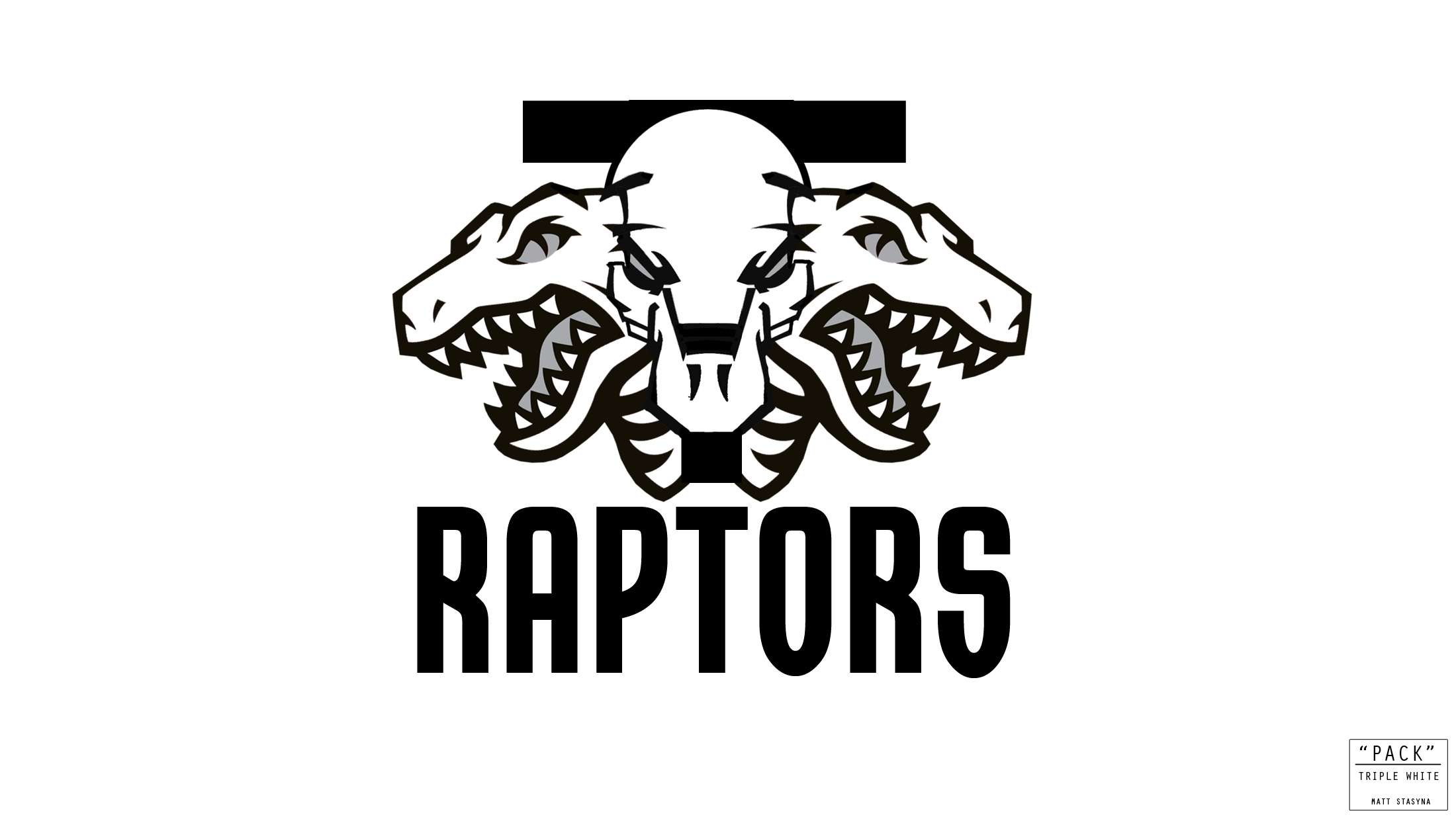
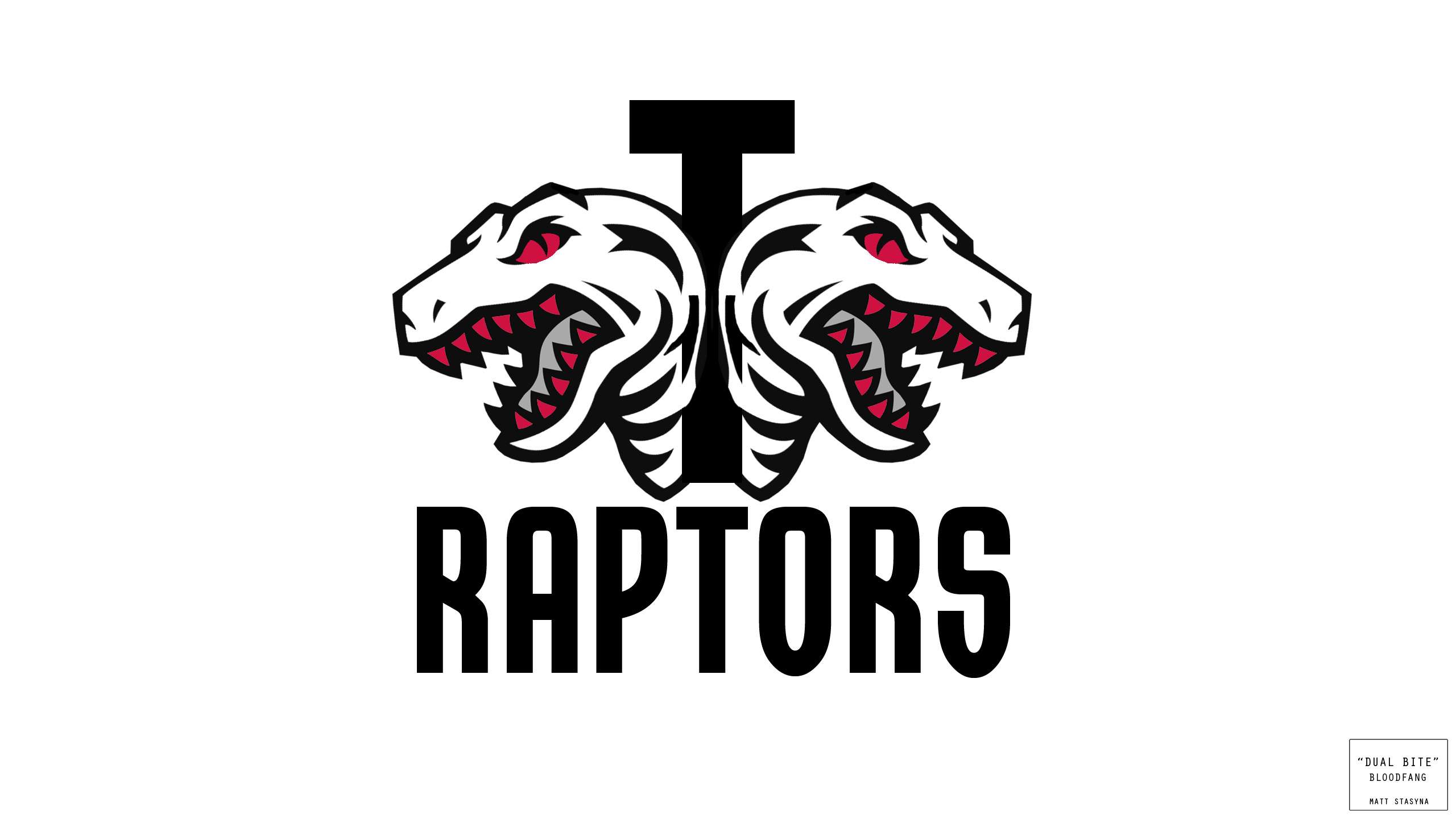
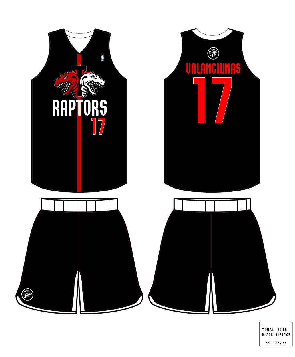
Love these ones! Nothing says RaptorS like 3x the Raptors! That or it's a Raptor Cerberus!
Re: Jersey/Logo Attempts (Turbozone)
Posted: Tue Jun 11, 2013 2:37 am
by mowe
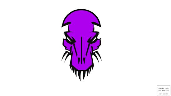
I REALLY love those purple jerseys. Never wanted to go back to purple until I saw your design.
Re: Jersey/Logo Attempts (Turbozone)
Posted: Tue Jun 11, 2013 2:44 am
by N1QUE24
Purple jerseys are fire.
Re: Jersey/Logo Attempts (Turbozone)
Posted: Tue Jun 11, 2013 2:45 am
by Valanciunuts
Re: Jersey/Logo Attempts (Turbozone)
Posted: Tue Jun 11, 2013 2:51 am
by Double Helix
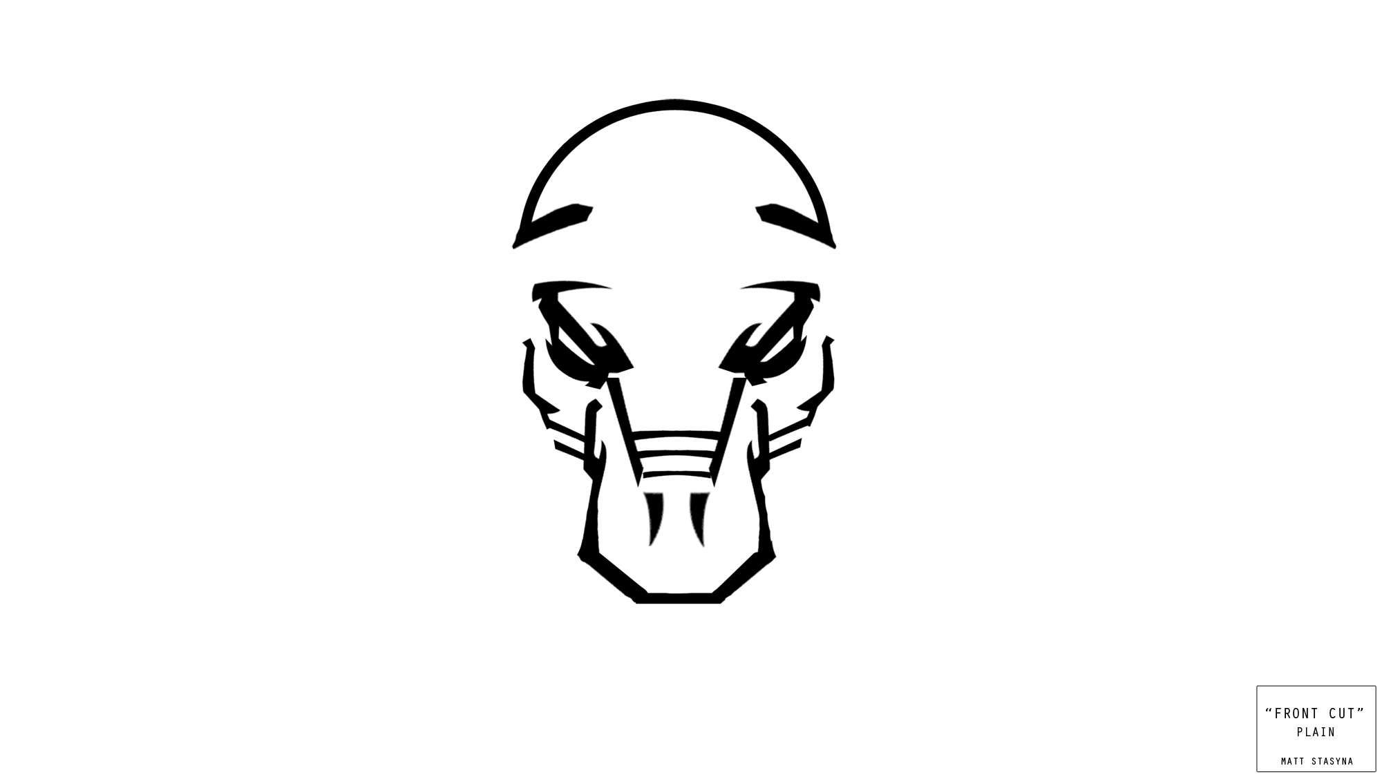
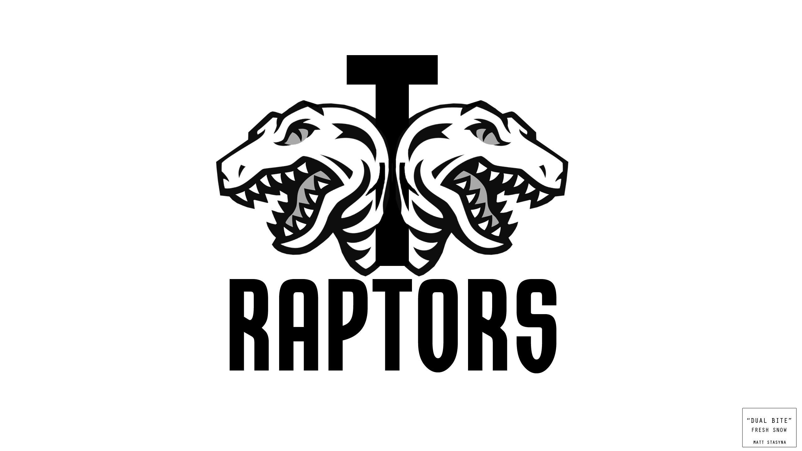
I like aspects of the head on look but wish so much of that design wasn't left to the imagination as I think it could look kind of cool on a hat if you fleshed it out more.
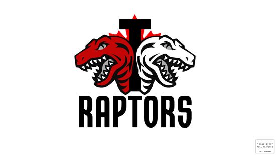
The T with the maple leaf and two Raptors facing opposite directions is probably the most polished and ready for the masses.
Re: Jersey/Logo Attempts (Turbozone)
Posted: Tue Jun 11, 2013 2:52 am
by Turbo_Zone
Double Helix wrote:I like aspects of the head on look but wish so much of that design wasn't left to the imagination as I think it could look kind of cool on a hat if you fleshed it out more.
The T with the maple leaf and two Raptors facing opposite directions is probably the most polished and ready for the masses.
I agree. It's the most "market-ready" of the bunch and one of two which I feel could survive the MLSE boardroom.
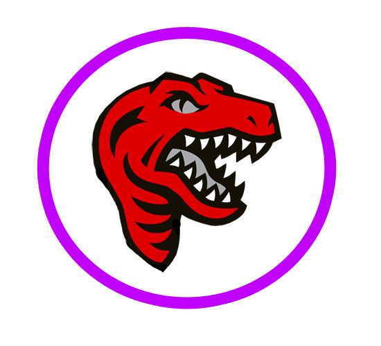
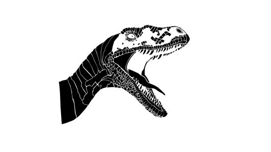
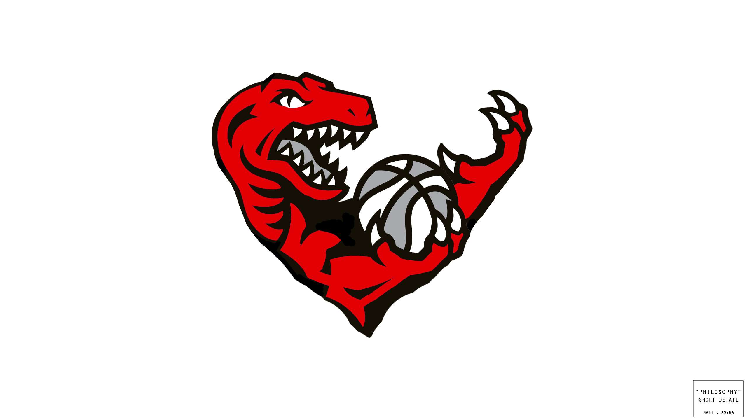
Here is a detail of the plain Raptor head from the Purple Jersey:
Re: Jersey/Logo Attempts (Turbozone)
Posted: Tue Jun 11, 2013 2:53 am
by sule
I'm really liking logo #8 and logo #9, and jersey #1.
Re: Jersey/Logo Attempts (Turbozone)
Posted: Tue Jun 11, 2013 2:54 am
by S.W.A.N
Turbozone how about do a raptor on top of the CN Tower King Kong style.....
Re: Jersey/Logo Attempts (Turbozone)
Posted: Tue Jun 11, 2013 2:56 am
by Turbo_Zone
S.W.A.N wrote:Turbozone how about do a raptor on top of the CN Tower King Kong style.....
That's a sweet idea!
The Tower is a bit tall so it's hard to cram it in.
With that said, a giant Raptor grasping it would be great!
Just might do that!
(I'll give you credit for the initial idea of course!)
Re: Jersey/Logo Attempts (Turbozone)
Posted: Tue Jun 11, 2013 2:57 am
by S.W.A.N
Turbo_Zone wrote:S.W.A.N wrote:Turbozone how about do a raptor on top of the CN Tower King Kong style.....
That's a sweet idea!
The Tower is a bit tall so it's hard to cram it in.
With that said, a giant Raptor grasping it would be great!
Just might do that!
(I'll give you credit for the initial idea of course!)
Awesome !!
It would look sweet if the tower went all the way up one side of jersey with the raptor kind of hanging off into the middle...
Re: Jersey/Logo Attempts (Turbozone)
Posted: Tue Jun 11, 2013 2:57 am
by joseph235
Omg the purple jerseys are awesome.
Re: Jersey/Logo Attempts (Turbozone)
Posted: Tue Jun 11, 2013 3:03 am
by talha_raps
niQ wrote:Love these ones! Nothing says RaptorS like 3x the Raptors! That or it's a Raptor Cerberus!
I really like that one too. Turbo Zone I think you should somehow incorporate the Toronto Skyline on top of the ball. I'm sure you can make it look nice and it represents the city pretty nice.
Re: Jersey/Logo Attempts (Turbozone)
Posted: Tue Jun 11, 2013 3:03 am
by whysoserious
Wo1verine wrote:Here's probably my favorite of the bunch!
Look forward to your second session!
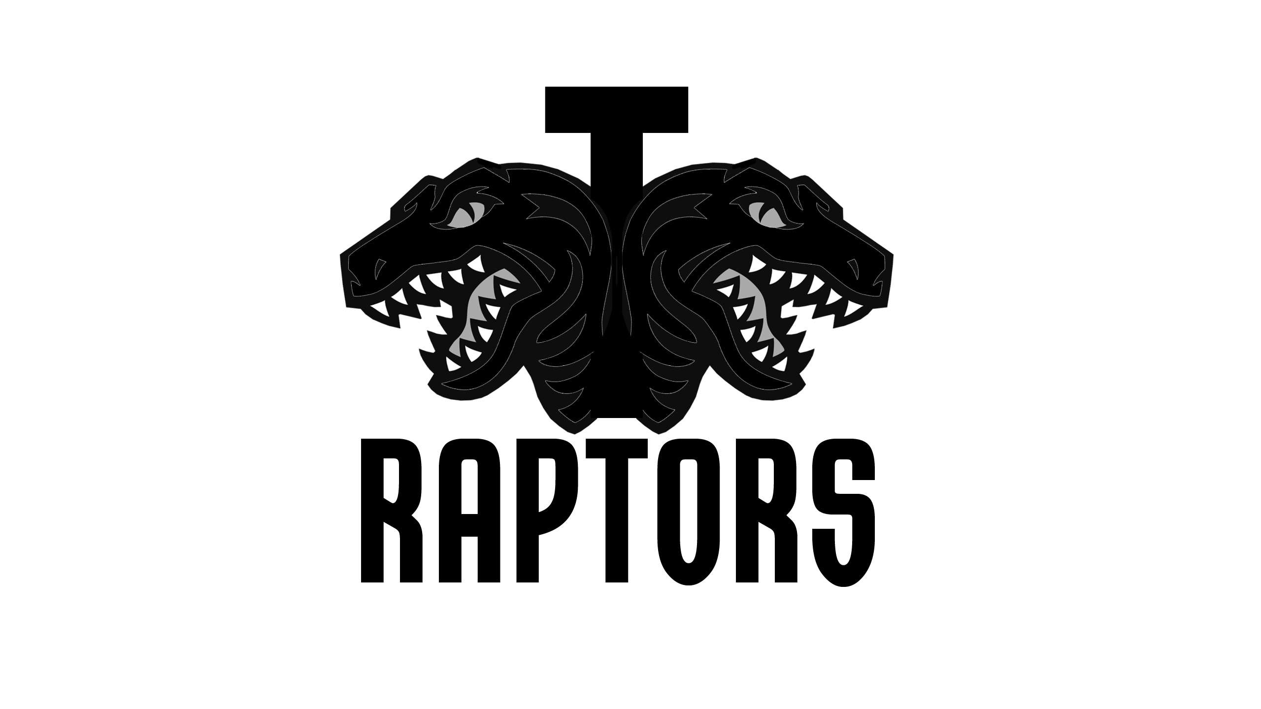
really like this one as well, maybe just with the one head and then the T and R somehow.
Not feeling the first warrior kind of Raptors but that's just me. As always, great work TZ.
Re: Jersey/Logo Attempts (Turbozone)
Posted: Tue Jun 11, 2013 3:04 am
by whysoserious
N1QUE24 wrote:Purple jerseys are fire.
Those to me are the ideal third jersey for this team.
Jersey/Logo Attempts (Turbozone)
Posted: Tue Jun 11, 2013 3:07 am
by Double Helix
Would you be interested in running the vertical stripe offset slightly to the left and another, bolder horizontal one across the chest to create a large T shape that runs across the upper chest framing both the team and player name? The T could be present front and back and also serve as a nice divider for the offset number on the front and the larger number on the back.
Of all the modern fonts, I like this one.It suits the name nicely but it's still clean.
I just thought of this but has anybody tried to do a T.O. with the "O" as an overhead basketball net? Maybe the two periods could be Raptor eyes looking forward at the viewer and you could just do a set of teeth along and bottom of the T.O. As though its partially a Raptor looking at you in the dark but all you can see are the eyes and teeth.
So, letter T, then first period (Left Raptor eye looking forward), then letter O (overhead angle of basketball net), then second period (right Raptor eye looking forward) and a set of teeth along the bottom could work.
Still, I think that something like that would look awesome on a hat. I hope somebody can run with these ideas. I would if I could draw. I'm an idea man, not a painter.

Re: Jersey/Logo Attempts (Turbozone)
Posted: Tue Jun 11, 2013 3:12 am
by Turbo_Zone
^ I'll def give your idea a try next time I sit down!
I did try some "large T's" but I will admit it sucks up a LOT of space.
With that said, when I sit down again I'll give it a whirl!
Next for me is to eyeball this and make a stencil:
Husky Image:
http://i750.photobucket.com/albums/xx14 ... ks/4-1.jpg
Jersey/Logo Attempts (Turbozone)
Posted: Tue Jun 11, 2013 3:16 am
by Double Helix
Turbo_Zone wrote:^ I'll def give your idea a try next time I sit down!
I did try some "large T's" but I will admit it sucks up a LOT of space.
With that said, when I sit down again I'll give it a whirl!
Next for me is to eyeball this and make a stencil:

I just came up with something afterward and edited it involving the concept of us only seeing the eyes and teeth of a Raptor looking forward with each eye serving as the periods between T.O.
An overhead basketball net would also be possible for the O.
This is more of a hat-related/center court-related design I'm imagining than a jersey design with regard to the T.O. and the teeth though.


