Page 1 of 2
THE COLORS ARE UGLY!!!
Posted: Wed Sep 3, 2008 9:31 pm
by jman23
http://store.nba.com/family/index.jsp?c ... age=familythis is the ugliest logo i've ever seen lol and i'm fixing to cry

Re: THE COLORS ARE UGLY!!!
Posted: Wed Sep 3, 2008 9:34 pm
by Radiohead311
I agree. Logo colors everything is just awful so far.
But like Presti said the only thing that really matters is the players in the jerseys.
Re: THE COLORS ARE UGLY!!!
Posted: Wed Sep 3, 2008 9:42 pm
by B-Rich
Re: THE COLORS ARE UGLY!!!
Posted: Wed Sep 3, 2008 10:02 pm
by funkatron101
Re: THE COLORS ARE UGLY!!!
Posted: Wed Sep 3, 2008 10:18 pm
by JDubJazz
Wow, my condolences to the OKC basketball faithfull. I used to be convinced that the Jazz had the worst logo/marketing in all of pro sports, but ladies and gentlemen, we have a new champion! I'm not sure WNBA or even Arena league teams would use a logo that bad. Oh well, at least you get to watch Kevin Durant do amazing things, assuming you don't go blind watching him in those colors.
Re: THE COLORS ARE UGLY!!!
Posted: Wed Sep 3, 2008 10:26 pm
by KyleinOK
Get over it closet Sonics fan.
The logo is fine.
We don't need your drama here.
Re: THE COLORS ARE UGLY!!!
Posted: Wed Sep 3, 2008 10:28 pm
by MUpacersSIC
um the logo is not fine, and this isn't from a sonics fan. I'm sorry but really they couldn't come up with something better? There are people on this site with more talent than the people they hired to come up with this.
Re: THE COLORS ARE UGLY!!!
Posted: Wed Sep 3, 2008 10:31 pm
by magee
My sister could've made better colors and logos for free. A shame, a crying shame.
Re: THE COLORS ARE UGLY!!!
Posted: Wed Sep 3, 2008 10:33 pm
by U2larkin04
Good thing they didn't use the exact colors that the Bobcats have or anything...
Re: THE COLORS ARE UGLY!!!
Posted: Wed Sep 3, 2008 10:39 pm
by Rockmaninoff
They really should have went with this one...

Just kidding. But for real, that logo/color scheme is horrible. How could the league office approve that? Are they that out of touch?
Re: THE COLORS ARE UGLY!!!
Posted: Wed Sep 3, 2008 10:45 pm
by jman23
KyleinOK wrote:Get over it closet Sonics fan.
The logo is fine.
We don't need your drama here.
dude the logo is terrible peolple at quail springs mall were
fixing to riot lol
Re: THE COLORS ARE UGLY!!!
Posted: Wed Sep 3, 2008 10:57 pm
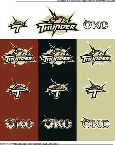
by bmw42690
funkatron, those logos are pretty cool that you posted. I wish it would have been that. I think having a color scheme with navy/black in it would have been alot better.
Re: THE COLORS ARE UGLY!!!
Posted: Wed Sep 3, 2008 11:09 pm
by Downtown
So if anyone says anything contrary to being thrilled with the OKC team they're closet Sonics fans? I think you're the one who needs to get over it KyleinOK.
As for the cheap name and logo, the sad part is that there have been posters on here that have come up with far superior ones, such as funkatron's, which is 100 times better. And Clay Bennett probably paid some company a six figure contract to come up with the logo.
But with time everyone will get used to it, like the Bobcats did. But I don't see too many people outside Oklahoma ordering the jerseys to wear.
Re: THE COLORS ARE UGLY!!!
Posted: Wed Sep 3, 2008 11:19 pm
by JO_CB_FTW
lol
Re: THE COLORS ARE UGLY!!!
Posted: Wed Sep 3, 2008 11:42 pm
by K-Dawg
It looks like a D-league logo
Re: THE COLORS ARE UGLY!!!
Posted: Wed Sep 3, 2008 11:47 pm
by sh00n
KyleinOK wrote:Get over it closet Sonics fan.
The logo is fine.
We don't need your drama here.
Man I'm a Raptors fan and I think the colors are horrible. It's basically the Nets logo with the Bobcats' colors, too.
Umm. . . let's go Thunder, let's go?
Re: THE COLORS ARE UGLY!!!
Posted: Thu Sep 4, 2008 3:24 am
by cdash
That is tragic. He has been plotting this huge conspiracy against the city of Seattle and this is the fruit of his labor? No originality, nothing remotely redeeming about the logo or the colors, and really it has nothing to do with Oklahoma City. Dont give me this crap about "red and orange being the color of the Oklahoma sunset" either. That's the color of every other sunset on the planet Earth, so give us a new one Clay. Horrible.
Re: THE COLORS ARE UGLY!!!
Posted: Thu Sep 4, 2008 3:58 am
by Nolan
With the right colors that logo could look decent, but they don't have the right colors so its just awful. Whoever designed this logo should definitely not put this on his/her resume.
Re: THE COLORS ARE UGLY!!!
Posted: Thu Sep 4, 2008 3:59 am
by KyleinOK
Downtown wrote:So if anyone says anything contrary to being thrilled with the OKC team they're closet Sonics fans? I think you're the one who needs to get over it KyleinOK.
As for the cheap name and logo, the sad part is that there have been posters on here that have come up with far superior ones, such as funkatron's, which is 100 times better. And Clay Bennett probably paid some company a six figure contract to come up with the logo.
But with time everyone will get used to it, like the Bobcats did. But I don't see too many people outside Oklahoma ordering the jerseys to wear.
Nope.
It's just clear there are already a ton of babies like yourself who wouldn't have been happy with anything.
Get it?
Re: THE COLORS ARE UGLY!!!
Posted: Thu Sep 4, 2008 5:45 am
by big L
Give me a break, this logo is just terrible! I can't believe this is what they came up with. It looks like a new flavor of corn chips or something. KyleinOK, can you come up with a real position here as to why you're happy with the logo? I mean, "it's just fine" and "you guys are babies" isn't much of a position. Can you tell us what you like about it without resorting to simply telling us that we wouldn't be happy with anything?