Orlando Magic's Re-Design

Moderators: bisme37, Dirk, KingDavid, cupcakesnake, bwgood77, zimpy27, infinite11285, Domejandro, ken6199

User avatar
VFX
RealGM
Posts: 18,024
And1: 15,880
Joined: May 30, 2016

Re: Orlando Magic's Re-Branding 

Post#21 » by VFX » Tue Jun 3, 2025 2:56 pm

Mamba Mentality wrote:don't mind the jerseys, but that primary logo is in the running for worst in the league


Thunder, Pelicans, and Clippers exist.
Duke4life831
Forum Mod
Forum Mod
Posts: 36,143
And1: 66,746
Joined: Jun 16, 2015
 

Re: Orlando Magic's Re-Branding 

Post#22 » by Duke4life831 » Tue Jun 3, 2025 2:58 pm

SOUL wrote:
Duke4life831 wrote:I don’t like the jersey without the pinstripes on the top half. Outside of that, this is one of the better “new look” that a team has come out with in awhile. I like the logo and court


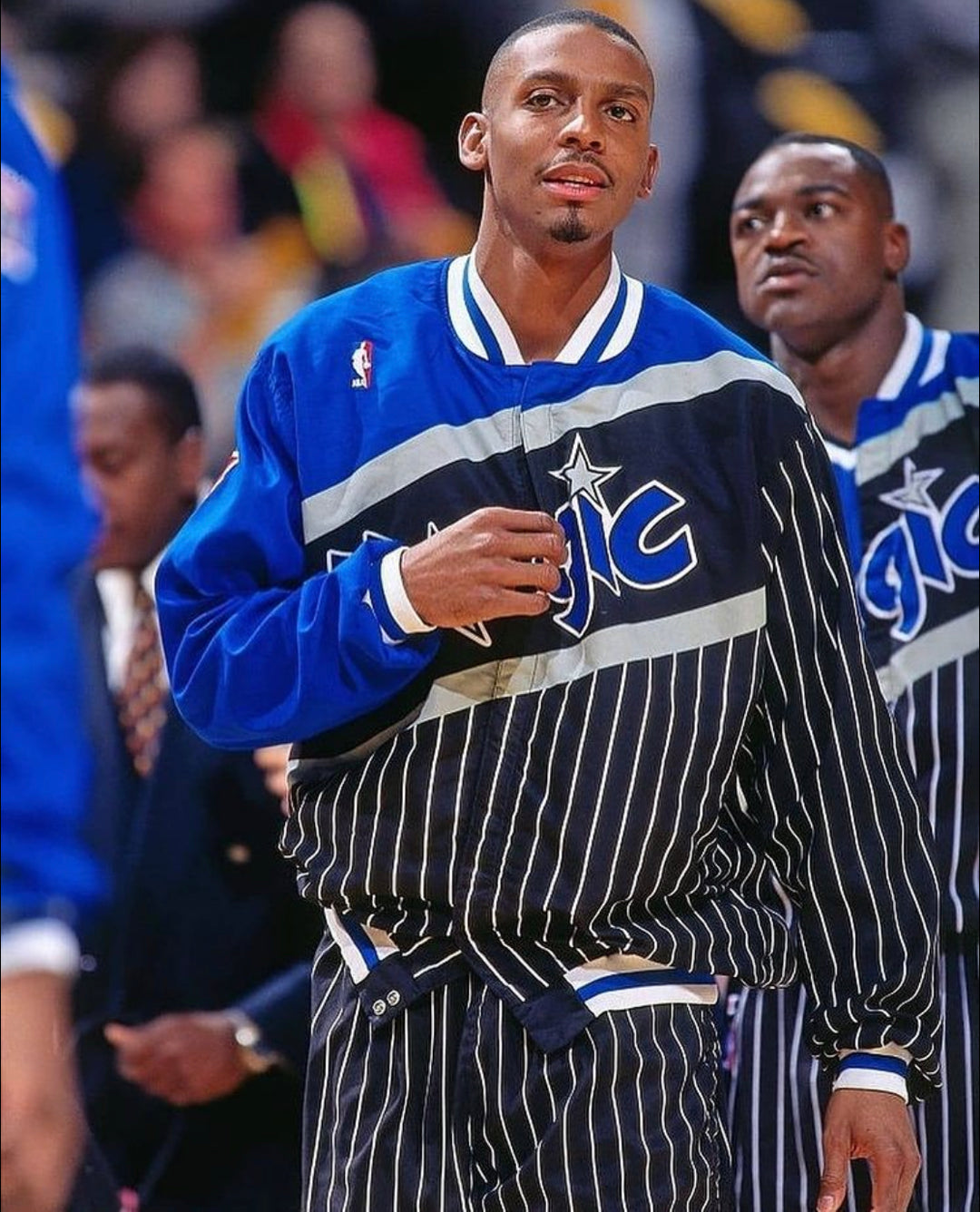
I gotta get used to it. I kinda like it though, it's an ode to their pinstripe warmup jerseys in the 90s.


Ya it’s the only part that I have to warm up to. With that said, I can easily see myself warming up to it pretty quick.

I think overall this is a perfect blend of recognizable branding, with a little new twist to it.
AFM
RealGM
Posts: 11,900
And1: 8,121
Joined: May 25, 2012
   

Re: Orlando Magic's Re-Branding 

Post#23 » by AFM » Tue Jun 3, 2025 3:00 pm

Looks great IMO
Saints14
Assistant Coach
Posts: 4,208
And1: 5,962
Joined: Jul 19, 2013
 

Re: Orlando Magic's Re-Branding 

Post#24 » by Saints14 » Tue Jun 3, 2025 3:02 pm

sp6r=underrated wrote:In the Silver era, teams change branding regularly to increase short-term revenue even if it comes at the cost of reducing long-term brand recognition. Teams wear four jerseys a year and the concept of home away jerseys is gone.

As a result, I no longer care about branding changes unless they are wholesale changes which is rare and not the case here. The Magic will ditch this design fairly soon even if it is very popular with fans.


Generally agree with this, but I do think it’s appropriate for teams to do a jersey redesign when they’re trying to turn over a new leaf or enter a new era. Think that applies to the Magic who should compete for home court advantage next year with their young core.

I like the jerseys, but I don’t love the new logo. The magic ball was cool and the “circular button with team name in generic font on the outside” feels very outdated, that was the trend in the 2010s and teams have moved on from it
jkvonny
Head Coach
Posts: 7,275
And1: 7,137
Joined: Jun 04, 2021
       

Re: Orlando Magic's Re-Branding 

Post#25 » by jkvonny » Tue Jun 3, 2025 3:04 pm

I like them!

Thats the old school '90s look.
Magic Shaq/Penny days.
The Real Dalic
RealGM
Posts: 17,714
And1: 7,591
Joined: Nov 22, 2009
Location: Orlando, FL
         

Re: Orlando Magic's Re-Branding 

Post#26 » by The Real Dalic » Tue Jun 3, 2025 3:07 pm

sp6r=underrated wrote:In the Silver era, teams change branding regularly to increase short-term revenue even if it comes at the cost of reducing long-term brand recognition. Teams wear four jerseys a year and the concept of home away jerseys is gone.

As a result, I no longer care about branding changes unless they are wholesale changes which is rare and not the case here. The Magic will ditch this design fairly soon even if it is very popular with fans.

We've had the same logo and floors and jerseys with only subtle changes since 2007. So I'm pretty sure this new look will stay for at least a decade. The Magic don't really change much very often.
God. Family. Country. Basketball.
User avatar
Effigy
RealGM
Posts: 14,427
And1: 13,506
Joined: Nov 27, 2001
     

Re: Orlando Magic's Re-Branding 

Post#27 » by Effigy » Tue Jun 3, 2025 3:09 pm

Yeah, these don't do anything for me. Just go back to the 90's jersey that Shaq and Penny wore. No need to fix what ain't broken.
The Real Dalic
RealGM
Posts: 17,714
And1: 7,591
Joined: Nov 22, 2009
Location: Orlando, FL
         

Re: Orlando Magic's Re-Branding 

Post#28 » by The Real Dalic » Tue Jun 3, 2025 3:11 pm

ropjhk wrote:It's not a rebrand, it's a redesign.

I don't mind the redesign. It's not bad. Gives a refreshed look without abandoning the core design elements.

You're right! Changed the title to better reflect that!
God. Family. Country. Basketball.
User avatar
FreeBird23
Pro Prospect
Posts: 844
And1: 2,394
Joined: Dec 29, 2021

Re: Orlando Magic's Re-Design 

Post#29 » by FreeBird23 » Tue Jun 3, 2025 3:15 pm

Love it
User avatar
SkyBill40
Head Coach
Posts: 7,352
And1: 6,084
Joined: Oct 24, 2014
Location: Phoenix
       

Re: Orlando Magic's Re-Design 

Post#30 » by SkyBill40 » Tue Jun 3, 2025 3:32 pm

Not a fan of the cross body stripe look, but the other two are a good callback for the franchise.
SweaterBae wrote:It's the perfect trade when nobody is happy.
3ddman23
RealGM
Posts: 10,341
And1: 3,196
Joined: Jul 02, 2013
Location: orlando
   

Re: Orlando Magic's Re-Branding 

Post#31 » by 3ddman23 » Tue Jun 3, 2025 3:34 pm

sp6r=underrated wrote:In the Silver era, teams change branding regularly to increase short-term revenue even if it comes at the cost of reducing long-term brand recognition. Teams wear four jerseys a year and the concept of home away jerseys is gone.

As a result, I no longer care about branding changes unless they are wholesale changes which is rare and not the case here. The Magic will ditch this design fairly soon even if it is very popular with fans.


Tha magic hasn't had a true rebrand since the 07-08 season (they had very minor tweaks to the jersey but it's been essentially the same for nearly 17 seasons) when they went back to the pinstripe from those awful solid blue & white jersey with the star at the collar, that everyone hated.

They had one of the longest running jersey essentially in the NBA( look at our jersey from the finals run in 09, almost the same to our Jersey from last season in 2025).

Although these aren't super innovative, almost everyone one loves the classic 90s magic jerseys and these are pretty damn close to that, aside from the font.

Tons of og magic fans always loved the star for the A in magic & Orlando, and hated when they took it away again for those awful 04-07 jerseys they had.

I'm not the biggest fan of the font & the new logos ( I think the shooting star basketball was one of the better NBA logos) but it's really cool to have something close to those classic 90s magic jerseys that we all love so much.
GO MAGIC
User avatar
Wonka
General Manager
Posts: 9,139
And1: 5,937
Joined: Aug 19, 2012
 

Re: Orlando Magic's Re-Design 

Post#32 » by Wonka » Tue Jun 3, 2025 3:35 pm

The black one with the random patch of blue up top is absolutely atrocious but I don’t mind the other two at all.
DirtybirdGA
Lead Assistant
Posts: 5,460
And1: 1,989
Joined: Mar 28, 2005
Location: Augusta
   

Re: Orlando Magic's Re-Design 

Post#33 » by DirtybirdGA » Tue Jun 3, 2025 3:37 pm

Alternate feels weird, but it's a nod to the warm-ups. I wish teams could use their own warm ups again instead of a league cookie-cutter brand.
Where the offseason has more buzz happens.
User avatar
SOUL
Retired Mod
Retired Mod
Posts: 58,501
And1: 40,495
Joined: Dec 11, 2006
Location: █████████████
     

Re: Orlando Magic's Re-Design 

Post#34 » by SOUL » Tue Jun 3, 2025 3:46 pm

Image

Image

These are the least popular right now but I think they're gonna grow on people. It's a bit busy but I love the reference. Yeah all black would be cool I'm sure there will be but I think it's fun.

The blue ones I wish had bigger font.
www.rareslums.com // please support my writing!
User avatar
Raps in 4
RealGM
Posts: 65,786
And1: 60,414
Joined: Nov 01, 2008
Location: Toronto
 

Re: Orlando Magic's Re-Design 

Post#35 » by Raps in 4 » Tue Jun 3, 2025 3:51 pm

The Jerseys look good, but that logo is just a copy and paste of the Raptors logo, which itself was copied from the Nets.
Broadcaster
Junior
Posts: 336
And1: 450
Joined: Jun 11, 2019

Re: Orlando Magic's Re-Design 

Post#36 » by Broadcaster » Tue Jun 3, 2025 3:55 pm

I like it. I do think designers try too had to be unique (original font would have been nice) but I think it’s a win. The font of Orlando looks a little small on the blue one though.
Statlanta
RealGM
Posts: 13,799
And1: 10,451
Joined: Mar 06, 2016

Re: Orlando Magic's Re-Branding 

Post#37 » by Statlanta » Tue Jun 3, 2025 4:15 pm

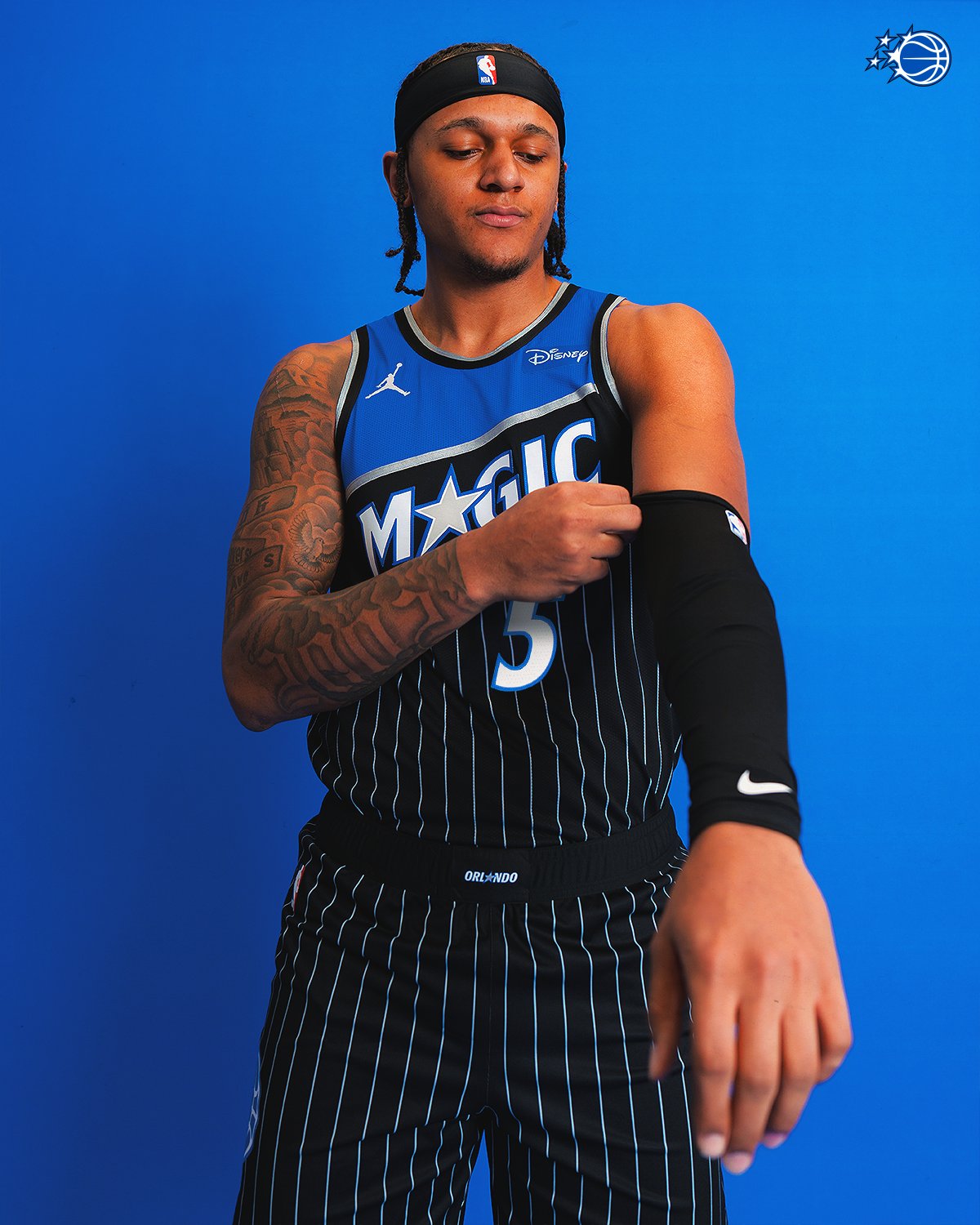
AbeVigodaLive wrote:I'm cool with the star/A treatment.

Two negatives:

1. Apparently, I'm one of the few non-fans of the pinstripes.
2. Court design needs more sponsors! Only two healthcare options? C'mon Orlando!


It's Central Florida we're only old people(healthcare) and theme parks(jersey sponsor)
Modern NBA footwork

GREY wrote: He steps back into another time zone
Statlanta
RealGM
Posts: 13,799
And1: 10,451
Joined: Mar 06, 2016

Re: Orlando Magic's Re-Design 

Post#38 » by Statlanta » Tue Jun 3, 2025 4:19 pm

The alt jersey is just terrible. It doesn't upgrade the old design of the jackets too well. Might as well wear the old jerseys or use the old throwback jackets than wear a poor imitation of the old jackets.

Everything else is mid to ok.
Modern NBA footwork

GREY wrote: He steps back into another time zone
User avatar
NyKnicks1714
RealGM
Posts: 26,030
And1: 27,956
Joined: Nov 20, 2001
   

Re: Orlando Magic's Re-Design 

Post#39 » by NyKnicks1714 » Tue Jun 3, 2025 4:23 pm

Looks amateurish to me. Like something someone in a high school graphic design class would come up with.
User avatar
UcanUwill
RealGM
Posts: 31,756
And1: 34,788
Joined: Aug 07, 2011
 

Re: Orlando Magic's Re-Design 

Post#40 » by UcanUwill » Tue Jun 3, 2025 4:24 pm

Jerseys look great, but...

RANT BEGINS

Logo is the same garbage as all these circular logos now. I get that it is app generation and they design logos so they would just look ok as app icon, but man, the talent and creativity in logo design is lost. I can photoshop, I could make that logo, and I do not have talent, I shouldn't be able to make NBA team logo. Just so terrible, yeah its a basketball in a circle againt, I haven't seen that before... Some designer probably got 50k for doing that s***, I could legit have done it if you said you want crap like this. I made some logos for people playing buzzerbeater.com, and maybe not all my logos were good, I am not saying I am pro graphic designer, but I always tried to make something at least interesting, not a basketball in a circle.

Return to The General Board