Ballerhogger wrote:RiotPunch wrote:Spoiler:
but there so SHINY!

Material looks like the bed sheets that you buy because they look nice, only to have them slip off onto the floor as soon as you fall asleep.
Moderators: Clav, Domejandro, ken6199, bisme37, Dirk, KingDavid, cupcakesnake, bwgood77, zimpy27, infinite11285


Ballerhogger wrote:RiotPunch wrote:Spoiler:
but there so SHINY!

SNPA wrote:Potential_64 wrote:SNPA wrote:It’s a cheesy cartoon dinosaur on the chest of grown men. What am I missing? It’s intended for children, literally looks like a design that came from a school kid’s lunch box. It’s a prepubescent image. It’s at the far end of terrible uniforms.
Or maybe you just have no taste? Do you prefer the sterilized boring "modern" look like LAC after Ballmer bought them. They had an opportunity to come up with a great new design with a giant cartoony boat. Instead they have the worst sports logo ever invented, just absolutely dead and boring with no aesthetic sense whatsoever
Yes, a purple cartoon dinosaur is the peak of high taste.


SDANNIE wrote:Loving some of these older jerseys. Thunder don't have much history to pick from but I am happy the sunset orange will be retired next year.


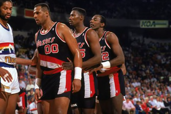
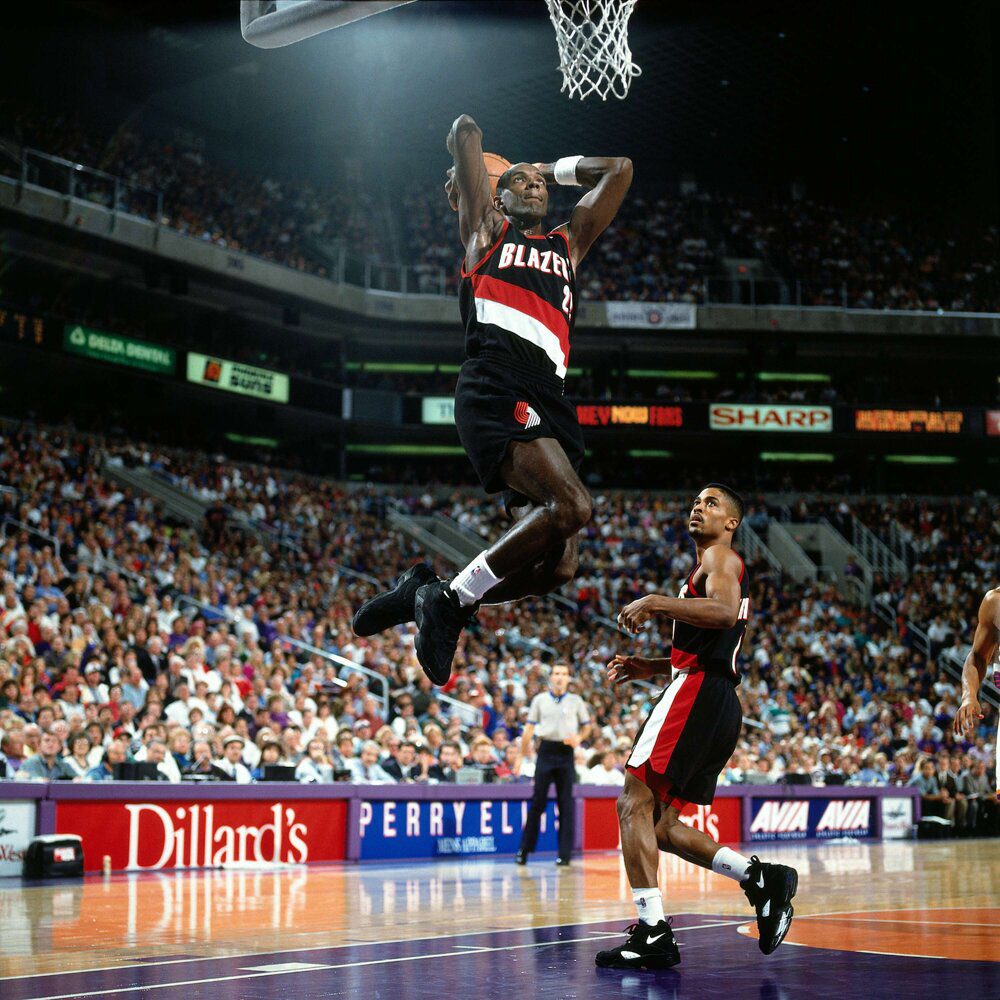
Red Robot wrote:Portland's jerseys have barely changed for decades and everything since they adopted the diagonal stripes looks good. I'd give a slight edge to the 80s version, modeled here by Drexler. It's clean, the colors are nice, and it the font and logo both look good.
:format(jpeg)/cdn.vox-cdn.com/uploads/chorus_image/image/50320843/usa-today-9233304.0.jpg)


Castle Black wrote:
JimmyPlopper wrote:Childs wrote:
Not a fan of cammo style sports uniforms. Ugly and tacky.


HomoSapien wrote:The Bulls current jersey is just classic, so I'm glad they're not messing around with it. I also really like these as an alternative:
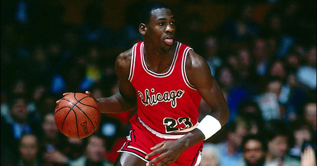
They've tried busting them back a few times, but the old ones used a darker cherry red that made the jerseys pop more.