twozeroMM wrote:Thanks guys. There's potential with these and the colors.
Also, to give a little background on the Jazz rebrand. They went with a branding agency called STUDIO DUMBAR/DEPT, which isn't very common with a lot of teams. They created an entire identity system that go along with these new jerseys. Dropping some of it below. ]
I cant believe this is what a branding agency came up with. Its so bland. Why are logos and jerseys becoming so boring and bland? Remember the 90's when logos and jerseys were fun and creative?
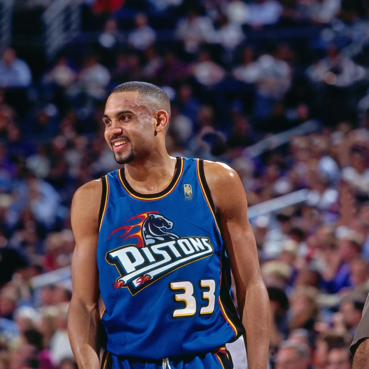
frankly the pistons make zero sense. motor city and they used a stallion?????
It's a horse... for horsepower... motor city... Boss Hoss!
Btw, if you put all the images in a post you're quoting within spoiler tags (see below), it will make the chain easier to scroll through.
- put [*spoiler] without the * before the post or images you're quoting. - and put a [/*spoiler] without the * after the post or images.
Freighttrain wrote:Now they only need new players and a coach and they're set
It's like shining up a turk when you can't even figure out the team that has two players with all-star potential. One is a future hall of fame and the other will note than likely be too.
But, yes, another season of new players are a necessity.
Not sure what shining up a turk means, but Utah is hard-capped in terms of talent and they will never sniff the finals as they are currently constructed.
PlatinumState wrote: I cant believe this is what a branding agency came up with. Its so bland. Why are logos and jerseys becoming so boring and bland? Remember the 90's when logos and jerseys were fun and creative?
frankly the pistons make zero sense. motor city and they used a stallion?????
It's a horse... for horsepower... motor city... Boss Hoss!
Btw, if you put all the images in a post you're quoting within spoiler tags (see below), it will make the chain easier to scroll through.
- put [*spoiler] without the * before the post or images you're quoting. - and put a [/*spoiler] without the * after the post or images.
oh, okay,,,i have to connect the dots when i look at a logo. that's kinda too much work LOL
btw. i know with the extra images and all. i was too lazy to siphon everything but the jazz logo
I assumed the black and yellow was just due to Utah being "the Beehive State". Trying to make the identity more "Utah" since "Jazz" doesn't fit the state at all. The whole Spotlight concept is quite a stretch
Charlesareed wrote:They should’ve just used the jerseys and color scheme from the Stockton Malone era makes more since and they were the best jazz uniforms ever
Seriously. Look at what beautiful cocepts people can come up with, and they had to hire a effing branding agency for those abominations
JB2 wrote:The purple mountain jersey was/is fire. So was the white. And the desert-scape. Why change a good thing? D-Wade and his fashion sense?
Nothing screams "Jazz" better than a purple mountain.
Nothing screams "Jazz" like the state of Utah.
They moved from New Orleans over forty years ago. They need to change their name to the Utah Temperance. Their jersey design can be a man and his 4 wives shrugging with a slew of empty alcohol bottles at their feet.
Whoa, between you and the polygamy guy, hot damn, these takes are just completely original and fresh. Why haven't you two comedic geniuses joined forces for the betterment of humanity?
mtcan wrote:Nothing screams "Jazz" better than a purple mountain.
Nothing screams "Jazz" like the state of Utah.
They moved from New Orleans over forty years ago. They need to change their name to the Utah Temperance. Their jersey design can be a man and his 4 wives shrugging with a slew of empty alcohol bottles at their feet.
Whoa, between you and the polygamy guy, hot damn, these takes are just completely original and fresh. Why haven't you two comedic geniuses joined forces for the betterment of humanity?
We've actually been a comedy team for quite some time. Our name is "Thirteen and Pregnant" and we tell a steady stream of Karl Malone and Utah Jazz jokes.
twozeroMM wrote:Thanks guys. There's potential with these and the colors.
Also, to give a little background on the Jazz rebrand. They went with a branding agency called STUDIO DUMBAR/DEPT, which isn't very common with a lot of teams. They created an entire identity system that go along with these new jerseys. Dropping some of it below. ]
I cant believe this is what a branding agency came up with. Its so bland. Why are logos and jerseys becoming so boring and bland? Remember the 90's when logos and jerseys were fun and creative?
Some people have convinced "everyone" that simple is better
They moved from New Orleans over forty years ago. They need to change their name to the Utah Temperance. Their jersey design can be a man and his 4 wives shrugging with a slew of empty alcohol bottles at their feet.
Whoa, between you and the polygamy guy, hot damn, these takes are just completely original and fresh. Why haven't you two comedic geniuses joined forces for the betterment of humanity?
We've actually been a comedy team for quite some time. Our name is "Thirteen and Pregnant" and we tell a steady stream of Karl Malone and Utah Jazz jokes.
Nate505 wrote:Whoa, between you and the polygamy guy, hot damn, these takes are just completely original and fresh. Why haven't you two comedic geniuses joined forces for the betterment of humanity?
We've actually been a comedy team for quite some time. Our name is "Thirteen and Pregnant" and we tell a steady stream of Karl Malone and Utah Jazz jokes.