Logo looks like put all the branding buzzwords into an AI generator:
"generic modern anonymous minimal sleek basketball logo"
Nothing about it has character. That can't be the primary
Orlando Magic's Re-Design
Moderators: Clav, Domejandro, ken6199, bisme37, Dirk, KingDavid, cupcakesnake, bwgood77, zimpy27, infinite11285
Re: Orlando Magic's Re-Design
-
SWedd523

- RealGM
- Posts: 13,499
- And1: 6,461
- Joined: Jul 07, 2009
-


Re: Orlando Magic's Re-Design
-
GiggitySmalls
- Starter
- Posts: 2,496
- And1: 1,352
- Joined: Mar 21, 2017
-


Re: Orlando Magic's Re-Design
Definitely like it! I hope Banchero and Wagner have healthy seasons. If they can find pieces around those 2 they can be a serious threat in the east.
Sent from my SM-S936U using RealGM mobile app
Sent from my SM-S936U using RealGM mobile app
Re: Orlando Magic's Re-Design
-
Repeat 3-peat

- RealGM
- Posts: 14,915
- And1: 15,434
- Joined: Nov 02, 2013
-

Re: Orlando Magic's Re-Design
Another NBA re-brand? another round logo.
Jerseys look good though
3rd jersey is a copy of the Magic track suits of the 90's.

Jerseys look good though
3rd jersey is a copy of the Magic track suits of the 90's.

Re: Orlando Magic's Re-Design
-
JayMKE

- RealGM
- Posts: 29,351
- And1: 17,200
- Joined: Jun 21, 2010
- Location: LA
-


Re: Orlando Magic's Re-Design
Jersey is fire, logo is definitely a downgrade tho being a ball logo with text around it.
FREE GIANNIS
Re: Orlando Magic's Re-Design
-
Diop
- Forum Mod - Hornets

- Posts: 40,468
- And1: 20,825
- Joined: Jul 24, 2004
- Location: Diop Dead Ugly
-

Re: Orlando Magic's Re-Design
-
doogie_hauser
- Head Coach
- Posts: 6,055
- And1: 7,211
- Joined: Feb 04, 2024
-


Re: Orlando Magic's Re-Design
Awful. Looks like the true kit of a plastic/artificial franchise
Re: Orlando Magic's Re-Design
-
Mk0

- RealGM
- Posts: 26,370
- And1: 21,320
- Joined: Jul 02, 2010
-

Re: Orlando Magic's Re-Design
Abracadabra, razzamatazz
Slam dunk sesame
Hocus pocus, alakazam
Gonna set the spirit free
Orlando Mogic
Orlando Mogic
Orlando Mogic, wooahhh
Orlando Mogic (Orlando Mogic)
Orlando Mogic (Orlando Mogic)
Orlando Mogic
Watch out, beware
Gonna get ya!
Slam dunk sesame
Hocus pocus, alakazam
Gonna set the spirit free
Orlando Mogic
Orlando Mogic
Orlando Mogic, wooahhh
Orlando Mogic (Orlando Mogic)
Orlando Mogic (Orlando Mogic)
Orlando Mogic
Watch out, beware
Gonna get ya!
I AM A BUSINESS MAN NOW
Re: Orlando Magic's Re-Design
-
BigGargamel
- Lead Assistant
- Posts: 5,229
- And1: 10,950
- Joined: Jan 28, 2020
- Contact:
-


Re: Orlando Magic's Re-Design
Not a fan of the logo but the star and pinstripes are iconic. Never should have ditched them in the first place.
Re: Orlando Magic's Re-Design
-
Bloodbather

- Pro Prospect
- Posts: 859
- And1: 1,661
- Joined: Dec 23, 2023
-

Re: Orlando Magic's Re-Design
All the new logos seemingly apply the same design approach nowadays and that annoys me. It's always that round shape with the black outer circle with the samey looking fonts. Looks so similar to the Raptors and Nets logos.
Re: Orlando Magic's Re-Design
-
PlatinumState

- Veteran
- Posts: 2,741
- And1: 3,212
- Joined: Jul 26, 2016
-


Re: Orlando Magic's Re-Design
I cant believe design companies literally get paid millions to come up with new team branding.
Re: Orlando Magic's Re-Design
-
irfunk_
- Freshman
- Posts: 95
- And1: 67
- Joined: Apr 28, 2018
-

Re: Orlando Magic's Re-Design
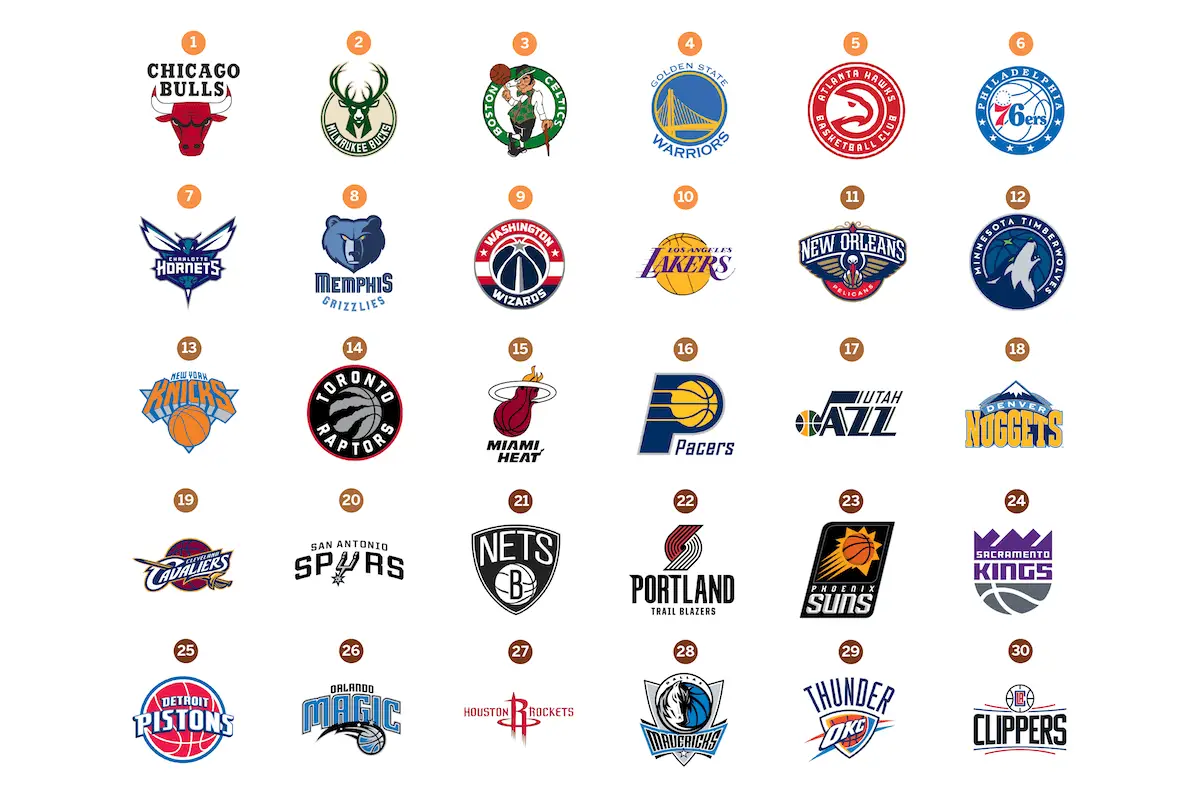
So the new Magic logo just joined the same thing different color group of Wizards, 76ers, Hawks, Raptors, Twolwes, GSW, Pistons.
Spoiler:
Re: Orlando Magic's Re-Design
-
ORLMagicGirl15
- RealGM
- Posts: 14,099
- And1: 5,759
- Joined: Aug 03, 2010
-

Re: Orlando Magic's Re-Design
Bloodbather wrote:All the new logos seemingly apply the same design approach nowadays and that annoys me. It's always that round shape with the black outer circle with the samey looking fonts. Looks so similar to the Raptors and Nets logos.
It appears that the league is requiring that circular global logo so the other franchises will do something like that as well at some point.
For God so loved the world that He gave His only begotten Son, that whoever believes in Him should not perish but have everlasting life.-John 3:16
Go Magic, Go Dwight, Go Vuc, Go Paolo, Go Keegan
Go Magic, Go Dwight, Go Vuc, Go Paolo, Go Keegan
Re: Orlando Magic's Re-Design
-
QPR
- Analyst
- Posts: 3,181
- And1: 4,354
- Joined: Mar 02, 2011
Re: Orlando Magic's Re-Design
The 3rd jersey looks like one of those ones you get from Kmart because your parents couldn't afford an authentic jersey
Re: Orlando Magic's Re-Design
-
willywazza
- Bench Warmer
- Posts: 1,312
- And1: 435
- Joined: May 17, 2013
Re: Orlando Magic's Re-Design
-
AddiFB
- Veteran
- Posts: 2,996
- And1: 2,726
- Joined: Jul 31, 2009
- Location: Iceland
-
Re: Orlando Magic's Re-Design
ORLMagicGirl15 wrote:Bloodbather wrote:All the new logos seemingly apply the same design approach nowadays and that annoys me. It's always that round shape with the black outer circle with the samey looking fonts. Looks so similar to the Raptors and Nets logos.
It appears that the league is requiring that circular global logo so the other franchises will do something like that as well at some point.
It seems to be the case. Franchises that want to rebrand will seemingly have to join the circle logo geoup.
- Orlando Magic fan since 1991 -
Re: Orlando Magic's Re-Design
-
The Servant
- Rookie
- Posts: 1,217
- And1: 1,463
- Joined: Dec 26, 2022
-


Re: Orlando Magic's Re-Design
I like them. Well done Orlando! Good job on the rebuild and good job on the rebrand. Time to shake that losing stink off the franchise and get rolling, the East is wide open gents.
Re: Orlando Magic's Re-Design
-
Im Coming Home

- RealGM
- Posts: 27,512
- And1: 20,202
- Joined: Dec 08, 2009
- Location: The Island
-


Re: Orlando Magic's Re-Design
I don't like the half black/blue jersey, the OG Black is probably top 5 best jerseys for me, and they ruined it.
Everything else is fantastic!
Everything else is fantastic!
RGM Knicks BAF- Houston Rockets

PG: Cunningham | Small | Ja. Butler
SG: Au. Thompson | Ja. Butler |
SF: B.Ingram | Bullock | LaRavia
PF: Porter Jr. | GG Jackson | Love
C: Jackson Jr. | Eubanks
PG: Cunningham | Small | Ja. Butler
SG: Au. Thompson | Ja. Butler |
SF: B.Ingram | Bullock | LaRavia
PF: Porter Jr. | GG Jackson | Love
C: Jackson Jr. | Eubanks
Re: Orlando Magic's Re-Design
-
The Real Dalic
- RealGM
- Posts: 17,738
- And1: 7,630
- Joined: Nov 22, 2009
- Location: Orlando, FL
-


Re: Orlando Magic's Re-Design
Just to clear one thing up, the logo with the words and the black border is not the primary logo. It's the one that will be on the court most of the time. But this one is actually the primary logo.
God. Family. Country. Basketball.
Re: Orlando Magic's Re-Design
-
Im Coming Home
- RealGM
- Posts: 27,512
- And1: 20,202
- Joined: Dec 08, 2009
- Location: The Island
-
Re: Orlando Magic's Re-Design
The Real Dalic wrote:Just to clear one thing up, the logo with the words and the black border is not the primary logo. It's the one that will be on the court most of the time. But this one is actually the primary logo.
I prefer the "Global Logo" as the primary tbh..
RGM Knicks BAF- Houston Rockets
PG: Cunningham | Small | Ja. Butler
SG: Au. Thompson | Ja. Butler |
SF: B.Ingram | Bullock | LaRavia
PF: Porter Jr. | GG Jackson | Love
C: Jackson Jr. | Eubanks
PG: Cunningham | Small | Ja. Butler
SG: Au. Thompson | Ja. Butler |
SF: B.Ingram | Bullock | LaRavia
PF: Porter Jr. | GG Jackson | Love
C: Jackson Jr. | Eubanks