Spoiler:
to this :
Spoiler:
WTF happened there? I know old horse logo maybe was a bit overdesigned, you can tweak exhaust flames and other things, but the idea was good, logo was epic. But they went with something that any of us with basic PS skill could honestly make? I was baffled at a time, because it was still 2000s, a time when overdesigned logos was a thing, you were required talent to make a logo, personally I love that 90s 2000s style, but we will come back to that.
But it was just a beginning and in late 2010s they started the crappiest trend possible, no designer required rebrands. I dont know if they were aiming for mobile app look or what, but they confused simplicity with talentless crap. The worst that came from that were definitely The Raptors and The Nets logo. We got used to it by now, but seriously - look at it. I will not call it big downgrades, cause it is not like Toronto Barney or whatever Nets had were great, but come on.
Nets logo is seriously the worst, seriously, anyone could make that logo, no talent required there. Now, I might talk out of my a--, but I seriously think my home made BC Twente logo, which I have on my avatar, is better than these logos. It is also simple, but at least I put some effort for it to look good. If you ever wondered what is that logo in my avatar, it is not a real team, it is a logo for my buzzerbeater.com manager game team, and an homage to FC Twente football team.
How did they even made Nets logo? There were rumors that JayZ himself made it, i believe that...
Another downgrade I absolutely hate, it is probably not a rebrand per se, it is simply jersey tweak, but man, Lakers had these :
Spoiler:
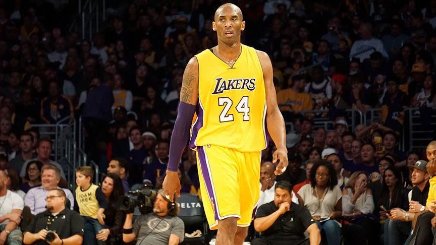

and now they have these ;
Spoiler:


It is such a downgrade to me, Lakers unis were my favorites in the entire league easily, now its garbage, same I would say about CAVS, but honestly lots of teams transitioned to terrible unis, cant list them all, but named Lakers, cause it is one of those teams that would never do complere rebrand like changing the colors, cause it is so iconic at this point, but their TWEAKS are garbage, it was so pointless, just go back to Kobe Odom era unis, please.
But what about upgrades? I bet most of you will say Golden state Warriors had the best rebrand, Personally I disagree, but I get that I am in minority, I get that old Warriors logo and colors sucked, but I still liked it. I like that stupid silver surfer throwing a lightning logo, it needed some change for sure, but I thought it was cool. As I said, I love those late 90s, early 2000 overdesign styles, it is just my thing. Where, I never liked modern classic look, I understand the appeal, but I dont like it personally. But after Raptors, Nets rebrands, I see how that classic style is gold in comparison.