all logos:
http://grantland.com/the-triangle/the-definitive-nba-logo-rankings/
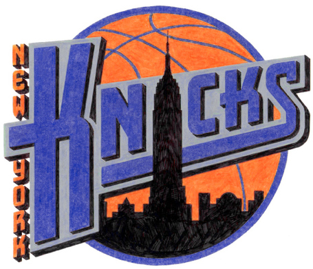
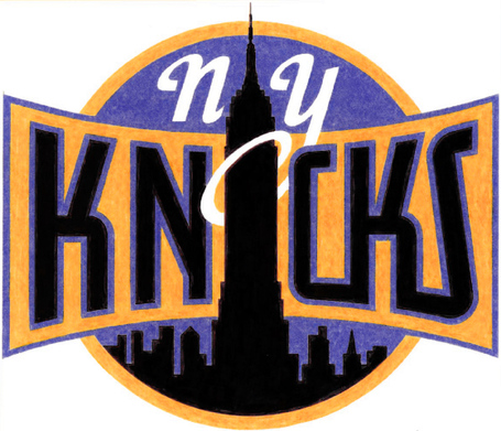
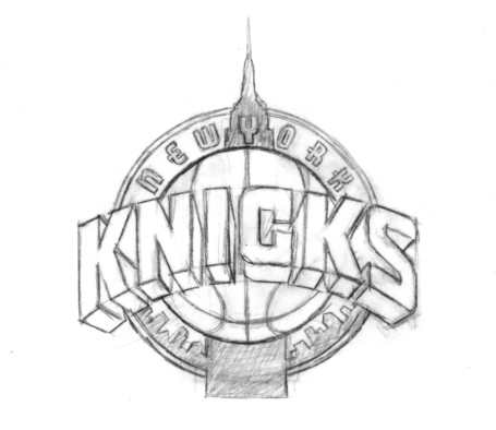
26. NEW YORK KNICKS
"New York is the greatest city in the world, and there is nothing New York about this logo. There are only vague allusions. The giant block letters, leaning a few degrees backward, are meant to mimic skyscrapers as seen from below. The triangular shield is a nod to the emblems Gotham superheroes wear upon their chests.
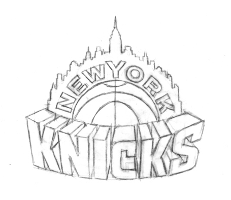
Whatever. You could transfer the same combination of triangle, basketball, and font to any team.The logo wasn’t supposed to be this bland. The league hired Michael Doret, a noted lettering expert, to craft a majestic mark centered on the Empire State Building. Doret integrated the building seamlessly, so that it didn’t subsume the other elements of the logo. The sketches screamed New York without screaming.
The Knicks retreated into mediocrity, in part because they ran into issues acquiring the rights to the building’s image. A team stealing money from the city via a massive tax break on Madison Square Garden should pay, within reason, for a logo that reflects its grandiose place in the NBA universe.
“It was so close to being perfect,” O’Grady says.
“It’s just boring,” Fox says. “And Doret’s work is never boring. If it is, that means something terrible has happened.”
At least Doret’s subway token mark, with a stylized”NYK,” lives on as a secondary logo. That thing rocks."


Zach Lowe thinks knicks logo is sh*t
Moderators: Deeeez Knicks, mpharris36, j4remi, HerSports85, NoLayupRule, GONYK, Jeff Van Gully, dakomish23
Zach Lowe thinks knicks logo is sh*t
-
BodyCount
- Sixth Man
- Posts: 1,710
- And1: 602
- Joined: Jul 02, 2013
Re: ESPN thinks knicks logo is sh*t
-
GONYK

- Forum Mod - Knicks

- Posts: 66,833
- And1: 45,431
- Joined: Jun 27, 2003
- Location: Brunson Gang
-


Re: ESPN thinks knicks logo is sh*t
They also think our team name is great
5. New York Knickerbockers
What’s about to be revealed: I’m a sucker for names that double as descriptors, in some local dialect, for a group of people from that particular locality or tribe. Naming a sports team after the residents of its city binds players and fans in common cause, a unity of civic pride that seems almost impossible to achieve today with constant player movement and massive salaries that shift players onto a different plane of existence. The “band of brothers” effect of a Knickerbocker-type name is cool, even if we all know it’s false.
It’s true that “Knickerbocker” was originally a term for a pair of pants, rolled up at the ankles, that the 17th-century Dutch settlers of Manhattan apparently liked very much.3 But the term developed into something like an earlier version of “New Yorkers” — a collective term for the residents of what is now the world’s greatest city.
Washington Irving popularized it by using Diedrich Knickerbocker as a nom de plume in his history of the city; a cartoonish “Father Knickerbocker” became a popular character; and a local baseball team adopted the name in the mid-1800s. No NBA team name has a longer, prouder tradition.
The common shorthand, Knicks, works beautifully, and has the nice symmetry of the two K‘s. Problem: It’s hard to derive a mascot from a name that basically means “person from this region”; the Knicks don’t have an in-arena mascot. And what would it be? A Wall Street trader being led to minimum-security prison in handcuffs and a $10,000 suit? A walking yellow cab? An angry subway rider, furious that PEOPLE WON’T STEP INTO THE MIDDLE OF THE FREAKING TRAIN and that some jackass is playing his iPod so loudly the whole car can hear? A life-size rat? A person trying to fit a bed in a closet and yet somehow paying $1,000 per month for the privilege?
Sorry, I lost control for a minute there. The Knicks have a great name!
http://grantland.com/features/the-definitive-guide-nba-team-names-part-2/
Re: ESPN thinks knicks logo is sh*t
-
F N 11

- RealGM
- Posts: 94,866
- And1: 67,599
- Joined: Jun 27, 2006
- Location: Getting over screens with Gusto.
- Contact:
-

Re: ESPN thinks knicks logo is sh*t
-
Juggynaut
- Assistant Coach
- Posts: 3,947
- And1: 2,817
- Joined: Feb 14, 2010
-


Re: ESPN thinks knicks logo is sh*t
I'll probably put the Knicks logo in the middle of the pack, definitely not top tier. I agree that the Knicks have a great name only because the other NBA teams have terrible names.

Re: Zach Lowe thinks knicks logo is sh*t
-
El Poochio

- RealGM
- Posts: 35,219
- And1: 25,092
- Joined: May 19, 2015
- Location: Where The Wild Things Are
-


Re: Zach Lowe thinks knicks logo is sh*t
I didnt read that shİt but I think our name, colours, and our logo have been the best part of our team for some time now

B: Melo | Lonzo
B: J. Green | Donte | B. Hield
B: Herb | K. Oubre | N. Clifford
B: Zion | J. Isaac | D. Jones Jr | A. Toohey
B: KP | G. Yabusele | J. Huff
Re: Zach Lowe thinks knicks logo is sh*t
-
GONYK
- Forum Mod - Knicks
- Posts: 66,833
- And1: 45,431
- Joined: Jun 27, 2003
- Location: Brunson Gang
-
Re: Zach Lowe thinks knicks logo is sh*t
I think Lowe is right if you compare our current logo to the logos we could have had
Re: Zach Lowe thinks knicks logo is sh*t
-
louieOrr

- Sixth Man
- Posts: 1,708
- And1: 474
- Joined: Jun 20, 2010
-


Re: Zach Lowe thinks knicks logo is sh*t
Yep our logo is great. This is the logo dude though we should go with...
/cdn0.vox-cdn.com/uploads/chorus_image/image/16781/knicks_color_comp_a_cropped.jpg)
is this guy serious?
is this guy serious?

Re: Zach Lowe thinks knicks logo is sh*t
-
NYKnicksTAPE

- RealGM
- Posts: 16,889
- And1: 13,426
- Joined: Dec 05, 2014
-

Re: Zach Lowe thinks knicks logo is sh*t
We have the best team name in the NBA. "Knicks" just rolls of the tongue so easily. We also have the best colors and the best arena. I love this team

Re: Zach Lowe thinks knicks logo is sh*t
-
louieOrr
- Sixth Man
- Posts: 1,708
- And1: 474
- Joined: Jun 20, 2010
-
Re: Zach Lowe thinks knicks logo is sh*t
-
kingquan316

- Assistant Coach
- Posts: 4,333
- And1: 2,341
- Joined: Dec 21, 2003
Re: Zach Lowe thinks knicks logo is sh*t
Knicks logo is awesome, it's simple and cool looking on hats and shirts. Similar to how the Laker logo is. I rather wear that than other teams like the Celtics with that corny leprechaun, or that goofy bear in Memphis.
Re: Zach Lowe thinks knicks logo is sh*t
-
GONYK
- Forum Mod - Knicks
- Posts: 66,833
- And1: 45,431
- Joined: Jun 27, 2003
- Location: Brunson Gang
-


Re: Zach Lowe thinks knicks logo is sh*t
-
GONYK
- Forum Mod - Knicks
- Posts: 66,833
- And1: 45,431
- Joined: Jun 27, 2003
- Location: Brunson Gang
-


Re: Zach Lowe thinks knicks logo is sh*t
-
louieOrr
- Sixth Man
- Posts: 1,708
- And1: 474
- Joined: Jun 20, 2010
-

Re: Zach Lowe thinks knicks logo is sh*t
-
kingquan316
- Assistant Coach
- Posts: 4,333
- And1: 2,341
- Joined: Dec 21, 2003
Re: Zach Lowe thinks knicks logo is sh*t
GONYK wrote:
I honestly don't like any of these. I saw them before, and was glad they chose the current one we have. I feel that too much stuff is going on in these logos, and I like the simplicity of the current one.
Re: Zach Lowe thinks knicks logo is sh*t
-
kfig5

- Bench Warmer
- Posts: 1,288
- And1: 67
- Joined: Jan 21, 2004
-
Re: Zach Lowe thinks knicks logo is sh*t
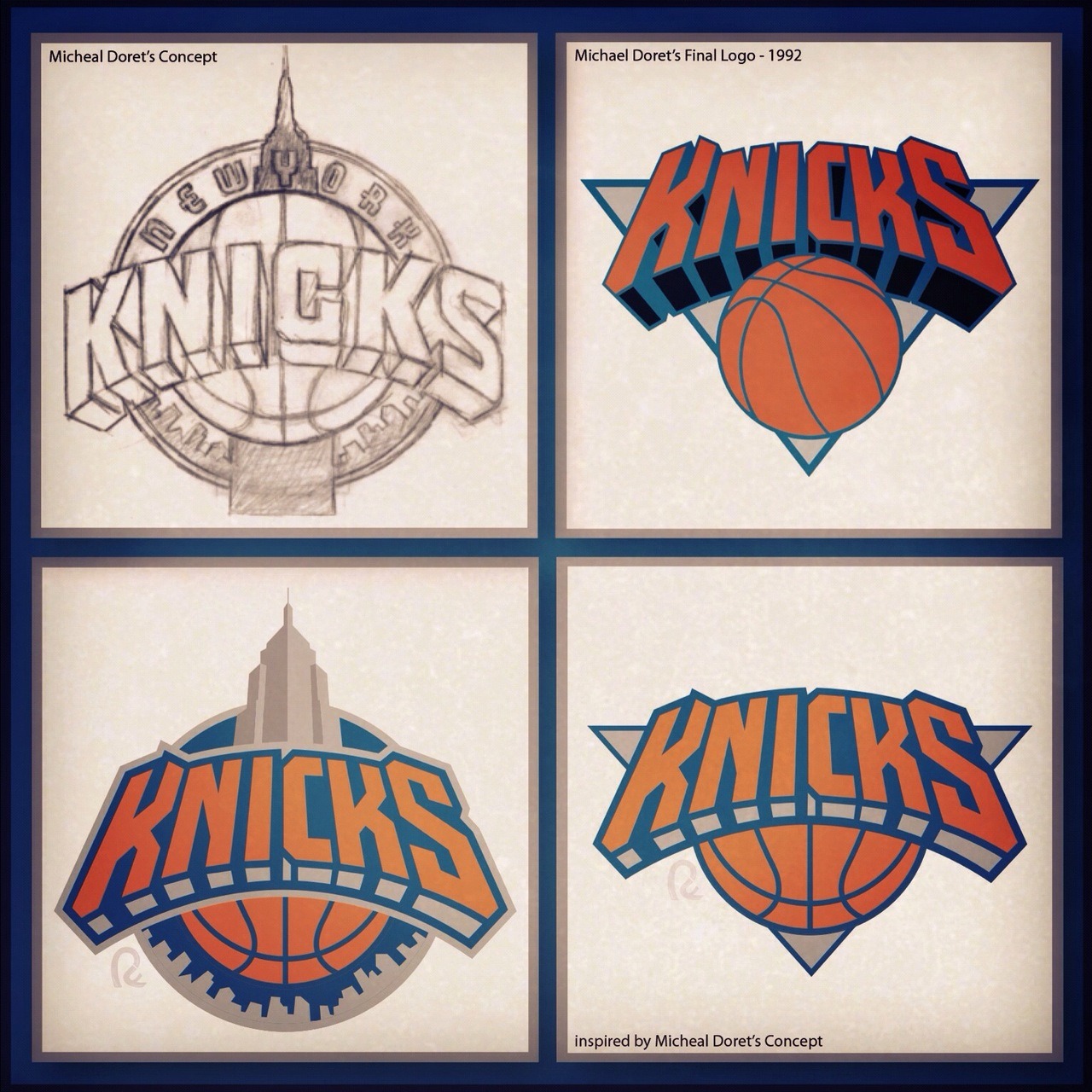
I honestly think they should have used the bottom left logo, and added NEW YORK to the top of the wordmark.

Re: Zach Lowe thinks knicks logo is sh*t
-
Hijinks

- Analyst
- Posts: 3,025
- And1: 1,327
- Joined: Jun 20, 2012
- Location: Germany
-

Re: Zach Lowe thinks knicks logo is sh*t
he isn't wrong, you know!
it isn't really crative and thinking about, what you could do with all the ny possibilites, it is actually quite sad. i dont hate the logo, but i think there are a lot better ones out there. the token logo though, i love.
it isn't really crative and thinking about, what you could do with all the ny possibilites, it is actually quite sad. i dont hate the logo, but i think there are a lot better ones out there. the token logo though, i love.
too many urkels on your team, that's why your wins low
Re: RE: Re: Zach Lowe thinks knicks logo is sh*t
-
GONYK
- Forum Mod - Knicks
- Posts: 66,833
- And1: 45,431
- Joined: Jun 27, 2003
- Location: Brunson Gang
-
Re: RE: Re: Zach Lowe thinks knicks logo is sh*t
kfig5 wrote:[img]http://40.media.tumblr.com/tumblr_mab2p1rp7c1r5by95o1_1280.jpg[/img]
I honestly think they should have used the bottom left logo, and added NEW YORK to the top of the wordmark.
Yea, I really like that lower left one
Sent from my HTC One using Tapatalk
Re: Zach Lowe thinks knicks logo is sh*t
-
Thugger HBC
- Retired Mod

- Posts: 49,679
- And1: 18,760
- Joined: Jan 14, 2011
- Location: Defense+efficient offense=titles...what do you have?
-

Re: Zach Lowe thinks knicks logo is sh*t
He's right, the logo is weak at best and there certainly were other choices that are much, much better. The name is boss though.
I would love to have a logo featuring Penn Station with a subway on it, but I'd settle for the Empire State building in the background.
I would love to have a logo featuring Penn Station with a subway on it, but I'd settle for the Empire State building in the background.
R. I. P. Mamba 8/23/78 - 1/26/20
Gone, but will never be forgotten
Gone, but will never be forgotten
Re: Zach Lowe thinks knicks logo is sh*t
-
N Y K

- RealGM
- Posts: 15,076
- And1: 8,517
- Joined: Jan 18, 2015
-


Re: Zach Lowe thinks knicks logo is sh*t
Our logo is trash.
Bulls logo is damn perfect. Probably the best in all of sports.
Bulls logo is damn perfect. Probably the best in all of sports.
Re: Zach Lowe thinks knicks logo is sh*t
-
Dr. Detfink
- RealGM
- Posts: 18,889
- And1: 4,552
- Joined: Dec 31, 2005
Re: Zach Lowe thinks knicks logo is sh*t
The logo itself is fine, along with the typography. The modern hues are ridiculous. The only time you see brighter colors is usually the gay parade.