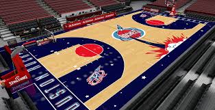
Maybe I am too old, maybe not, I find many NBA courts annoying. Their design pattern and color is such a distraction from watching the game on TV. It is a very unpleasant experience for eyes and I guess some ego ignores or does not undestand natural needs and common sense.
Watching gray Brooklyn court for 2+ hours is a tough deal. Charlotte Hornets beehives, New Orleans pelicans in 3pt area... Put these symbols or strange colors to mid court area and stop downgrading the product.
Also pink Miami jerseys or Jazz red orange jerseys used to be brutal.
Terrible design patterns on NBA courts, jerseys etc
Moderators: Clav, Domejandro, ken6199, bisme37, Dirk, KingDavid, cupcakesnake, bwgood77, zimpy27, infinite11285
Terrible design patterns on NBA courts, jerseys etc
-
jozef
- Sixth Man
- Posts: 1,763
- And1: 137
- Joined: Oct 29, 2001
- Location: Slovakia
- Contact:
Terrible design patterns on NBA courts, jerseys etc
I should be on Lacob payroll...
Re: Terrible design patterns on NBA court s
-
Fencer reregistered
- RealGM
- Posts: 41,053
- And1: 27,923
- Joined: Oct 25, 2006
Re: Terrible design patterns on NBA court s
I liked the Miami Vice-ish palette on a recent Miami uniform. This year's are awful, however.
I liked the Charlotte court as well.
I liked the Charlotte court as well.
Banned temporarily for, among other sins, being "Extremely Deviant".
Re: Terrible design patterns on NBA court s
-
TheLand13
- Assistant Coach
- Posts: 4,289
- And1: 4,534
- Joined: Aug 31, 2021
-


Re: Terrible design patterns on NBA court s
Forget the courts.
The jersey's these days make it hard for me to focus on the game.
The jersey's these days make it hard for me to focus on the game.
Re: Terrible design patterns on NBA court s
-
Myth
- RealGM
- Posts: 11,829
- And1: 10,470
- Joined: Oct 01, 2008
-


Re: Terrible design patterns on NBA court s
The Nets one is the only one that bothers me. It is like an optical illusion messing with my eyes, like one of those magic eye posters. All the others I will have a preference of which ones I think look best or worst, but they don't actually bother my vision or effect my viewing experience.
Re: Terrible design patterns on NBA court s
-
AbeVigodaLive
- Lead Assistant
- Posts: 5,000
- And1: 7,384
- Joined: Nov 24, 2008
Re: Terrible design patterns on NBA court s
YEAH!
Why can't we go back to tasteful, non-distracting court designs!
Why can't we go back to tasteful, non-distracting court designs!
Re: Terrible design patterns on NBA court s
-
PlatinumState

- Veteran
- Posts: 2,747
- And1: 3,219
- Joined: Jul 26, 2016
-


Re: Terrible design patterns on NBA court s
OP would have a stroke if he had to sit through a Oregon game

Jersey Colors and Arena Floors — Too Much?
-
Amare_1_Knicks
- Lead Assistant
- Posts: 5,521
- And1: 3,414
- Joined: Aug 07, 2010
Jersey Colors and Arena Floors — Too Much?
As the title suggests, what do we all think about the current state of NBA Jersey’s and Court Designs?
Personally, I’ve been finding it to be way over the top (both the jerseys and arenas/floors) in an annoyingly distracting way. The colors don’t really follow the general color schemes of the team anymore. Back in the day, you knew what color each team would be sporting — home, away, and one alternate (typically). And if they deviated from that, then it would still be an expectant/predictable alternative.
Same thing with the courts — there are fantastical overlays, and different colored wood-shading, different colors on each baseline, or the team logo has an odd take on it, etc.
May be an odd nit-pick, but was interested in others thoughts.
Re: Jersey Colors and Arena Floors — Too Much?
-
chuck_wagon44
- Senior
- Posts: 691
- And1: 777
- Joined: Jan 01, 2019
-


Re: Jersey Colors and Arena Floors — Too Much?
yes it is too much.
I guess the better question is: is there any way to scale back the color/jersey/court combos. You used to be able to turn the TV on and know right away what teams are playing based on the colors and court etc.
Now that's not even possible. Makes the NBA more amateur looking on top of the fact the players wear mismatched socks and colors that don't even match the uniforms.
I saw a Boston Celtic player wearing Yellow/Purple shoes...it's gotten that ridiculous. NBA needs to do something from a branding standpoint.
Re: Jersey Colors and Arena Floors — Too Much?
-
Mauro Pedrosa

- Analyst
- Posts: 3,630
- And1: 4,408
- Joined: Oct 15, 2016
- Contact:
-


Re: Jersey Colors and Arena Floors — Too Much?
I think that 5 jerseys per team per year would be enough.
Main color, alternate, black, white, retro
Main color, alternate, black, white, retro
Re: Jersey Colors and Arena Floors — Too Much?
-
payton2kemp
- Starter
- Posts: 2,340
- And1: 4,362
- Joined: Dec 15, 2014
- Location: I can't tell you. I'm an investigator.
-


Re: Jersey Colors and Arena Floors — Too Much?
The courts are fine, whats terrible is the ever changing digital ads on the court during a game.
Re: Jersey Colors and Arena Floors — Too Much?
-
FeatheryTouch
- Senior
- Posts: 729
- And1: 805
- Joined: Mar 10, 2022
-


Re: Jersey Colors and Arena Floors — Too Much?
I'm guessing all the color chaos is about jersey sales.
If some misguided souls out there keep buying overpriced teal Spurs jerseys, then NBA teams will keep trotting them out.
If some misguided souls out there keep buying overpriced teal Spurs jerseys, then NBA teams will keep trotting them out.
Re: Jersey Colors and Arena Floors — Too Much?
-
bisme37

- Forum Mod - Celtics

- Posts: 24,847
- And1: 72,172
- Joined: May 24, 2014
-

Re: Jersey Colors and Arena Floors — Too Much?
I'm cool with it usually but it bugs me when teams wear colors that are not remotely associated with them. And even more when teams are dressed in the colors of the team they are playing that night. There was a game earlier this season where the Bucks were wearing blue uniforms on the Sixers blue court lol. Confusing and distracting.
Re: Jersey Colors and Arena Floors — Too Much?
-
DoctaJ

- Sixth Man
- Posts: 1,721
- And1: 461
- Joined: Dec 11, 2006
- Location: Calgary, AB
-


Re: Jersey Colors and Arena Floors — Too Much?
There was literally this exact topic posted earlier this morning.. Couldn't have just used the same thread? 
I don't care about the courts and colours of the jerseys etc aside from one thing. Home team should wear light, Road team should wear dark.
That was my one gripe with the NHL when they switched what jersey the teams wore. Used to be fun seeing your team in white and the road team in their colours - every game was a bit unique. Then they switched it and it's literally the same colours every game (home team with their colour jersey and road team in white).
But oh well, not like I watch very many games anymore.
Re: Terrible design patterns on NBA courts, jerseys etc
-
Catchall
- RealGM
- Posts: 20,536
- And1: 11,122
- Joined: Jul 06, 2008
-


Re: Terrible design patterns on NBA courts, jerseys etc
-
CraftylikeaFox
- Sixth Man
- Posts: 1,646
- And1: 2,421
- Joined: Dec 19, 2018
-


Re: Terrible design patterns on NBA courts, jerseys etc
I live halfway between the bay area and Sacramento. Have yet to see a Warriors or Kings statement, city, etc jersey in the wild. I don't know who is actually buying these.
Re: Terrible design patterns on NBA court s
-
azcatz11

- RealGM
- Posts: 31,167
- And1: 34,918
- Joined: Apr 13, 2017
- Location: Phoenix
-


Re: Terrible design patterns on NBA court s
Myth wrote:The Nets one is the only one that bothers me. It is like an optical illusion messing with my eyes, like one of those magic eye posters. All the others I will have a preference of which ones I think look best or worst, but they don't actually bother my vision or effect my viewing experience.
The raptors court is distracting. They have that 3D Raptors sign behind the baseline
Praying for Burrow
Re: Terrible design patterns on NBA courts, jerseys etc
-
BigGargamel
- Lead Assistant
- Posts: 5,229
- And1: 10,951
- Joined: Jan 28, 2020
- Contact:
-


Re: Terrible design patterns on NBA courts, jerseys etc
Ahh, your daily “old man yells at cloud” post. Some jerseys are ugly but it’s always been that way.
I’ll take a jersey designed by a teenage girl who decorated her myspace page with a hundred glittery unicorns over whoever designed the new jazz uniforms. They should be ashamed of themselves
I’ll take a jersey designed by a teenage girl who decorated her myspace page with a hundred glittery unicorns over whoever designed the new jazz uniforms. They should be ashamed of themselves
Re: Terrible design patterns on NBA courts, jerseys etc
-
Lalouie

- RealGM
- Posts: 23,349
- And1: 12,453
- Joined: May 12, 2017
Re: Terrible design patterns on NBA courts, jerseys etc
jozef wrote:Maybe I am too old, maybe not, I find many NBA courts annoying. Their design pattern and color is such a distraction from watching the game on TV. It is a very unpleasant experience for eyes and I guess some ego ignores or does not undestand natural needs and common sense.
Watching gray Brooklyn court for 2+ hours is a tough deal. Charlotte Hornets beehives, New Orleans pelicans in 3pt area... Put these symbols or strange colors to mid court area and stop downgrading the product.
Also pink Miami jerseys or Jazz red orange jerseys used to be brutal.
i generally cannot agree with your assessment of the floors
but pro jerseys, football and basketball, all sukkkk.
it seems design is less the intended goal and more about name display. in an age when company names are getting more "catchy", pro sports team jerseys are too "IBM-ish", especially basketball where all it tries to do is show flash
but regrardless, if i'm the team owner i will try to make the floor as distracting as F**** for visiting teams
Re: Jersey Colors and Arena Floors — Too Much?
-
Lalouie
- RealGM
- Posts: 23,349
- And1: 12,453
- Joined: May 12, 2017
Re: Jersey Colors and Arena Floors — Too Much?
bisme37 wrote:I'm cool with it usually but it bugs me when teams wear colors that are not remotely associated with them. And even more when teams are dressed in the colors of the team they are playing that night. There was a game earlier this season where the Bucks were wearing blue uniforms on the Sixers blue court lol. Confusing and distracting.
how long ago was it that teams (college and pro) all started wearing BLACK. that's when "teams colors" were trashed
Re: Terrible design patterns on NBA courts, jerseys etc
-
Nate505

- RealGM
- Posts: 13,757
- And1: 13,574
- Joined: Oct 29, 2001
- Location: Denver, CO
-


Re: Terrible design patterns on NBA courts, jerseys etc
The current Jazz redesign is **** terrible, and the fact that people probably got paid good money to make it is a crime against humanity.
I know this is an old man moment, but I hate all this garbage of uniforms and courts changing all the time and having tons of variations. It's impossible to establish an identity, and it's telling the successful franchises historically don't do it.
I know this is an old man moment, but I hate all this garbage of uniforms and courts changing all the time and having tons of variations. It's impossible to establish an identity, and it's telling the successful franchises historically don't do it.