https://www.nba.com/news/clippers-unveil-new-unis-2024-25-season
gotta say, this came out of nowhere. I don't not like it, but I liked the current uniforms, font of the name, ok maybe logo could have used a re-work


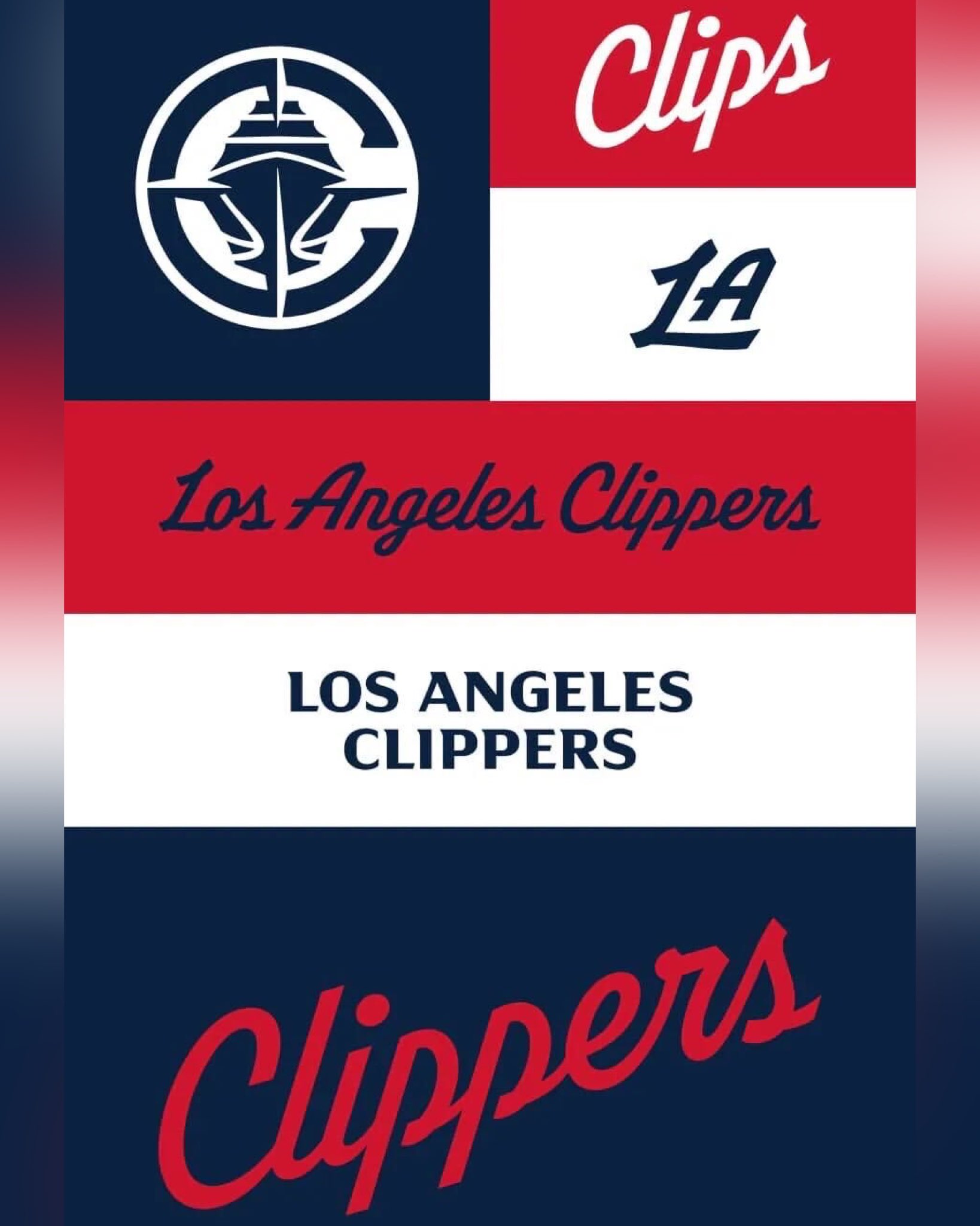
New Logo - New Uniforms - Rebranding
New Logo - New Uniforms - Rebranding
-
donemilio21
- Analyst
- Posts: 3,128
- And1: 849
- Joined: Aug 20, 2009
- Location: Santa Barbara
-


Re: New Logo - New Uniforms - Rebranding
-
donemilio21
- Analyst
- Posts: 3,128
- And1: 849
- Joined: Aug 20, 2009
- Location: Santa Barbara
-
Re: New Logo - New Uniforms - Rebranding
-
Bobbymcgee
- Veteran
- Posts: 2,739
- And1: 2,816
- Joined: Jul 03, 2015
-
Re: New Logo - New Uniforms - Rebranding
Looks alright I guess. Reminds me too much of the Washington Wizards colors.
I would have preferred a full rebrand though. Something like - The California Condors of Inglewood
I would have preferred a full rebrand though. Something like - The California Condors of Inglewood
Re: New Logo - New Uniforms - Rebranding
-
madmaxmedia

- RealGM
- Posts: 12,589
- And1: 7,511
- Joined: Jun 22, 2001
- Location: SoCal
-


Re: New Logo - New Uniforms - Rebranding
I like this 100000% better than our current branding, which still looks like EA Sports every time I see it.
I really like the new colors and the uniforms. The logo is only okay but might grow on me.
I really like the new colors and the uniforms. The logo is only okay but might grow on me.
The Wait Of A Lifetime
-
Wammy Giveaway
- Veteran
- Posts: 2,553
- And1: 1,162
- Joined: Jul 30, 2013
The Wait Of A Lifetime
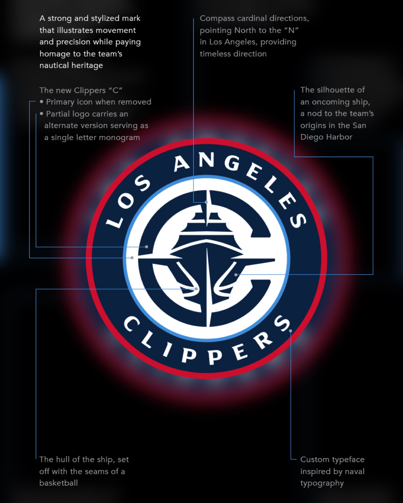
If I knew any better, the Clippers would not officially "embrace" their ship identity until they officially moved into their new arena. They didn't want to show off the new logo while still in the Staples/Crypto Arena as any move they made at the time while under the shadow of the Big Brother Lakers would be seen as inferior. That's why they did the hack job of a logo with that Miami Heat artist many years ago.
And everybody keeps saying this rebrand is bad. Geeze, what do you want from the Clippers?! If you're trying to force them to act normal like the rest of the other sports franchises, you're not going to get that. The evil Donald Sterling handicapped them from day one with his greedy, selfish, crooked shenanigans, so you can forgive them for having to wait until the move to spring this new logo on us. In retrospect, the Heat's rendition of the Clippers logo was only conceived as a means to distance themselves from the Sterling era. Sure, we had to wait ten years, but what's the alternative?
Besides, what if they had one of the worst playoff collapses in NBA history under that new logo, which would theoretically include a 3-0 collapse (knock on wood). Or worse, they regress to the loser Clippers of the Sterling era. Now, new logo with a True Big 3 of Harden-George-Leonard, and it doesn't take affect until they're in the new arena, timed perfectly to their final year in the Lakers kingdom? That's a good wait.
"The waiting is the hardest part" - Tom Petty
Re: New Logo - New Uniforms - Rebranding
-
madmaxmedia
- RealGM
- Posts: 12,589
- And1: 7,511
- Joined: Jun 22, 2001
- Location: SoCal
-
Re: New Logo - New Uniforms - Rebranding
Bobbymcgee wrote:Looks alright I guess. Reminds me too much of the Washington Wizards colors.
I would have preferred a full rebrand though. Something like - The California Condors of Inglewood
I can see the similarity to the Wizards, but I still like it better than the basic red and blue of before. They could have tweaked one of the new colors somewhat to discriminate it more, but strictly speaking both our red and blue are darker than the Wizards red and blue.
I don't mind the Clipper name, after all we are in a coastal city so it still makes sense.
Re: New Logo - New Uniforms - Rebranding
-
Ballings7
- RealGM
- Posts: 24,235
- And1: 2,051
- Joined: Jan 04, 2006
Re: New Logo - New Uniforms - Rebranding
I think they're too bland to be regular uniforms, remind me of retro ones too much which are fine but don't get worn all the time.
The white one looks basically the same as the ones from early 2000s to 2012.
If the black city and white city with the urban-style "Los Angeles" are going away, that really sux. Those are really good and distinctive from other teams.
I dig the logos though. Would of liked to see that featured more somewhere on the upper part of the jerseys to make them not so bland.
Overall, do not like
The Playoffs don't care about your Analytics
Re: New Logo - New Uniforms - Rebranding
-
og15
- Forum Mod - Clippers

- Posts: 51,279
- And1: 34,120
- Joined: Jun 23, 2004
- Location: NBA Fan
-
Re: New Logo - New Uniforms - Rebranding
madmaxmedia wrote:I like this 100000% better than our current branding, which still looks like EA Sports every time I see it.
I really like the new colors and the uniforms. The logo is only okay but might grow on me.
Yea, solid improvement.
Like I said on the GB, I'm not super picky about this stuff as long as it isn't an eyesore or ugly, which none of this is.
So I'm down with it. I wasn't a huge fan of the previous logo and jerseys style wise.
Re: New Logo - New Uniforms - Rebranding
-
esqtvd

- RealGM
- Posts: 12,189
- And1: 4,864
- Joined: Jun 24, 2017
- Location: LA LA LA LAND
- Contact:
-


Re: New Logo - New Uniforms - Rebranding
-
clipperlover
- Bench Warmer
- Posts: 1,330
- And1: 1,155
- Joined: Sep 10, 2019
Re: New Logo - New Uniforms - Rebranding
If you haven't read this, it explains a lot: https://www.espn.com/nba/story/_/id/39586633/nba-story-clippers-new-uniforms-logos
Re: New Logo - New Uniforms - Rebranding
-
clipperlover
- Bench Warmer
- Posts: 1,330
- And1: 1,155
- Joined: Sep 10, 2019
Re: New Logo - New Uniforms - Rebranding
Bobbymcgee wrote:Looks alright I guess. Reminds me too much of the Washington Wizards colors.
I would have preferred a full rebrand though. Something like - The California Condors of Inglewood
This year's Sh*itty Edition jersey is basically the MJ era Wizards jerseys. They are terrible. While the new uniform's blue color is similar to the Wiz, the red and white are classic Clippers colors.
Like the "Clippers" cursive. Not sure I like the sharper lines.
Now that the terrible Microsoft Clippy logo is being removed from our uniforms, hope we can drown the cartoon condor in the ocean.
Re: New Logo - New Uniforms - Rebranding
-
Captain Ballmer
- Rookie
- Posts: 1,219
- And1: 988
- Joined: Jul 14, 2015
- Location: Istanbul
-

Re: New Logo - New Uniforms - Rebranding
Well, this championSHIP is about to sail.
2024-25 Clippers W/L Count against OKC, HOU, PHX, MIN (0-14)
2024-25 Clippers W/L Count against rest of NBA (43-18)
2024-25 Clippers W/L Count against rest of NBA (43-18)
Re: New Logo - New Uniforms - Rebranding
-
donemilio21
- Analyst
- Posts: 3,128
- And1: 849
- Joined: Aug 20, 2009
- Location: Santa Barbara
-
Re: New Logo - New Uniforms - Rebranding
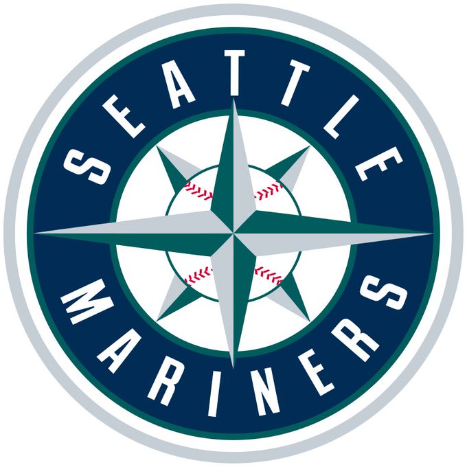
esqtvd wrote:same thing but different
yeah it's between Mariners and Wizards.
Re: New Logo - New Uniforms - Rebranding
-
ERClips
- Junior
- Posts: 305
- And1: 404
- Joined: Nov 27, 2021
-
Re: New Logo - New Uniforms - Rebranding
I’m an old school Clippers fan but I like it all. Why not?
The plain C and the one with the ship are pretty cool. It’s not like we’re gonna move into the dome with the same old threads. To really make it sell though we gotta win a championship & separate from our past.
The plain C and the one with the ship are pretty cool. It’s not like we’re gonna move into the dome with the same old threads. To really make it sell though we gotta win a championship & separate from our past.
Re: New Logo - New Uniforms - Rebranding
-
nickhx2
- RealGM
- Posts: 10,576
- And1: 6,476
- Joined: Feb 13, 2014
Re: New Logo - New Uniforms - Rebranding
it's a tremendous upgrade. very glad to see them.
the previous ones were just plain bad, only mitigated by some of the ones in recent years that added some variants with flair.
overall, going back to the cursive is a major positive that i think they really missed. and now the logo is actually something to be proud of rather than what looked like some silly stop gap.
just in time for the new arena, too!
Re: New Logo - New Uniforms - Rebranding
-
clipperlover
- Bench Warmer
- Posts: 1,330
- And1: 1,155
- Joined: Sep 10, 2019
Re: New Logo - New Uniforms - Rebranding
Saw this over on a Reddit forum: https://www.reddit.com/r/LAClippers/comments/1b1i4oq/when_you_guys_said_the_new_logo_had_too_much/
Would definitely be a much better mascot
Would definitely be a much better mascot
Re: New Logo - New Uniforms - Rebranding
-
MartinToVaught

- RealGM
- Posts: 15,741
- And1: 17,808
- Joined: Oct 19, 2014
-


Re: New Logo - New Uniforms - Rebranding
nickhx2 wrote:and now the logo is actually something to be proud of rather than what looked like some silly stop gap.
To be fair, the old logo was a stopgap. It was thrown together on the fly and they had to hire another team's in-house creative staff on short notice instead of an actual graphic design firm.
I assume it would have been changed years ago if not for the new arena giving them an incentive to wait.
This time around, they actually had time to do it right and it shows.

Re: New Logo - New Uniforms - Rebranding
-
Roscoe Sheed
- RealGM
- Posts: 11,393
- And1: 5,305
- Joined: May 01, 2007
- Location: Los Angeles
Re: New Logo - New Uniforms - Rebranding
I know the Clipper name was decided based on a naming contest in 1978 in San Diego.
Does anybody know what other names were voted on back then? When I look it up, all I can find is that the Clipper name took first place without any mention of 2nd, 3rd place, etc.
Does anybody know what other names were voted on back then? When I look it up, all I can find is that the Clipper name took first place without any mention of 2nd, 3rd place, etc.
Return to Los Angeles Clippers