ImageImageImage

Rasheed Wallace - Stone Wall XXXVI

Moderators: dVs33, Cowology, theBigLip, Snakebites

User avatar
Fartman86
Junior
Posts: 299
And1: 1
Joined: Sep 02, 2005
Location: Poland
Contact:

Rasheed Wallace - Stone Wall XXXVI 

Post#1 » by Fartman86 » Sun Feb 3, 2008 5:43 pm

03.02.08 - Rasheed Wallace - Stone Wall XXXVI

Image

1280x960 |1024x768 |800x600

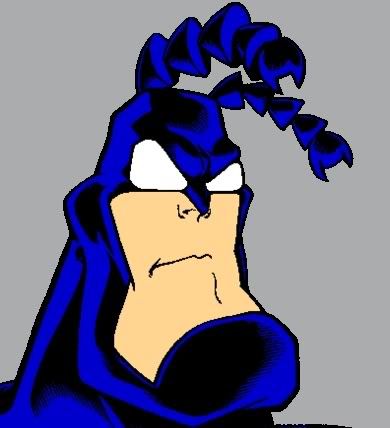
A collaboration wallpaper with Jakub Kaleta (Qba). In initial stages this work was supposed to be a light one picture piece but we ended up sending it back and forth 5 times and we really like the final look of this work.

Big thanks to Rahian and Usman for their pointers ;-)

I hope that all of you Detroit fans will like this work.
Image
User avatar
Fartman86
Junior
Posts: 299
And1: 1
Joined: Sep 02, 2005
Location: Poland
Contact:


Post#2 » by Fartman86 » Mon Feb 4, 2008 12:33 am

104 views and no comments? Come on people, anything ?
Image
BillCartwrightDaMan
Senior
Posts: 660
And1: 23
Joined: Jun 07, 2005


Post#3 » by BillCartwrightDaMan » Mon Feb 4, 2008 12:36 am

:clap: Did not reply but am using it right now as my wallpaper, I did extend it tho my resolution is 1440x900

anyways nice use of mixed media like the cup stain and nice blends, thanks for the effort. Rasheed is my favorite piston.
User avatar
HeroicKennedy
General Manager
Posts: 7,757
And1: 134
Joined: Jul 12, 2007
Location: In your nightmares!


Post#4 » by HeroicKennedy » Mon Feb 4, 2008 12:49 am

That is one of the best damn wallpapers I've ever seen.
User avatar
Typhoon20
Sixth Man
Posts: 1,991
And1: 4
Joined: Nov 07, 2004


Post#5 » by Typhoon20 » Mon Feb 4, 2008 12:50 am

I don't know why they didn't like the Pistons wall,
I think it has a beautiful style and overall a beautiful wall.
Image
User avatar
roc
Retired Mod
Retired Mod
Posts: 14,252
And1: 983
Joined: May 29, 2006
Location: roc city


Post#6 » by roc » Mon Feb 4, 2008 2:12 am

I like most of it. My 2 nit picks are the lettering and Pistons logo stand out like sore thumbs when juxtaposed against the unsaturated tones of the rest of the piece. Great work none the less though.

Can we see a second version perhaps?

Take what I say with a grain of salt as I am a harsh critic (even worse when it comes to my own work) as this is what I do for a living and have a tendency towards ultra nitpickyness (hooray a new word, or not :lol: ).
Image
the crux of the biscuit is the apostrophe
Hunter
Sixth Man
Posts: 1,970
And1: 3
Joined: Jan 06, 2008


Post#7 » by Hunter » Mon Feb 4, 2008 2:51 am

I generally think fartman makes the best walls, but honestly I'm not a big fan of this one. It's well done for what it is, but I'm not really feelin' the effect on Sheed and the text is a bit hard to make out.
JES12 wrote:Bass just barley turned 23 and is a starting PF on any team without a 8 time all-NBA PF in front of him!
User avatar
Fartman86
Junior
Posts: 299
And1: 1
Joined: Sep 02, 2005
Location: Poland
Contact:


Post#8 » by Fartman86 » Mon Feb 4, 2008 9:44 am

r0cd0gg wrote:I like most of it. My 2 nit picks are the lettering and Pistons logo stand out like sore thumbs when justaposed against the unsaturated tones of the rest of the piece. Great work none the less though.

Can we see a second version perhaps?

Take what I say with a grain of salt as I am a harsh critic (even worse when it comes to my own work) as this is what I do for a living and have a tendency towards ultra nitpickyness (hooray a new word, or not :lol: ).


heh I do this for living aswell and after looking closely even at the thumbnail I think you might have a point right there, thanks a lot for the comment.
Image
User avatar
Manocad
RealGM
Posts: 69,969
And1: 10,562
Joined: Dec 13, 2005
Location: Middle Fingerton
Contact:


Post#9 » by Manocad » Mon Feb 4, 2008 5:14 pm

Hunter wrote:I generally think fartman makes the best walls, but honestly I'm not a big fan of this one. It's well done for what it is, but I'm not really feelin' the effect on Sheed and the text is a bit hard to make out.

Ditto. Not my cup of tea either.
Image
User avatar
Fartman86
Junior
Posts: 299
And1: 1
Joined: Sep 02, 2005
Location: Poland
Contact:


Post#10 » by Fartman86 » Mon Feb 4, 2008 10:42 pm

Well you can't please everybody, thanks for all the feedback positive or negative, it always helps to get opinions on work.
Image
ajaX82
Retired Mod
Retired Mod
Posts: 12,160
And1: 85
Joined: Jul 04, 2006


Post#11 » by ajaX82 » Mon Feb 4, 2008 10:52 pm

I really like it actually. r0cd0gg is right on his points tho, the logo/letters dont fit the rest of the picture. change that and you are money
User avatar
roc
Retired Mod
Retired Mod
Posts: 14,252
And1: 983
Joined: May 29, 2006
Location: roc city


Post#12 » by roc » Mon Feb 4, 2008 11:12 pm

I would also move 'big Sheed' to the left a bit for compositional reasons and tone down some of the effect on 'big Sheed' as it is making him look a bit decrepit or diseased, like a leper kind of. :o

The background itself is good to go.
Image
the crux of the biscuit is the apostrophe

Return to Detroit Pistons