this is the ugliest logo i've ever seen lol and i'm fixing to cry

Moderators: Dadouv47, retrobro90


Lattimer wrote:Cracks me up that people still think that Wiggins will be involved in the trade for Love. Wolves are out of their mind if they think they are getting Wiggins for Love.


dude the logo is terrible peolple at quail springs mall wereKyleinOK wrote:Get over it closet Sonics fan.
The logo is fine.
We don't need your drama here.


KyleinOK wrote:Get over it closet Sonics fan.
The logo is fine.
We don't need your drama here.


@bruce_arthur "And finally, as a whore." RT @docfunk "Here is what LeBron looks like as a Knick, a Fireman, an Astronaut..."
Downtown wrote:So if anyone says anything contrary to being thrilled with the OKC team they're closet Sonics fans? I think you're the one who needs to get over it KyleinOK.
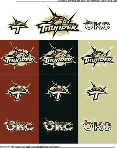
As for the cheap name and logo, the sad part is that there have been posters on here that have come up with far superior ones, such as funkatron's, which is 100 times better. And Clay Bennett probably paid some company a six figure contract to come up with the logo.
But with time everyone will get used to it, like the Bobcats did. But I don't see too many people outside Oklahoma ordering the jerseys to wear.
Return to Oklahoma City Thunder