THE COLORS ARE UGLY!!!

Moderators: retrobro90, Dadouv47

Gorilla Warfare
Lead Assistant
Posts: 4,785
And1: 2,325
Joined: Jun 18, 2008
   

Re: THE COLORS ARE UGLY!!! 

Post#21 » by Gorilla Warfare » Thu Sep 4, 2008 5:59 am

K-Dawg wrote:It looks like a D-league logo


No, D-League logos look better.
Rene
Ballboy
Posts: 1
And1: 0
Joined: Aug 08, 2008
Location: Cologne, Germany
Contact:

Re: THE COLORS ARE UGLY!!! 

Post#22 » by Rene » Thu Sep 4, 2008 8:51 am

The logo and colours and well deserved. It´s the perfect mirror of Bennett´s way of acting: It´s simply classless. But, hey: You OKC-people did not care how this teams comes to your town, so why should you care how this team will look like? Seduced people do not ask questions.
ZenBaller
Freshman
Posts: 80
And1: 2
Joined: Jul 15, 2007

Re: THE COLORS ARE UGLY!!! 

Post#23 » by ZenBaller » Thu Sep 4, 2008 11:34 am

I feel for you OKC fans. Terrible colors and logo. At least you got a nice group of talented youngsters and this will be forgotten :(
funkatron101
General Manager
Posts: 7,737
And1: 1,174
Joined: Jan 02, 2008
Location: St. Paul

Re: THE COLORS ARE UGLY!!! 

Post#24 » by funkatron101 » Thu Sep 4, 2008 2:33 pm

Downtown wrote:So if anyone says anything contrary to being thrilled with the OKC team they're closet Sonics fans? I think you're the one who needs to get over it KyleinOK.

As for the cheap name and logo, the sad part is that there have been posters on here that have come up with far superior ones, such as funkatron's, which is 100 times better. And Clay Bennett probably paid some company a six figure contract to come up with the logo.

But with time everyone will get used to it, like the Bobcats did. But I don't see too many people outside Oklahoma ordering the jerseys to wear.

Just to note, which I don't think you mean to imply it, but I did not create the logo I posted. I merely found it on the internets and thought it was very striking. It embodied the team name perfectly, while the actual logo doesn't represent anything. Strike that. It represents a clear sky. Which is the opposite weather condition for thunder.
Lattimer wrote:Cracks me up that people still think that Wiggins will be involved in the trade for Love. Wolves are out of their mind if they think they are getting Wiggins for Love.
Downtown
Head Coach
Posts: 6,876
And1: 578
Joined: Jun 30, 2001

Re: THE COLORS ARE UGLY!!! 

Post#25 » by Downtown » Thu Sep 4, 2008 4:07 pm

KyleinOK, are you ashlov in disguise? I mean your thin skin is exactly the same as him. I see you're new to this site with 6 posts to your credit, but you need to know something. People from everywhere visit this site and simply give their opinions. If you don't like them, tough.

Look in the mirror. From your post the "baby" comparison fits.

I did say that over time people will get used to the crappy logo and name. Afterall, as Sam Presti said, it's about the player wearing the jersey.
Big_Mac79
Sixth Man
Posts: 1,659
And1: 2
Joined: Mar 03, 2006
Location: Washington State

Re: THE COLORS ARE UGLY!!! 

Post#26 » by Big_Mac79 » Thu Sep 4, 2008 8:59 pm

Anyone know when they will introduce the jerseys?
Spykes
Retired Mod
Retired Mod
Posts: 25,738
And1: 16
Joined: Mar 15, 2004
Location: Paddy's Pub

Re: THE COLORS ARE UGLY!!! 

Post#27 » by Spykes » Fri Sep 5, 2008 12:33 am

Ya, I have to agree with almost everyone here. That color scheme and logo are really terrible. The black and gold look would have been MUCH better.
User avatar
BlazertheGreek
Pro Prospect
Posts: 975
And1: 6
Joined: Jul 04, 2008
Location: Portland, Oregon

Re: THE COLORS ARE UGLY!!! 

Post#28 » by BlazertheGreek » Mon Sep 8, 2008 3:27 am

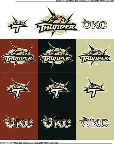
funkatron101 wrote:It's a shame it wasn't more like this
http://www.flickr.com/photos/65516705@N ... otostream/

Image


Now these colors and logo would have been really nice!

I was very dissapointed to see the new colors of the once proud Sonic franchise. If you are going to move a team and change everything about it...put some thought into it for crying out loud. Its like someone gave the designers some colored pencils and a stencil and let them have at it. Horrible.
funkatron101
General Manager
Posts: 7,737
And1: 1,174
Joined: Jan 02, 2008
Location: St. Paul

Re: THE COLORS ARE UGLY!!! 

Post#29 » by funkatron101 » Thu Sep 11, 2008 6:16 pm

That mock up is probably the best representation of "Thunder" you can get. You look at it and envision a loud thunderous crack.

I understand that it might have been difficult to illustrate a sound, but they didn't even try.
Lattimer wrote:Cracks me up that people still think that Wiggins will be involved in the trade for Love. Wolves are out of their mind if they think they are getting Wiggins for Love.
Downtown
Head Coach
Posts: 6,876
And1: 578
Joined: Jun 30, 2001

Re: THE COLORS ARE UGLY!!! 

Post#30 » by Downtown » Thu Sep 11, 2008 7:05 pm

One interesting logo I saw somewhere had a charging buffalo. I thought that kind of had a different representation of thunder as a loud deafining sound. Or maybe a herd of wild stampeding horses. "Thunder" could be made to be something other than the weather.

I think the OKC fans need to move beyond the colours and logos anyways. It's a little shocking that there's pretty much no mention of basketball itself on this site.
User avatar
Howler21
Senior
Posts: 577
And1: 0
Joined: Jul 03, 2008
Location: OKC

Re: THE COLORS ARE UGLY!!! 

Post#31 » by Howler21 » Thu Sep 11, 2008 8:17 pm

Downtown wrote:One interesting logo I saw somewhere had a charging buffalo. I thought that kind of had a different representation of thunder as a loud deafining sound. Or maybe a herd of wild stampeding horses. "Thunder" could be made to be something other than the weather.

I think the OKC fans need to move beyond the colours and logos anyways. It's a little shocking that there's pretty much no mention of basketball itself on this site.


I think the reasoning behind it is that alot of the people from around here that would be getting down to talking basketball have had their set team for years. Ive been a Wolves fan since the rider days and even though its a big deal and I am now just miles away from a team my loyalties are stuck with minny and id rather discuss the pups than thunder....jmo
Duiz
Banned User
Posts: 10,714
And1: 2
Joined: Apr 06, 2007
Location: Chaine Wasatch, Occident des Etats-Unis

Re: THE COLORS ARE UGLY!!! 

Post#32 » by Duiz » Fri Sep 12, 2008 6:53 am

Terrible...
User avatar
87BlazerMan
Pro Prospect
Posts: 804
And1: 0
Joined: May 24, 2007
Location: N.E.P.

Re: THE COLORS ARE UGLY!!! 

Post#33 » by 87BlazerMan » Fri Sep 12, 2008 10:10 am

This logo really is pretty terrible. Its so terrible I just can't help myself:

Widows 98 called and they want their clip art back! LOL

Return to Oklahoma City Thunder


cron