NyCeEvO wrote:Ronito wrote:Someone photoshop Anthony Davis putting on the Brooklyn hat. ****, I promised I wouldn't do this to myself

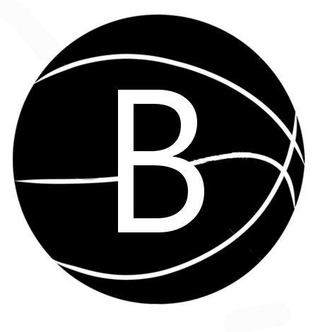
What do you the 'B' is for? It stands for the 'Brow!
Boom!!!


Moderators: Rich Rane, NyCeEvO

NyCeEvO wrote:Ronito wrote:Someone photoshop Anthony Davis putting on the Brooklyn hat. ****, I promised I wouldn't do this to myself
What do you the 'B' is for? It stands for the 'Brow!


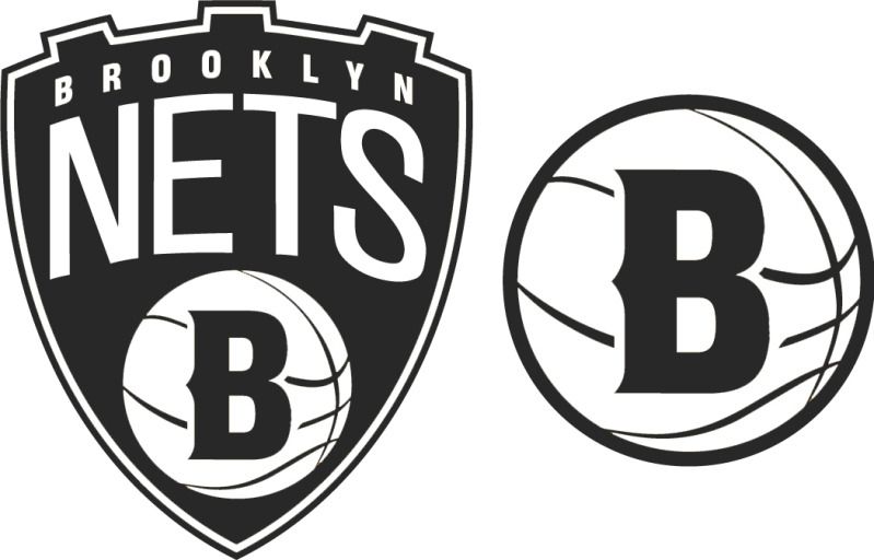
Still Desi wrote:Not my work. A user named Conrad. posted this on sportslogos forum (right click open to see alt logo), jiggaman should have hired him!
http://boards.sportslogos.net/topic/865 ... e__st__220


SportsFan13 wrote:that looks really cool good job with that


Still Desi wrote:Not my work. A user named Conrad. posted this on sportslogos forum (right click open to see alt logo), jiggaman should have hired him!
http://boards.sportslogos.net/topic/865 ... e__st__220


NyCeEvO wrote:Black and white is ok with me as long as they can make the design of the jerseys look nice.
You can definitely tell that Jay-Z had a lot of input on this stuff because the symbol is more of a marketable clothing line than it is an NBA team logo.


xam2k7 wrote:


Rich Rane wrote:I think we're all missing the point here. vc4pres needs to stop watching games.
Shameer1016 wrote:xam2k7 wrote:
Photoshopped bro


NyCeEvO wrote:The jerseys will change everything. Don't worry.
Plus, I still have the theory that they're going to put Brooklyn on top of the shield when regularly promoting the logo.
I think that this is just the small insignia that goes on side of the shorts.
treiz wrote:Still Desi wrote:Not my work. A user named Conrad. posted this on sportslogos forum (right click open to see alt logo), jiggaman should have hired him!
http://boards.sportslogos.net/topic/865 ... e__st__220
That looks really nice actually. Not a big fan of the logo being black and white but hopefully they can prove me wrong when the unis come out. Anybody got anything yet?

xam2k7 wrote:
What do you think of this for hats and such? kind of old school feel BKLYN... wish we added some carolina blue or something to our scheme