ImageImageImageImageImage

Jersey design (2nd design added)

Moderators: Morris_Shatford, 7 Footer, DG88, niQ, Duffman100, tsherkin, Reeko, lebron stopper, HiJiNX

User avatar
BrickHeads
Assistant Coach
Posts: 4,256
And1: 94
Joined: Feb 11, 2005
         

Re: Jersey design (2nd design added) 

Post#61 » by BrickHeads » Thu Jul 26, 2012 3:08 pm

truthrising wrote:Yeah same here, I was really thinking more like this.

Image


I really Like this one. Maybe the red Claw in the middle of the front might work also (not in a red circle).
Image
User avatar
racingdynamics
Junior
Posts: 383
And1: 7
Joined: Jan 27, 2009

Re: Jersey design (2nd design added) 

Post#62 » by racingdynamics » Thu Jul 26, 2012 4:10 pm

I'd like for the Raptors to do what the Jays did this year, a modern twist on a classic style.

I think the retro raps jerseys tug on the nostalgia strings in all of us, but they should tidy it up to make it more 2013. Keep the logo on the front, but maybe make it a tad smaller and encased in a circle, similar to Golden State's new jerseys.

I think our current jerseys are just too blah. We blend in with the crowd. Without knowing, you could walk into the stadium and mistake the Raptors for a handful of different team based on our generic jerseys. Our old jerseys used to turn heads...time to bring them back.
Tim Horton
Analyst
Posts: 3,470
And1: 1,244
Joined: Feb 27, 2009
 

Re: Jersey design (2nd design added) 

Post#63 » by Tim Horton » Thu Jul 26, 2012 4:11 pm

the 'barney' design is awesome.
Image
biebstothelotto
Ballboy
Posts: 49
And1: 125
Joined: May 07, 2012

Re: Jersey design (2nd design added) 

Post#64 » by biebstothelotto » Thu Jul 26, 2012 7:07 pm

Some jays knock offs:
Image

Image
Dennis 37
RealGM
Posts: 15,766
And1: 18,482
Joined: Feb 24, 2007
Location: Ontario, Canada
 

Re: Jersey design 

Post#65 » by Dennis 37 » Thu Jul 26, 2012 7:16 pm

J-Roc wrote:Or if someone can take the same jersey but just clean it up. Standard pinstripes, standard fonts, a dinosaur who wears the same uniform or no uniform, or maybe instead of the big "R", the Canadian flag?


Here it is with straight pinstripes. Haven't played with fonts yet.

Image
Image
Image
Image
Image
Maxpainmedia:
"NYC has the **** most Two Faced fans, but we ALL loved IQ,, and that is super rare, I've been a Knicks fan for 37 years, this kid is a star and he will snap in Toronto"
User avatar
Man of Steel
Lead Assistant
Posts: 4,610
And1: 548
Joined: Jun 03, 2010
Location: Toronto
       

Re: Jersey design 

Post#66 » by Man of Steel » Thu Jul 26, 2012 7:18 pm

Dennis 37 wrote:
J-Roc wrote:Or if someone can take the same jersey but just clean it up. Standard pinstripes, standard fonts, a dinosaur who wears the same uniform or no uniform, or maybe instead of the big "R", the Canadian flag?


Here it is with straight pinstripes. Haven't played with fonts yet.
Image


:clap:

They still look feminine because of the way they slope up at the chest area but the design is well done.
Can't see the black stripe in the middle on this one but aside from that, well done.
User avatar
carlosey
General Manager
Posts: 9,161
And1: 2,141
Joined: Jul 14, 2001

Re: Jersey design (2nd design added) 

Post#67 » by carlosey » Thu Jul 26, 2012 7:20 pm

both the red and black jerseys with the straight pinstripes are awesome! Maybe with a more modern number font it would be good enough to sell. Good job!
Dennis 37
RealGM
Posts: 15,766
And1: 18,482
Joined: Feb 24, 2007
Location: Ontario, Canada
 

Re: Jersey design 

Post#68 » by Dennis 37 » Thu Jul 26, 2012 7:24 pm

luisnani wrote:Can't see the black stripe in the middle on this one but aside from that, well done.


Lighter middle stripe.

Image
Maxpainmedia:
"NYC has the **** most Two Faced fans, but we ALL loved IQ,, and that is super rare, I've been a Knicks fan for 37 years, this kid is a star and he will snap in Toronto"
User avatar
Man of Steel
Lead Assistant
Posts: 4,610
And1: 548
Joined: Jun 03, 2010
Location: Toronto
       

Re: Jersey design 

Post#69 » by Man of Steel » Thu Jul 26, 2012 7:28 pm

Dennis 37 wrote:
luisnani wrote:Can't see the black stripe in the middle on this one but aside from that, well done.


Lighter middle stripe.

Image


[youtube]http://www.youtube.com/watch?v=RnKXiQzgbm0[/youtube]
HALA MADRID || GO LEAFS GO || LET'S GO RAPTORS
User avatar
Pooh_Jeter
Lead Assistant
Posts: 5,573
And1: 9,651
Joined: Apr 29, 2008

Re: Jersey design (2nd design added) 

Post#70 » by Pooh_Jeter » Thu Jul 26, 2012 7:29 pm

I like the straight pinstripes, but I think the logo needs to be smaller. Color scheme of the logo is off too.
alienchild wrote:Again, I hope the basketball gods give us the 14th pick in the draft. I hope OG asks for a trade, Birch signs elsewhere and GTJ signs an offer sheet and Raptors don't match. Frankly Masai is dead to me.
User avatar
niQ
Forum Mod - Raptors
Forum Mod - Raptors
Posts: 16,036
And1: 29,911
Joined: Jun 14, 2011

Re: Jersey design (2nd design added) 

Post#73 » by niQ » Thu Jul 26, 2012 7:58 pm

FWIW, I think the BACK is DOPE!. (the first one, black colourway). The front may need some work. I kind of like the one without a logo altogether. But then that's the problem, we wouldn't have a logo lol. Maybe the Claw without the enclosing circle? Don't know...

Keep up the good work though!
User avatar
duppyy
RealGM
Posts: 19,343
And1: 13,862
Joined: Aug 04, 2004
Location: ???????, ??????
       

Re: Jersey design (2nd design added) 

Post#74 » by duppyy » Thu Jul 26, 2012 9:37 pm

®ated wrote:sh00n was suspended in a a very shady way, (cant get into it) but he was basically baited and then honestly didnt go full throttle like he does but apparently still got a suspension. The person he was arguing with was very volatile. But apparently cliques save eachother even when the **** hits the fans. So here we are today with sh00n wrongfully suspended.


Poor sh00n.

I made a free sh00n sig for him lol
User avatar
sh00n
RealGM
Posts: 20,409
And1: 1,996
Joined: Jul 15, 2006
Contact:
       

Re: Jersey design (2nd design added) 

Post#75 » by sh00n » Thu Jul 26, 2012 10:03 pm

Hey guys.

Did I miss anything?

(YounG GunneR is my dude for life.)
User avatar
J-Roc
RealGM
Posts: 33,150
And1: 7,552
Joined: Aug 02, 2008
Location: Sunnyvale
       

Re: Jersey design (2nd design added) 

Post#76 » by J-Roc » Thu Jul 26, 2012 10:18 pm

The straight pinstripe design is better, but pinstripes are usually one colour, and more stripes (closer together). I forgot to mention before, when the design team went out of control, they said, let's make pinstripes....electric.....AND different colours!! "Here, smoke another..."
User avatar
Just Win Baby
Senior
Posts: 737
And1: 75
Joined: Jun 26, 2012
Location: Maryland
 

Re: Jersey design (2nd design added) 

Post#77 » by Just Win Baby » Thu Jul 26, 2012 10:36 pm

I'd like to see the Raptor logo included on the front and I also like the background pattern type of thing like the pinstripes in the classic.
User avatar
kwamebargnani
General Manager
Posts: 9,470
And1: 2,479
Joined: Jun 23, 2008
     

Re: Jersey design (2nd design added) 

Post#78 » by kwamebargnani » Thu Jul 26, 2012 10:41 pm

Just pure text for the name would be better I think
Dennis 37
RealGM
Posts: 15,766
And1: 18,482
Joined: Feb 24, 2007
Location: Ontario, Canada
 

Re: Jersey design (2nd design added) 

Post#79 » by Dennis 37 » Thu Jul 26, 2012 10:53 pm

J-Roc, I'll work on the pin stripes, and possibly adjust the logo colour. Links, instead of full size to preserve space.

ImageImage

ImageImage

ImageImage

ImageImage

ImageImage
Maxpainmedia:
"NYC has the **** most Two Faced fans, but we ALL loved IQ,, and that is super rare, I've been a Knicks fan for 37 years, this kid is a star and he will snap in Toronto"
User avatar
VC-INJURY
Sixth Man
Posts: 1,886
And1: 1,417
Joined: Nov 18, 2009

Re: Jersey design 

Post#80 » by VC-INJURY » Thu Jul 26, 2012 11:02 pm

Dennis 37 wrote:Image


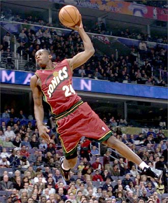
Love these jerseys (the black and purple too). I really dug the maroon ones the sonics and pistons used to have too.

Image

Image
Image

Return to Toronto Raptors