


So I've spent a few days working on a Toronto Huskies re-brand with main logo and two secondary logo's along with home and away uniforms. The designs are very rough around the edges (most of it is hand-drawn and yet to be properly vectored) but I've spent long enough staring at it and need to now throw it open to the opinion of you guys and get some feedback before further developing it.
Tell me what you like, what you don't like and your conversation can guide me some and hopefully a bit of collaboration will push through a finished set of designs that make everyone happy.
I am a graphic designer but I don't ever get a chance to do anything sports-related so little side projects like this can be a lot of fun. You never know, maybe someone takes notice once we're done putting together a polished branding package that gets fan approval.
So go for it, rip it or praise it, let me know your thoughts.
(p.s. Mods, I know there are a few Huskies related threads on the front page but please keep this one separate as I hope to keep returning to it as I progress with the project. thanks)

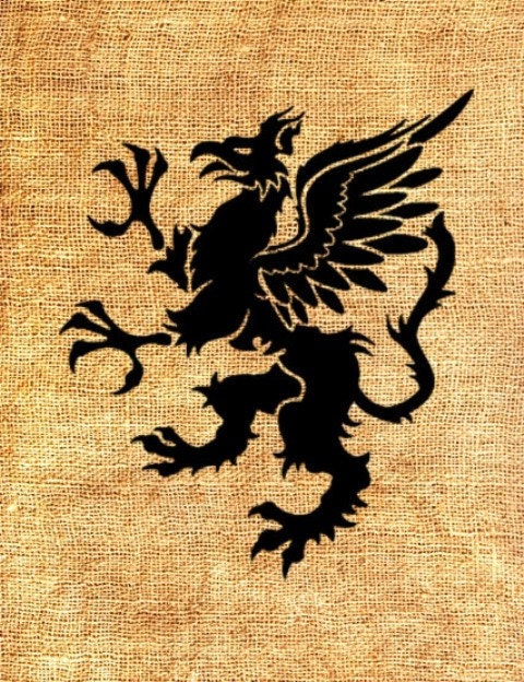
With the Huskies re-brand mostly only going down well with those open to a name change, I thought it appropriate to attempt my take on a Raptors re-brand and again get the thoughts of the fanbase during the design process. If the Toronto Raptors are to celebrate their 20 year anniversary in 2016, the only path I wanted to go down was to really get the essence of the original branding back while giving everything a much needed facelift. Included are Primary, Secondary and Third logo's along with a jersey script. This is a re-brand that very much embraces the franchises' 90's roots while doing a clearer job representing the city of Toronto and Canada.
Once again let me know your thoughts.


