LosManos,
you definitely did some good work here but I will offer you a couple of points to consider and perhaps put into an alternate design if you are going to pitch to MLSE.
1. The main Husky illustration - I found the honeycomb/scale look distracting and it gave the figure an almost prehistoric or mythological feel that I don't think you were going for.
2. The Husky script - I found it to be very feminine and not sure it would work for a men's pro sport team. It would look very nice if TOR got a WNBA franchise and used the same name. Being serious, not snarky.
3. The feel of 1 and 2 may not be a good fit together. Mixed messages so to speak. Pick a direction and tie everything into that.
Just my opinion but I wanted to give you a different perspective on the designs.


*Update* Raptors re-branding v.1 - Focus Group
Moderators: HiJiNX, 7 Footer, Morris_Shatford, niQ, Duffman100, tsherkin, Reeko, lebron stopper, DG88
Re: Huskies re-branding v.1 - Focus Group
-
lucky777s
- Lead Assistant
- Posts: 4,586
- And1: 686
- Joined: Jun 21, 2009
Re: Huskies re-branding v.1 - Focus Group
-
Orsk

- Pro Prospect
- Posts: 959
- And1: 444
- Joined: Jul 23, 2010
Re: Huskies re-branding v.1 - Focus Group
Anyway, other than the logo, not a horrible design, but can we stop with this idea of Huskies? Why do people want to change it to that so bad? Raptors is way better, has an established history, not all bad and a lot of kids have grown up with it. Huskies has really no meaning to TO either, other than one losing season a long long time ago, so why is everyone obsessed with it?
I agree the logo and unis could use updating, but the name change isnt necessary. Just put half as much effort into updating our logo and unis for a RAPS team as people do about trying to change to huskies.
I agree the logo and unis could use updating, but the name change isnt necessary. Just put half as much effort into updating our logo and unis for a RAPS team as people do about trying to change to huskies.

Re: Huskies re-branding - Focus Group
-
Orsk
- Pro Prospect
- Posts: 959
- And1: 444
- Joined: Jul 23, 2010
Re: Huskies re-branding - Focus Group
ecksplicit wrote:Send these jerseys to the Raps organization, they're great.
Except dont, since they arent his logo design. I do like the other logo with the bball turning into the maple leaf though. Very reminiscent of the Canada basketball logo, but thats probably a good thing in this case.
IMO this should be locked up until you can come up with a new logo. I like your designs but the main attraction seems to be "your" logo.
Re: Huskies re-branding v.1 - Focus Group
-
VC-INJURY

- Sixth Man
- Posts: 1,886
- And1: 1,417
- Joined: Nov 18, 2009
Re: Huskies re-branding v.1 - Focus Group
Orsk wrote:Anyway, other than the logo, not a horrible design, but can we stop with this idea of Huskies? Why do people want to change it to that so bad? Raptors is way better, has an established history, not all bad and a lot of kids have grown up with it. Huskies has really no meaning to TO either, other than one losing season a long long time ago, so why is everyone obsessed with it?
I agree the logo and unis could use updating, but the name change isnt necessary. Just put half as much effort into updating our logo and unis for a RAPS team as people do about trying to change to huskies.
Agreed. If this team changes their name to Huskies, and are still crap, which in all likelihood will be true, they will have even less of an established identity had they just stuck with Raptors. I don't even know why this is a serious conversation.

Re: Huskies re-branding v.1 - Focus Group
-
Rhythm043
- Lead Assistant
- Posts: 5,620
- And1: 1,865
- Joined: Sep 26, 2001
Re: Huskies re-branding v.1 - Focus Group
Nice work and all but I still they the whole Huskies thing sucks . Give it up
On Gerald Henderson vs Derozan:
"Yes. Hendo is quite a bit better than DeMar.
So yes, I do believe he's currently the better player and do project that will continue to be in the future. I would also take Turner over DD."
--Throwback24,Jan 2014
"Yes. Hendo is quite a bit better than DeMar.
So yes, I do believe he's currently the better player and do project that will continue to be in the future. I would also take Turner over DD."
--Throwback24,Jan 2014
Re: Huskies re-branding v.1 - Focus Group
-
Double Helix
- Retired Mod

- Posts: 32,626
- And1: 29,213
- Joined: Jun 26, 2002
Re: Huskies re-branding v.1 - Focus Group
Because the Timberwolves logo, as a wolf, looks closer to a Siberian husky we'd probably have to go more the Samoyed Husky look to better differentiate. That's probably better anyway since it seems you want to go white and blue primarily.
Samoyeds look a little rounder than the Stark wolf logo. The skulls aren't quite so flat and their snouts aren't quite as long.
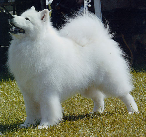
But obviously angrier-looking.

Samoyeds look a little rounder than the Stark wolf logo. The skulls aren't quite so flat and their snouts aren't quite as long.
But obviously angrier-looking.

Re: Huskies re-branding - Focus Group
-
Los Manos

- Head Coach
- Posts: 6,619
- And1: 1,903
- Joined: Mar 09, 2005
-


Re: Huskies re-branding - Focus Group
Orsk wrote:Los Manos wrote:The Husky logo still needs a lot of work but just to show it's not identical to the Stark Direwolf Banner:
As a Graphic Designer you should know better than plagiarize a logo from elsewhere. That is a straight rip of the house stark wolf from Game of Thrones just changed colours and added ears up the top...... The one you linked on page 2 is indeed a stark banner, but there is another with the exact layout of the "net".
Yes I can see that you have redrawn some of it, but the fact remains it is not your DESIGN even though it has been reproduced by you.

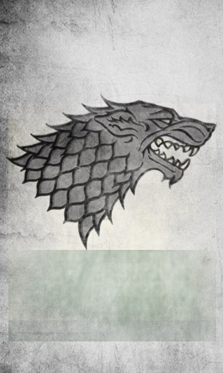
Plagiarism is a strong word to use especially when I have have made clear to credit the original design used in GoT as the inspiration for the sketch. I have not tried to pass of someone else's work as my own at all. Plus I would ask for some leeway in your fast judgement considering I have clearly indicated that this is the first stage in the design process and as such there will be familiarity with certain elements as we all have to take our inspiration from somewhere. That said, I don't anticipate the final Husky head logo carrying anywhere as many similarities to the GoT logo in the final design, I do think it needs a complete re-draw.
Re: Huskies re-branding v.1 - Focus Group
-
pharring
- Sixth Man
- Posts: 1,765
- And1: 503
- Joined: Jul 16, 2004
- Location: Lofty Bay Street Tower
Re: Huskies re-branding v.1 - Focus Group
There are a LOT of potential variations on a Huskey-inspired logo:
https://www.google.ca/search?q=huskies+logo&tbm=isch&tbo=u&source=univ&sa=X&ei=Id6xUeiaB6q30AHY6IDgBw&sqi=2&ved=0CCwQsAQ&biw=1600&bih=753
https://www.google.ca/search?q=huskies+logo&tbm=isch&tbo=u&source=univ&sa=X&ei=Id6xUeiaB6q30AHY6IDgBw&sqi=2&ved=0CCwQsAQ&biw=1600&bih=753
Re: Huskies re-branding v.1 - Focus Group
-
Ditchweed
- Starter
- Posts: 2,327
- And1: 89
- Joined: Jun 03, 2011
- Location: somewhere around 80 miles south of Minneapolis
Re: Huskies re-branding v.1 - Focus Group
The Huskies are a losing team from the past that played barely a season. There is no tradition with them, they are dead, officially dead, and the name should be also. It is hard to understand those wanting to even consider changing the Raptors name and look to the "junior Timberwolves" and associate with a losing tradition. Talk about a step backwards. It is 2013, not 1946.
Time for this thread and its nonsense to be locked.
Time for this thread and its nonsense to be locked.
Re: Huskies re-branding v.1 - Focus Group
-
J.Kim
- Retired Mod
- Posts: 10,689
- And1: 23
- Joined: Jan 12, 2003
- Location: Washington D.C.
Re: Huskies re-branding v.1 - Focus Group
pharring wrote:There are a LOT of potential variations on a Huskey-inspired logo:
https://www.google.ca/search?q=huskies+logo&tbm=isch&tbo=u&source=univ&sa=X&ei=Id6xUeiaB6q30AHY6IDgBw&sqi=2&ved=0CCwQsAQ&biw=1600&bih=753
A lot of retreads too. I wonder if there's been a fresh take on a Huskie's logo in the last 10 years.
Re: Huskies re-branding v.1 - Focus Group
-
SDM

- RealGM
- Posts: 19,557
- And1: 954
- Joined: Jan 08, 2004
-


Re: Huskies re-branding v.1 - Focus Group
I'm so-so on the logo itself and think it could use more detail, but I think the cursive jerseys look awesome. Great colours.
Re: Huskies re-branding v.1 - Focus Group
-
SaveTheHens
- Assistant Coach
- Posts: 3,777
- And1: 1,904
- Joined: Aug 06, 2009
Re: Huskies re-branding v.1 - Focus Group
I like it a lot but I would hate the day we change our name to the Huskies. Why do it? We've been a bad team as the Raptors but was all those years wasted for nothing?
Maybe change the Raptor Logo (although the classic Raptor shouldn't have been thrown away. As cartoony as it looked it was original & very recognizable. The claw is boring). The jerseys are in dire need of a change too. Bring back the old "raptors" font but having a more simplistic logo would be cool.
Also, simplicity can be cool but no need to emulate Brooklyn. If its a little more complex there's nothing wrong with it, especially if we become a winning team.

Re: Huskies re-branding v.1 - Focus Group
-
Raps_Swingman
- Analyst
- Posts: 3,094
- And1: 211
- Joined: Dec 28, 2002
-


Re: Huskies re-branding v.1 - Focus Group
I'm 100% behind the Huskies rebrand and these jerseys are sick. Well done OP.
This is a blue and white city, might as well hop on the bandwagon so Drake can make a Blue & White remix of Black & Yellow.
But seriously, Huskies is way better then Raptors...or Pelicans...
This is a blue and white city, might as well hop on the bandwagon so Drake can make a Blue & White remix of Black & Yellow.
But seriously, Huskies is way better then Raptors...or Pelicans...
That's what she said.
Re: Huskies re-branding - Focus Group
-
Los Manos
- Head Coach
- Posts: 6,619
- And1: 1,903
- Joined: Mar 09, 2005
-
Re: Huskies re-branding - Focus Group
Orsk wrote:ecksplicit wrote:Send these jerseys to the Raps organization, they're great.
Except dont, since they arent his logo design. I do like the other logo with the bball turning into the maple leaf though. Very reminiscent of the Canada basketball logo, but thats probably a good thing in this case.
IMO this should be locked up until you can come up with a new logo. I like your designs but the main attraction seems to be "your" logo.
My reference folder for creating that part of the logo contains dozens of images from profile photos of Huskies teeth, to sports logo's, to medieval banners. I'm sure someone could equally say that my logo is plagiarised from the following image also. If you put this next to the Stark Direwolf logo though you'd say they're completely different.
To repeat, this is early in the design process and I have been clear in crediting the inspiration for the main logo husky head. It was the neck/fur detail that I was most interested in because of the potential to eventually make it look like a basketball net. I have had no intention of passing off the work of others as my own and never will but I wouldn't be a designer if I didn't use the designed world around me as inspiration to draw from.
Re: Huskies re-branding v.1 - Focus Group
-
theSkinny

- Retired Mod
- Posts: 22,097
- And1: 4,277
- Joined: Jan 06, 2006
- Location: 2019 NBA Champions.
-

Re: Huskies re-branding v.1 - Focus Group
My thoughts..
The Script is pretty cool, although I do dislike the makings on the upper portion of the H, I dont think its needed. The other markings work for me.
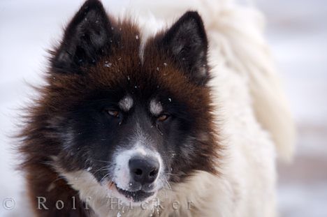
The Husky logo is an issue for me on a number of levels.
Making the GoT connection that quickly makes it an automatic fail (fad, trendy)
The idea of the Net incorporation was great, except it looks like scales.
It is too "scary" small kids wont identify with it.. the eyes have to be intense, not angry/scary
The larger logos are a great idea, the one on the right has a very fleur d' lis aspect.. was this intentional?
The script I was hoping you would go for was more along the lines of WW2 nose art...

I like the direction your headed, for a first draft I would say you are well on your way.
To the poster who shared his friends Husky logo on instagram... It is a great drawing, never could it be a sports team logo... too busy, too much detail (good luck trying to embroider that).. the concept is cool and could be used for marketing but not as the logo...
The Script is pretty cool, although I do dislike the makings on the upper portion of the H, I dont think its needed. The other markings work for me.
The Husky logo is an issue for me on a number of levels.
Making the GoT connection that quickly makes it an automatic fail (fad, trendy)
The idea of the Net incorporation was great, except it looks like scales.
It is too "scary" small kids wont identify with it.. the eyes have to be intense, not angry/scary
The larger logos are a great idea, the one on the right has a very fleur d' lis aspect.. was this intentional?
The script I was hoping you would go for was more along the lines of WW2 nose art...
I like the direction your headed, for a first draft I would say you are well on your way.
To the poster who shared his friends Husky logo on instagram... It is a great drawing, never could it be a sports team logo... too busy, too much detail (good luck trying to embroider that).. the concept is cool and could be used for marketing but not as the logo...

Re: Huskies re-branding v.1 - Focus Group
-
Rhettmatic

- Retired Mod
- Posts: 21,081
- And1: 14,547
- Joined: Jul 23, 2006
- Location: Toronto
-
Re: Huskies re-branding v.1 - Focus Group
Really nice work. You should try submitting those designs to someone more important than all of us (read: literally anyone).

Sig by the one and only Turbo_Zone.
Re: Huskies re-branding v.1 - Focus Group
-
Los Manos
- Head Coach
- Posts: 6,619
- And1: 1,903
- Joined: Mar 09, 2005
-
Re: Huskies re-branding v.1 - Focus Group
Double Helix wrote:Because the Timberwolves logo, as a wolf, looks closer to a Siberian husky we'd probably have to go more the Samoyed Husky look to better differentiate. That's probably better anyway since it seems you want to go white and blue primarily.
Samoyeds look a little rounder than the Stark wolf logo. The skulls aren't quite so flat and their snouts aren't quite as long.
But obviously angrier-looking.
Thanks for the tip, not being Canadian these bits of insight are really helpful.
They've still got a good old set of fangs on them though!


Re: Huskies re-branding v.1 - Focus Group
-
superchimp

- Junior
- Posts: 497
- And1: 576
- Joined: Jan 07, 2010
Re: Huskies re-branding v.1 - Focus Group
I really like the look everything except for the possibility the unfortunate mojo of House Stark might combine with our historically bad mojo to make things even worse.
My only real criticism, as a graphic designer, is minor and to do with the letterforms in "Huskies". I would clean up the curves slightly. I know what you are going for and I like the style of the lettering, I'd just simplify the paths and remove the ragged points and have smoother changes in stroke thickness. I like contrast in stroke thickness, it should just flow more naturally.
The design is very clean and those minor inconsistencies conflict with that.
Other than that, full speed ahead!
Raptor Jesus believes in OakleyDokely. Do you?
Re: Huskies re-branding v.1 - Focus Group
-
J.Kim
- Retired Mod
- Posts: 10,689
- And1: 23
- Joined: Jan 12, 2003
- Location: Washington D.C.
Re: Huskies re-branding v.1 - Focus Group
Seems like there's equal hate on both sides for the name Raptors and Huskies...
Why not try a logo re-design with a different name too, especially since there's enough designs out there with both names.
Something like, Toronto Dons? Pays tribute to the Don River and the other "Dons" in the city. Simple and unique enough... (Though I'd probably hate seeing that as a word mark on a jersey since its such a short name...)
Re: Huskies re-branding v.1 - Focus Group
-
theSkinny
- Retired Mod
- Posts: 22,097
- And1: 4,277
- Joined: Jan 06, 2006
- Location: 2019 NBA Champions.
-