


talha_raps wrote:niQ wrote:
Love these ones! Nothing says RaptorS like 3x the Raptors! That or it's a Raptor Cerberus!
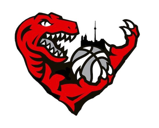
I really like that one too. Turbo Zone I think you should somehow incorporate the Toronto Skyline on top of the ball. I'm sure you can make it look nice and it represents the city pretty nice.

With a graphic as complex as a skyline (especially with the CN Tower throwing it all off) it doesn't really work.
You sort of have to reign it in with a circle, contain it if you will, like G-State did.
Check it out here:


