


Logo Rebrand (Everything Huskies/Raptors) Megathread
Moderators: HiJiNX, 7 Footer, Morris_Shatford, niQ, Duffman100, tsherkin, Reeko, lebron stopper, DG88
Re: Work In Progress - Raps logo update v.1
-
StMikes31
- Banned User
- Posts: 3,929
- And1: 591
- Joined: Mar 19, 2012
Re: Work In Progress - Raps logo update v.1
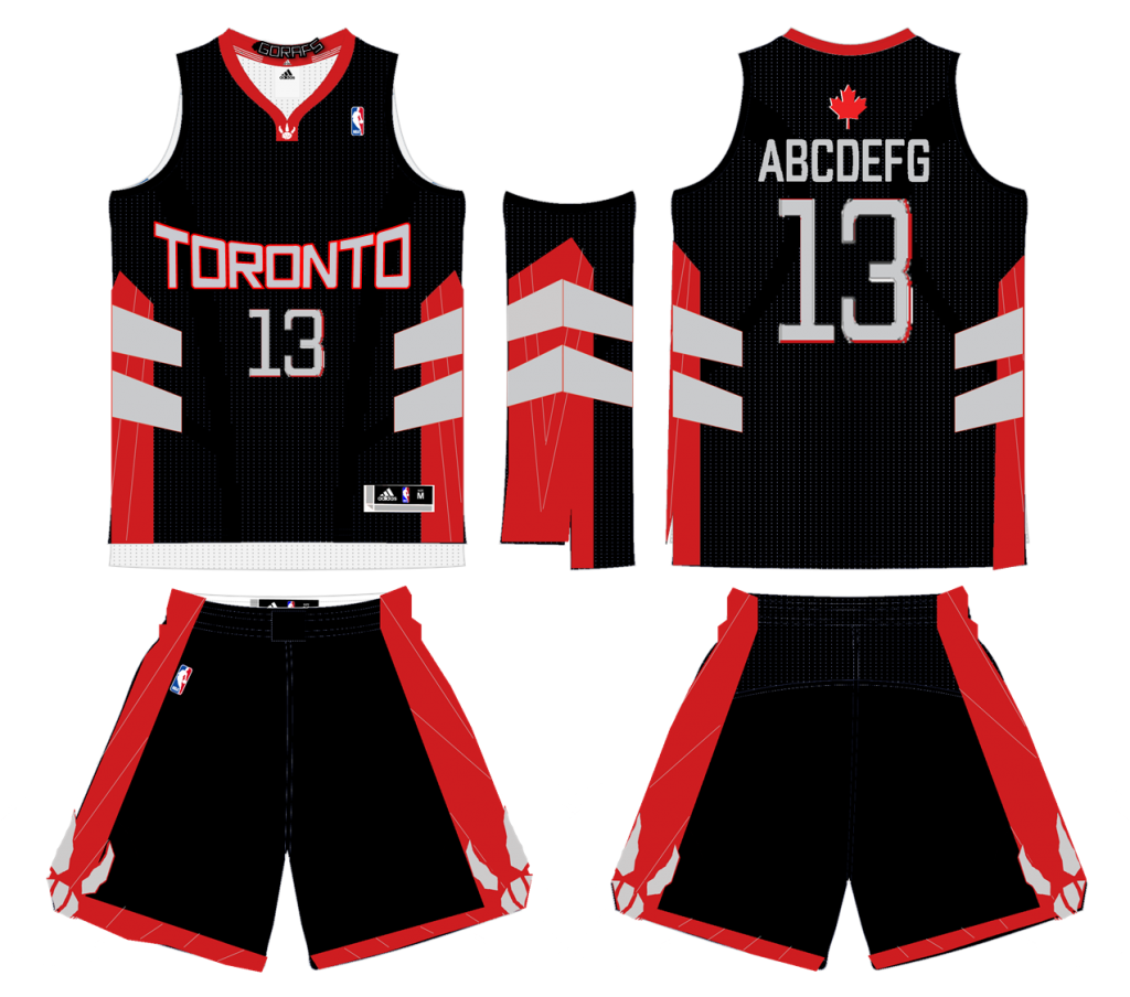
Really nice font and colours! Raptor needs to be tough looking.
Re: Work In Progress - Raps logo update v.1
-
whysoserious
- RealGM
- Posts: 30,555
- And1: 8,634
- Joined: Jun 19, 2004
-


Re: Work In Progress - Raps logo update v.1
The colours and triangle work, the maple leaf is in there. Just the raptors head needs to look more vicious.
Could you almost use the Turok head as a guide with the mouth open and then the Toronto Raptors in between?
Not sure it works cause I like how you've placed the name at the bottom. The Raptors head just looks weird for some reason and not vicious enough. I still think a straight on view of the head for a Raptor is very difficult to acheive simplifiying it down to vectors, two to tthree colours at most.
Re: Work In Progress - Raps logo update v.1
-
beckham23

- Junior
- Posts: 310
- And1: 83
- Joined: Jan 16, 2004
Re: Work In Progress - Raps logo update v.1
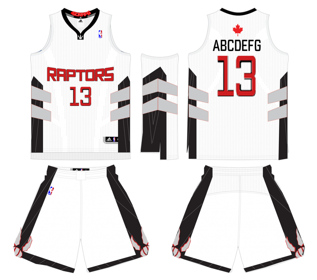
goodjoey wrote:hey so i know that everyone has their ideas, but i've started to take this new logo thing a bit more seriously and have been working on some new ideas the last couple of nights. This is my first version of what i think can be a cool update. Im not thrilled with how the raptor head came out, wish it were more fierce, but again, still just a work in progress. Let me know what you think, and if there are any ideas you think can help make it even better.
Enjoy
jersey designs coming tomorrow:) stay tuned!
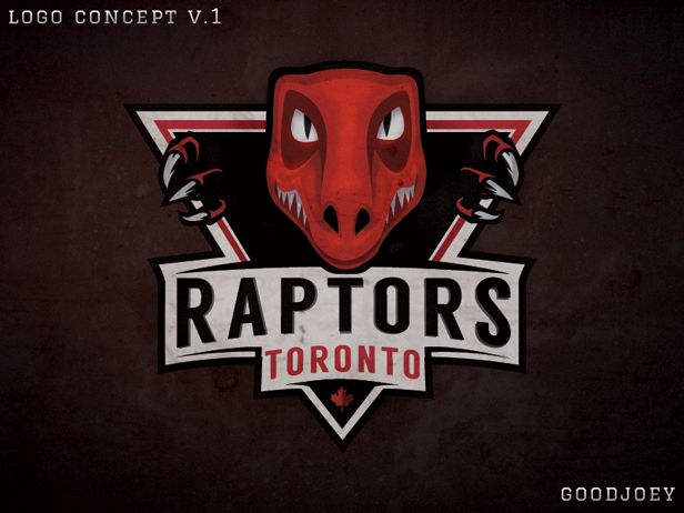
Is that a new character for a Tim Burton movie?
Looks nice, but not for a sports team logo though.
Re: Work In Progress - Raps logo update v.1
-
carl_english

- General Manager
- Posts: 7,703
- And1: 3,140
- Joined: Jun 07, 2011
Re: Work In Progress - Raps logo update v.1
In this case you don't need the raptor in writing since its staring you in the faceeee
Re: Work In Progress - Raps logo update v.1
-
goodjoey

- Pro Prospect
- Posts: 953
- And1: 273
- Joined: Dec 21, 2008
- Location: your moms house
Re: Work In Progress - Raps logo update v.1
StMikes31 wrote:Really nice font and colours! Raptor needs to be tough looking.
yeah thats kinda how I feel about it too. Ill have to work on the raptors some more, maybe his mouth will be open in v2, like he's going to pounce. I'll work on it tonight and try and make it a bit more intimidating.

Re: Logo Rebrand (Everything Huskies/Raptors) Megathread
-
VC-INJURY

- Sixth Man
- Posts: 1,886
- And1: 1,417
- Joined: Nov 18, 2009
Re: Logo Rebrand (Everything Huskies/Raptors) Megathread
Any one who makes a logo, put the logo in this image so everyone can get an idea of how well it fits with other NBA logos. (Right click -> Open image in new tab)


Re: Logo Rebrand (Everything Huskies/Raptors) Megathread
-
YoungD23

- Sixth Man
- Posts: 1,896
- And1: 1,069
- Joined: Jun 15, 2008
- Location: 6ix
-
Re: Logo Rebrand (Everything Huskies/Raptors) Megathread
- - Not my work, Got it from another website - -
(Thought it was nice!)
--------------------------------------------------------------------
(Thought it was nice!)
--------------------------------------------------------------------
Re: Logo Rebrand (Everything Huskies/Raptors) Megathread
-
Haisan
- Sophomore
- Posts: 240
- And1: 28
- Joined: Dec 24, 2010
Re: Logo Rebrand (Everything Huskies/Raptors) Megathread
For me, the moment i watched that Raptors-Knicks game for the NBA's 50th anniversary — when the Raptors wore Huskies retro uniforms — I have wanted the team to change to that name and the blue colour scheme. I want Huskies!
Re: Logo Rebrand (Everything Huskies/Raptors) Megathread
-
Raps Militia

- Lead Assistant
- Posts: 5,950
- And1: 5,468
- Joined: Mar 09, 2012
-


Re: Logo Rebrand (Everything Huskies/Raptors) Megathread
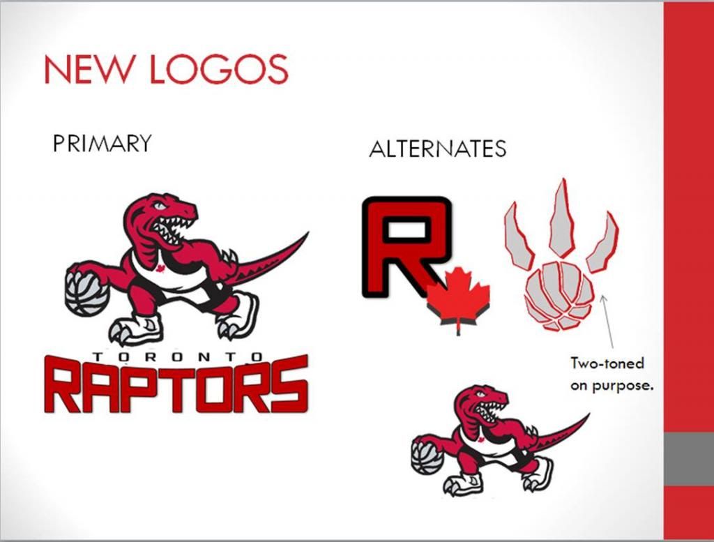
The second logo made by venom is perfect, IMHO.
However, I would keep the Raptors name....
However, I would keep the Raptors name....

Re: Work In Progress - Raps logo update v.1
-
Sherlock

- General Manager
- Posts: 8,316
- And1: 12,706
- Joined: Mar 27, 2012
-

Re: Work In Progress - Raps logo update v.1
goodjoey wrote:StMikes31 wrote:Really nice font and colours! Raptor needs to be tough looking.
yeah thats kinda how I feel about it too. Ill have to work on the raptors some more, maybe his mouth will be open in v2, like he's going to pounce. I'll work on it tonight and try and make it a bit more intimidating.
I like the concept. As you pointed out in your OP, the head definitely needs to be fiercer looking, but the overall feel of the concept is great (like the subtle placement of the Maple Leaf too).
I think you should flip the position of the words Toronto and Raptors so that the first glance at the logo reads: "Toronto Raptors" instead of "Raptors Toronto".
Other than that, I'm a fan. Look forward to v2.0.
Interviewer: Championship #2?
Ujiri: Hey...We're gonna get it. I don't know when it'll be, but we're gonna get it. Just like I said we'll get the first one and I said I didn't know when we'd get it...But we will. Guarantee you we will.
Ujiri: Hey...We're gonna get it. I don't know when it'll be, but we're gonna get it. Just like I said we'll get the first one and I said I didn't know when we'd get it...But we will. Guarantee you we will.
Re: Work In Progress - Raps logo update v.1
-
gerrit4

- Head Coach
- Posts: 6,710
- And1: 3,297
- Joined: Mar 10, 2006
Re: Work In Progress - Raps logo update v.1
Looks great other than the head. I like the style of the rest though.
Re: Work In Progress - Raps logo update v.1
-
LiSTWithLani
- Lead Assistant
- Posts: 5,493
- And1: 3,231
- Joined: Jun 13, 2006
- Location: Toronto
- Contact:
-
Re: Work In Progress - Raps logo update v.1
I actually have to say that as a whole, this is my hands-down favourite.
I agree that the head needs improving, but the styling of the logo is fantastic.
try making the eyes smaller (we're genetically supposed to find large eyes cute and less intimidating - proportionately that is). Also, try opening the mouth (slightly) and showing both top and bottom teeth throughout. (If you're feeling up to it, you can incorporate the skyline into the bottom teeth.)

Re: Work In Progress - Raps logo update v.1
-
kmatrixg
- Veteran
- Posts: 2,801
- And1: 118
- Joined: Jul 20, 2007
- Location: Geographically: Northern Hemisphere; Socially: On the margins; Narratively: A long way to go
Re: Work In Progress - Raps logo update v.1
I'd take away the excessive shading in the head. two tone, maybe three at most.
Re: Work In Progress - Raps logo update v.1
-
goodjoey
- Pro Prospect
- Posts: 953
- And1: 273
- Joined: Dec 21, 2008
- Location: your moms house
Re: Work In Progress - Raps logo update v.1
lstern wrote:I actually have to say that as a whole, this is my hands-down favourite.
I agree that the head needs improving, but the styling of the logo is fantastic.
try making the eyes smaller (we're genetically supposed to find large eyes cute and less intimidating - proportionately that is). Also, try opening the mouth (slightly) and showing both top and bottom teeth throughout. (If you're feeling up to it, you can incorporate the skyline into the bottom teeth.)
great feedback! thanks, I will definitely be using your suggestions in v.2. However, im not a fan of the skyline for teeth thing. I'll see if there is another artful way i could put the skyline in subtly (similar to how i incorporated the leaf)
Re: Work In Progress - Raps logo update v.1
-
goodjoey
- Pro Prospect
- Posts: 953
- And1: 273
- Joined: Dec 21, 2008
- Location: your moms house
Re: Work In Progress - Raps logo update v.1
kmatrixg wrote:I'd take away the excessive shading in the head. two tone, maybe three at most.
originally it was, but i felt like it lacked some "realness", since it wasn't on a jersey or anything. for v2 i will upload both the flat and shaded versions so you can see the difference.
Re: Logo Rebrand (Everything Huskies/Raptors) Megathread
-
DG88
- Forum Mod - Raptors

- Posts: 39,232
- And1: 30,127
- Joined: Jul 26, 2008
- Location: You don't know my location but I know yours
-
Re: Logo Rebrand (Everything Huskies/Raptors) Megathread
Stickying this thread for all rebranding, logo, and jersey topics. Will merge the rest of the threads in here shortly

Re: Logo Rebrand (Everything Huskies/Raptors) Megathread
-
Double Helix
- Retired Mod

- Posts: 32,626
- And1: 29,213
- Joined: Jun 26, 2002
Re: Logo Rebrand (Everything Huskies/Raptors) Megathread
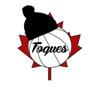
It would be hilarious to see an actual touque with this logo on it. Almost like a Raptor wearing a jersey that says Raptors on it.

How does this Raptors logo stack-up?
-
TorontoRapture

- Sixth Man
- Posts: 1,911
- And1: 978
- Joined: Jul 04, 2008
-
How does this Raptors logo stack-up?
I created this thread, because I want to get your opinion as to how the logo I made for the Raptors (assuming they stay the Raptors), compares to the rest of the logos in the NBA. So what do you think? Does it hold its own?
If your opinion changes as a result of conversation in this thread, you can always re-vote in the poll.
Thanks Ladies and Gents.

If your opinion changes as a result of conversation in this thread, you can always re-vote in the poll.
Thanks Ladies and Gents.

Re: Logo Rebrand (Everything Huskies/Raptors) Megathread
-
DreamTeam09
- RealGM
- Posts: 17,798
- And1: 11,222
- Joined: Jan 06, 2009
- Location: Scarborough
-
Re: Logo Rebrand (Everything Huskies/Raptors) Megathread
A lot of you guys are sick with the graphics. If anyone want's to make a ez $20 I have a logo already if someone can make a few mock ups on how it would look on sweaters / hats / shirts that'll be really helpful to me. That shouldn't be too hard for someone with knowledge on cpu graphics and ish.
quote this tweet if interested.
quote this tweet if interested.

In Raptor Ball I Trust
Re: How does this Raptors logo stack-up?
-
hankscorpioLA

- RealGM
- Posts: 10,528
- And1: 10,007
- Joined: Dec 15, 2011
Re: How does this Raptors logo stack-up?
I think its about on par with the Kings and Magic.
Unfortunately, those are the two worst logos in the league.
Its interesting...when I look at all of them together, the only one that really stands out as unique is Golden State. The new Nets one is also kinda similar - very minimalist, not cartoonish at all.
Unfortunately, those are the two worst logos in the league.
Its interesting...when I look at all of them together, the only one that really stands out as unique is Golden State. The new Nets one is also kinda similar - very minimalist, not cartoonish at all.
The absurd mystery of the strange forces of existence.