I think a face on drawing of the Raptor would make a pretty cool logo.
(like the Bulls, Grizzlies, 'wolves)


Logo Rebrand (Everything Huskies/Raptors) Megathread
Moderators: HiJiNX, 7 Footer, Morris_Shatford, niQ, Duffman100, tsherkin, Reeko, lebron stopper, DG88
Re: Logo Rebrand (Everything Huskies/Raptors) Megathread
-
TheRaptor!

- RealGM
- Posts: 11,200
- And1: 6,835
- Joined: Apr 15, 2007
Re: Work In Progress - Raps logo update v.1
-
goodjoey

- Pro Prospect
- Posts: 953
- And1: 273
- Joined: Dec 21, 2008
- Location: your moms house
Re: Work In Progress - Raps logo update v.1
goodjoey wrote:
does anyone have a front facing raptor showing its teeth? im gonna redo this mofo tonight?

Re: How does this Raptors logo stack-up?
-
S.W.A.N

- Head Coach
- Posts: 6,751
- And1: 3,368
- Joined: Aug 11, 2004
- Location: Sick Wicked And Nasty
-

Re: How does this Raptors logo stack-up?
TorontoRapture wrote:Hmm...this is some great feedback! Keep it coming, because it's giving me some ideas to bounce off of you. Thanks for continuing to speak your mind...for or against.
I like the new design but seeing it up with all the rest, it looks too busy...
We the North
Re: Logo Rebrand (Everything Huskies/Raptors) Megathread
-
RaptorNews
- RealGM
- Posts: 20,828
- And1: 23,156
- Joined: Jan 27, 2013
-

Re: Logo Rebrand (Everything Huskies/Raptors) Megathread
Snakeyes wrote:No offense to the creative minds around here, but this is still by far and away the best Raptors re-branding attempt I've seen as far as the logo goes:

Really like the jerseys, not sure about the logo. I like that its a T though
Re: Logo Rebrand (Everything Huskies/Raptors) Megathread
-
HSOB SIRHC

- General Manager
- Posts: 7,577
- And1: 1,248
- Joined: Oct 11, 2006
-
Re: Logo Rebrand (Everything Huskies/Raptors) Megathread
Snakeyes wrote:No offense to the creative minds around here, but this is still by far and away the best Raptors re-branding attempt I've seen as far as the logo goes:
I like the jersey, not so much the logo. Also, I'd change the red to a darker red. Reminds me too much of the Hawks jersey as it is.
Credit to Turbozone
Re: How does this Raptors logo stack-up?
-
TorontoRapture

- Sixth Man
- Posts: 1,911
- And1: 978
- Joined: Jul 04, 2008
-
Re: How does this Raptors logo stack-up?
Yeah, I know what you mean. I wish it wasn't so tough to come up with a new logo for the raptors. I've been designing and scrapping idea after idea. Eventually I'll make a winner...not that it will ever win anything. Just doing this for fun after all.S.W.A.N wrote:TorontoRapture wrote:Hmm...this is some great feedback! Keep it coming, because it's giving me some ideas to bounce off of you. Thanks for continuing to speak your mind...for or against.
I like the new design but seeing it up with all the rest, it looks too busy...

Re: Huskies Logo Concept
-
Ditchweed
- Starter
- Posts: 2,327
- And1: 89
- Joined: Jun 03, 2011
- Location: somewhere around 80 miles south of Minneapolis
Re: Huskies Logo Concept
Snooch wrote:Ditchweed wrote:OBILIC1389 wrote:Raptors has to be one of the most poorly chosen brand names in sports.
Huskies would be a nice name for the team and keep in the tradition of Toronto teams with the blue and white colours.
For those who want a dinosaur as their mascot please give your heads a shake....this team has done nothing to make us want to remember the past.....fresh name, fresh team, fresh start.......and most importantly the right way from the get go.
Choosing the Huskies is far worse, it represents failure and racism. A team of whites only that played just one season with a 22-38 record 67 years ago. You can't be serious wanting that name and maybe you need to give your head a shake.
sooooo, now the huskies is a racist name? all of the teams back in the day had all white players. guess they all must be racist too.
that is a pretty bad post, and that is saying something. congratulations.
They were, and when fools like you can't say anything against the argument of point and instead just throw slurs as a response, it just shows you have nothing of relevance to say. If you think that was a bad post that you didn't like, take the following previous made post that says it in full, stuff it up your nostrils, give it a good snort, and really not enjoy it:
MLSE should keep the Raptors name and claw logo, but if MLSE does go for a name change, the Huskies is the last name in the universe they should choose. It is a mark of failure and racism. It is the name of a team from 67 years ago that has no real tradition but rather just one barely played season with a 22-38 losing record, plus, it was also a whites only team from before integration. It would just rebrand the team as suckier looking "junior Timberwolves" failures far worse than anything the Raptors name could portray. As well, since it only has some connotation for local Toronto anachronisms who live in the past, it also slaps in the face and alienates all other Canadian fans. Trying to sell the Huskies as Canada's team would be an abject failure. It is 2013, not 1946, and time for something more appropriate than the Huskies.
Re: How does this Raptors logo stack-up?
-
S.W.A.N
- Head Coach
- Posts: 6,751
- And1: 3,368
- Joined: Aug 11, 2004
- Location: Sick Wicked And Nasty
-
Re: How does this Raptors logo stack-up?
TorontoRapture wrote:Yeah, I know what you mean. I wish it wasn't so tough to come up with a new logo for the raptors. I've been designing and scrapping idea after idea. Eventually I'll make a winner...not that it will ever win anything. Just doing this for fun after all.S.W.A.N wrote:TorontoRapture wrote:Hmm...this is some great feedback! Keep it coming, because it's giving me some ideas to bounce off of you. Thanks for continuing to speak your mind...for or against.
I like the new design but seeing it up with all the rest, it looks too busy...
I think the trick might be take the claw right out of the logo. the claw marks on the jersey are enough...
Some people here would bitch that it makes the maple leaf too prominent and that its the raptors not team Canada...But the Maple leaf with the CN tower does provide a good balance between being Distinctly Canadian and yet very Toronto Oriented at same time.
We the North
Re: Work In Progress - Raps logo update v.1
-
doogie88

- Junior
- Posts: 464
- And1: 71
- Joined: Nov 26, 2008
Re: Work In Progress - Raps logo update v.1
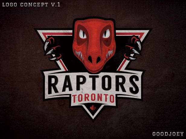
goodjoey wrote:hey so i know that everyone has their ideas, but i've started to take this new logo thing a bit more seriously and have been working on some new ideas the last couple of nights. This is my first version of what i think can be a cool update. Im not thrilled with how the raptor head came out, wish it were more fierce, but again, still just a work in progress. Let me know what you think, and if there are any ideas you think can help make it even better.
Enjoy
jersey designs coming tomorrow:) stay tuned!
Hate it.
Re: Work In Progress - Raps logo update v.1
-
ballislife

- Lead Assistant
- Posts: 4,992
- And1: 2,005
- Joined: Apr 27, 2010
-

Re: Work In Progress - Raps logo update v.1
doogie88 wrote:goodjoey wrote:hey so i know that everyone has their ideas, but i've started to take this new logo thing a bit more seriously and have been working on some new ideas the last couple of nights. This is my first version of what i think can be a cool update. Im not thrilled with how the raptor head came out, wish it were more fierce, but again, still just a work in progress. Let me know what you think, and if there are any ideas you think can help make it even better.
Enjoy
jersey designs coming tomorrow:) stay tuned!
Hate it.
It has potential, but it looks pretty bad... especially because our new team name would be "Raptors Toronto"

Re: Logo Rebrand (Everything Huskies/Raptors) Megathread
-
JustWin
- Bench Warmer
- Posts: 1,414
- And1: 1,930
- Joined: Oct 07, 2012
-
Re: Logo Rebrand (Everything Huskies/Raptors) Megathread
Oh god all these polls show people actually want the Huskies name... I will be VERY disgusted if they actually take that name... ugh!
Re: Work In Progress - Raps logo update v.1
-
doogie88
- Junior
- Posts: 464
- And1: 71
- Joined: Nov 26, 2008
Re: Work In Progress - Raps logo update v.1
ballislife wrote:doogie88 wrote:goodjoey wrote:hey so i know that everyone has their ideas, but i've started to take this new logo thing a bit more seriously and have been working on some new ideas the last couple of nights. This is my first version of what i think can be a cool update. Im not thrilled with how the raptor head came out, wish it were more fierce, but again, still just a work in progress. Let me know what you think, and if there are any ideas you think can help make it even better.
Enjoy
jersey designs coming tomorrow:) stay tuned!
Hate it.
It has potential, but it looks pretty bad... especially because our new team name would be "Raptors Toronto"
lol good point
Makes me think of a cartoon dinosaur coming out to say "Peek a boo!" or "Oh hai!"
Re: How does this Raptors logo stack-up?
-
ruckus

- RealGM
- Posts: 13,628
- And1: 11,359
- Joined: May 18, 2007
- Location: From the Slums of Shaolin...
-
Re: How does this Raptors logo stack-up?
Can anyone with design experience come up with something like this:
Take the current claw logo and replace the middle claw with the CN Tower. Put a circle around it and, in toronto subway font wrapping around the circle, "Toronto Raptors".
Something like this but, much, much nicer...

It keeps the simplicity of the claw but, ties it into the city with the tower and the font.

Re: Logo Rebrand (Everything Huskies/Raptors) Megathread
-
cookieman
- Sixth Man
- Posts: 1,629
- And1: 192
- Joined: Sep 09, 2002
- Location: Muresan's chin
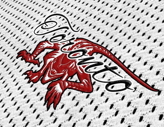
Re: Logo Rebrand (Everything Huskies/Raptors) Megathread
messing around with a tattoo-inspired look. Did a very quick bs version of what it might look like on fabric. I don't hate it but I may be alone. That's ok though, I'm used to it. *cries*


Re: Logo Rebrand (Everything Huskies/Raptors) Megathread
-
JL5
- Bench Warmer
- Posts: 1,328
- And1: 2
- Joined: Apr 07, 2007
-
Re: Logo Rebrand (Everything Huskies/Raptors) Megathread
cookieman wrote:messing around with a tattoo-inspired look. Did a very quick bs version of what it might look like on fabric. I don't hate it but I may be alone. That's ok though, I'm used to it. *cries*
Not really a fan of the font/placement, but definitely a fan of the design of the raptor. I think this is the direction we should be heading in; less cartoony (though I don't see many people complaining about the Hornets/Celtics), much more modern/aggressive.
Kudos!
Re: Huskies Logo Concept
-
Snooch
- Banned User
- Posts: 2,636
- And1: 1,027
- Joined: Mar 14, 2009
Re: Huskies Logo Concept
Ditchweed wrote:Snooch wrote:Ditchweed wrote:
Choosing the Huskies is far worse, it represents failure and racism. A team of whites only that played just one season with a 22-38 record 67 years ago. You can't be serious wanting that name and maybe you need to give your head a shake.
sooooo, now the huskies is a racist name? all of the teams back in the day had all white players. guess they all must be racist too.
that is a pretty bad post, and that is saying something. congratulations.
They were, and when fools like you can't say anything against the argument of point and instead just throw slurs as a response, it just shows you have nothing of relevance to say. If you think that was a bad post that you didn't like, take the following previous made post that says it in full, stuff it up your nostrils, give it a good snort, and really not enjoy it:
MLSE should keep the Raptors name and claw logo, but if MLSE does go for a name change, the Huskies is the last name in the universe they should choose. It is a mark of failure and racism. It is the name of a team from 67 years ago that has no real tradition but rather just one barely played season with a 22-38 losing record, plus, it was also a whites only team from before integration. It would just rebrand the team as suckier looking "junior Timberwolves" failures far worse than anything the Raptors name could portray. As well, since it only has some connotation for local Toronto anachronisms who live in the past, it also slaps in the face and alienates all other Canadian fans. Trying to sell the Huskies as Canada's team would be an abject failure. It is 2013, not 1946, and time for something more appropriate than the Huskies.
guess what, most teams then where white only, so the knicks are a name that represents the same thing. So I stand by my original sentiment that refuting the name huskies due to "racisim" is absurd.
Chuck cooper was the first the first black man signed in the nba in 1950, so teams a that time that were all white included the knicks, lakers, wizzards, 76ers, pistons, bulls, celtics, pacers, hawks and nuggets.
and dont call me a fool, bitch.
Re: Work In Progress - Raps logo update v.1
-
UcanUwill

- RealGM
- Posts: 33,913
- And1: 37,880
- Joined: Aug 07, 2011
-

Re: Work In Progress - Raps logo update v.1
doogie88 wrote:ballislife wrote:doogie88 wrote:
Hate it.
It has potential, but it looks pretty bad... especially because our new team name would be "Raptors Toronto"
lol good point
Makes me think of a cartoon dinosaur coming out to say "Peek a boo!" or "Oh hai!"
Someone nailed it saying it looks like Tim Burton Character. I 100% looks like Tim Burton character, creator had to have this in mind, it cant be a coincidence. That Raptor face has to go, it looks too much unintentionally hilarious. Need something more serious.
Re: Work In Progress - Raps logo update v.1
-
TripleMKE
- Sixth Man
- Posts: 1,927
- And1: 3,342
- Joined: Nov 11, 2012
-
Re: Work In Progress - Raps logo update v.1
goodjoey wrote:hey so i know that everyone has their ideas, but i've started to take this new logo thing a bit more seriously and have been working on some new ideas the last couple of nights. This is my first version of what i think can be a cool update. Im not thrilled with how the raptor head came out, wish it were more fierce, but again, still just a work in progress. Let me know what you think, and if there are any ideas you think can help make it even better.
Enjoy
jersey designs coming tomorrow:) stay tuned!
I really like that layout, not a fan of the dinosaur though. I think that layout with something else would look really good.
Here would be the template...

Re: Logo Rebrand (Everything Huskies/Raptors) Megathread
-
wolfv
- Analyst
- Posts: 3,569
- And1: 2,687
- Joined: May 10, 2010
Re: Logo Rebrand (Everything Huskies/Raptors) Megathread
cookieman wrote:
Hmm, yeah, not bad at all.

That is actually pretty nice
Re: Work In Progress - Raps logo update v.1
-
RoseBeforeHoes
- Pro Prospect
- Posts: 785
- And1: 1,479
- Joined: Nov 15, 2012