GED Education wrote:hankscorpioLA wrote:Something to consider....here a few thoughts....
"this new logo looks like it was made in a rudimentary graphics application on a Franklin by your son’s or daughter’s middle school history teacher for a field trip."
"Nothing about this execution could be called good or professional. "
"This is really really sad."
"I'm thoroughly disappointed by this "rebrand""
"I can appreciate what the designers were tying to do, but sadly, they failed miserably."
"The epitome of missed opportunity."
and so on.
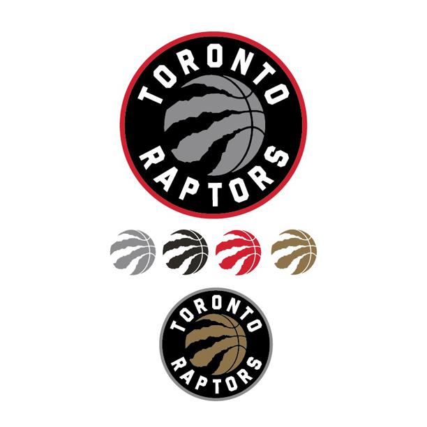
So....do you think we are talking about the Raptors?
Nope.
This is a piece written in 2010 about the new logo of the Golden State Warriors.
 http://www.underconsideration.com/brand ... #.VJSfssA4
That logo is now considered one of the best...or at least better...logos in the league.
THIS!
3 years from now when we're winning an NBA title, you'll love this logo.
Great logo.
that's why i'm inclined to trust the decision of a paid design team rather than a bunch of random fans… the same fans who years ago **** on the purple colour scheme, loved the red, now hate the red and want to bring the purple back… lol… and like i said, it's not even an ugly logo… does it look similar to the nets? yeah… that's the only issue i see with it… and that doesn't bother me that much… from a design perspective it's simple and effective… it's a logo not a freaking website banner… and tbh, i've seen people give compliments to wallpapers and realgm art posted on this board that was not so pleasing aesthetically… and yet, people seemed to really like it… so imo it doesn't really matter what all the fans think, nor should they be allowed to vote on something like a logo… because what they pick will probably end up looking a lot tackier than this one...