NBJ13 wrote:I don't hate it, I think it could be better.
That is basically the way I feel. I think they are on the right track, but this shouldn't be the final design.


Moderators: DG88, niQ, Duffman100, tsherkin, Reeko, lebron stopper, HiJiNX, 7 Footer, Morris_Shatford

NBJ13 wrote:I don't hate it, I think it could be better.


yuckwheat wrote:MixxSRC wrote:yuckwheat wrote:Naming the team the Raptors was a mistake but after that, ok - dinosaur - purple - barney - kind of makes sense ... and now it's part of your established tradition. Red and white - ok Canada, makes sense....
but Black and Gold? because of Drake? really. Just don't go down the route of fads. Be a trendsetter not a follower, at the very least.
Black and gold is not that different.
what color is unique though? It's easy to say be trendsetter but what does it even mean? Logo is wack but designing this **** is not easy
It doesn't have to be that unique but it's upsetting that the black and gold color scheme is brought up because of an association with a douchebag rapper, like what other reason is there for going that route?
If you want to change the colors, at least have it make some sense, like blue and white for obvious reasons or if going completely off the board, something way more radical (I dunno, red, black and green that might scare too many ppl)
the logo itself is just too similar in style to BK's, so it's a little too late to the party. If the plan is to sell more merchandise, I think it will backfire by being a follower rather than a trendsetter (like BK was and Toronto will not be). Bring something with flavor to the table, don't copy cat.
I know it's hard to design, but they could have done a lot better than this. In fact, maintaining the claw would have a been better idea or some take off on the "TR" design. This is just stupid.
MkDon wrote:
This Pelicans logo is also similar to the Nets. Funny how no one said they stole it from Brooklyn.
beanbag wrote:Who the hell cares? It doesn't matter at all! Like the logo, love the logo, hate the logo. Does not matter one bit. Get a life.


CB4Champ wrote:BillyGM wrote:Petitsion
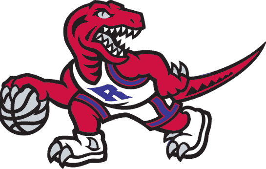
We should bring back the classic
Sigh, Miss You Raptor.


MixxSRC wrote:MkDon wrote:
This Pelicans logo is also similar to the Nets. Funny how no one said they stole it from Brooklyn.
because it's their alt. And they came up with a bunch of alt logos too. They didn't know which one would work


Geddy wrote:I see some of the guys who defended the likes of BC and Bargnani tooth and nail are supporting the logo... coincidence?
It's ok to criticize the team you follow once in a while.
steamed hams wrote:Yeah totally agreed, which is puzzling to why Marvin! and JRG are criticizing anyone who doesn't like the logo and that a design firm's experience and idea is on such a high pedestal that you can't like it. We are the audience. The consumer is US. That's like a chef telling customers to GTFO if they don't like the food, then questioning their tastes and then justifying it by saying "well you can't cook as well as I can, so shut up". You don't need to be a chef to know whether or not you like the food, or a movie director and screenwriter to know whether or not you like a movie.


DonMega wrote:Not sure if I like the gray. Don't want our jerseys resembling bkn at all as I hate that team with a passion. Glad they are trying different color schemes to see fan reaction though.


steamed hams wrote:Turbo_Zone wrote:
Ask yourself what you thought when you first saw it. You don't need a design background to know if it is ugly to you or not.
Logo presentations are sensitive. Whether it's brilliant or horrible, it's almost always met with loud noises from both those who love it and those who dislike it.
Then inevitably, many people convince themselves they like it either because they want to go against the grain or genuinely they just support and love the Raptors so much they have the logos back and start making legal-esque cases for it's benefits.
If you have to argue the merits of a design thoroughly and explain why it's good, it's probably not very good.
When a logo is good, people get talking about why it's good, not pointing out why it isn't bad.
You're allowed to hate this logo if you want. It doesn't mean you hate the Raptors.
Saying they're a "Professional Design Firm" should not give them a pass. As if a corporation has never screwed up a task before. Design firms have insights into branding guides, what's necessary for clothing distribution and other mundane details relevant to the industry; ultimately however, the core of design work remains constant at any level. It starts with an idea, then a draft then a digital build. There are several rounds of revisions and then a final design is agreed upon.
This one was either an unfortunate byproduct of groupthink, a selection from a too-old out-of-touch creative director in a senior role no one wants to challenge, overconfidence from the "WetheNorth" success leading to lazy work, lack of creative vision among the staff or just an inevitable statistical "miss" by Sid Lee who, lest we are blinded by Apple monitors and lattes, are just a group of humans after all capable of error.
To me, this design is generally flimsy, weaker than the last, the claw mark is poorly communicated, limp and not clear; and aesthetically unpleasant to the eye. It is neither elegantly simple nor brash and exciting. Instead it walks the middle line between both, getting the benefits of neither. There is no exciting admiration of opening a new design frontier nor calm quiet confidence that comes with a simple sleek look.
In its current state, this is one of the worst logos I've ever seen in sports, and unbefitting a team of our calibre.
I sincerely hope this is reconsidered.
Yeah totally agreed, which is puzzling to why Marvin! and JRG are criticizing anyone who doesn't like the logo and that a design firm's experience and idea is on such a high pedestal that you can't like it. We are the audience. The consumer is US. That's like a chef telling customers to GTFO if they don't like the food, then questioning their tastes and then justifying it by saying "well you can't cook as well as I can, so shut up". You don't need to be a chef to know whether or not you like the food, or a movie director and screenwriter to know whether or not you like a movie.


Jer15Jer wrote:sh00n wrote:Marvin! wrote:you all crack me up... seriously you do.
i've seen more pathetic responses to this than anything since tj vs jose
it's a good logo. not a great one but a good one.
the colours works together. the claw ties the old to the new. personally i would have extended the claw marks to more than half way up the ball but that's a small tickey tack thing.
to the people acting like this is the end of the world, you need to get some perspective on life. it's a basketball team logo - seriously. there are more important things in life
Agreed.
And to be honest, I like it more every time I see it. I really think if they take away the circle around it, it would be perfect. There would've been way less people comparing it to Brooklyn's logo had they not had the circle and it wasn't black and white in the first post.
This.
Good design takes time to appreciate. It's a good logo. And the basketball icon on it's own is the best part. That's the hat I'm going to buy.
I used to work at Sid Lee. I've seen the jerseys. They're great as well. The colours work perfectly together.
Purple was explored as well and originally presented. But in the end black and gold prevailed.
MEDIC wrote:DonMega wrote:Not sure if I like the gray. Don't want our jerseys resembling bkn at all as I hate that team with a passion. Glad they are trying different color schemes to see fan reaction though.
Yeah, that is why I am suggesting they make the ball the gold colour to make it a little more unique.
Most people seem to love those Canada hockey jerseys. I think that colour scheme is a huge winner.


J-Roc wrote:DUNPHY wrote:That Brooklyn logo is actually terrible... A big B? .... At least ours incorporates our name into the sport..
Brooklyn just slapped a B onto a basketball lol
The Brooklyn logo might not be overly creative, but they created a timeless logo. That B could be around for fifty years.
FWIW I think that's what the Raps are going for. So get used to it.
OAKLEY_2 wrote:beanbag wrote:Who the hell cares? It doesn't matter at all! Like the logo, love the logo, hate the logo. Does not matter one bit. Get a life.
It matters. It is rebranding. But how are you ever going to have a tradition if the marketing folks are always second guessing themselves? It's like watching an ad with retro 80's glam music and then Galen Weston appears out of nowhere with prep pullover from college and then he makes his bookend President's Choice pitch. Who comes up with this sht?
CB4real wrote:Jer15Jer wrote:sh00n wrote:Agreed.
And to be honest, I like it more every time I see it. I really think if they take away the circle around it, it would be perfect. There would've been way less people comparing it to Brooklyn's logo had they not had the circle and it wasn't black and white in the first post.
This.
Good design takes time to appreciate. It's a good logo. And the basketball icon on it's own is the best part. That's the hat I'm going to buy.
I used to work at Sid Lee. I've seen the jerseys. They're great as well. The colours work perfectly together.
Purple was explored as well and originally presented. But in the end black and gold prevailed.
Can you give us some details as to how they look? Is it a retro look, a modern look, primary colors for the home and away?
MkDon wrote:When i heard Drake was gonna be included in the re brand process i was happy because i know he likes the original Raptors with purple. So i always thought there would be a little amount of purple in the new logo that can really make it stand out. I can't understand how the new logo has the same colors as our actual when they said we will be getting something new. Red, black and silver is not new!
Purple goes well with silver, red and gold. Using it, will give original yet modern vibe to the new logo which i personally think it looks good. Just add some purple.