louieOrr wrote:Yep our logo is great. This is the logo dude though we should go with...
is this guy serious?
/cdn0.vox-cdn.com/uploads/chorus_image/image/16781/knicks_color_comp_a_cropped.jpg)
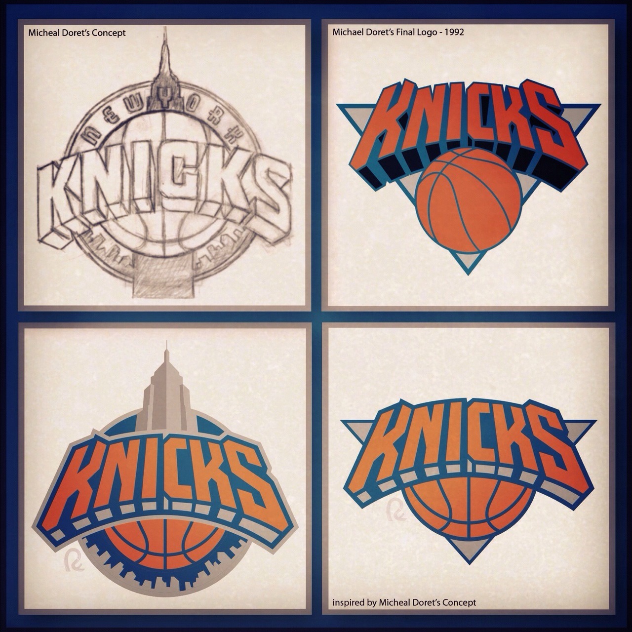
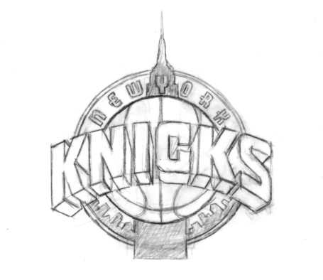
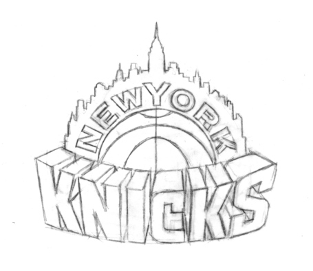
No. It's this logo that was the Empire State Building logo concept that was nixed, according to everything I've read:


Moderators: HerSports85, NoLayupRule, GONYK, Jeff Van Gully, dakomish23, Deeeez Knicks, mpharris36, j4remi

louieOrr wrote:Yep our logo is great. This is the logo dude though we should go with...
is this guy serious?


SelbyCobra wrote:louieOrr wrote:Yep our logo is great. This is the logo dude though we should go with...
is this guy serious?
No. It's this logo that was the Empire State Building logo concept that was nixed, according to everything I've read:


King of Canada wrote:Our logo is one of the absolute best. You want to know why? Because people recognize it. We aren't trying to market trinkets to teenie boppers here. We are talking about brand recognition for one of the most valuable franchises in sports.
GONYK wrote:

moocow007 wrote:King of Canada wrote:Our logo is one of the absolute best. You want to know why? Because people recognize it. We aren't trying to market trinkets to teenie boppers here. We are talking about brand recognition for one of the most valuable franchises in sports.
Hillary Clinton and Oprah Winfrey are two of the most recognized female faces on the planet and I wouldn't say either are raving beauties. Much like Clinton and Winfrey are recognized because they've been around seemingly forever doesn't mean they are necessarily the best classical representations of the female form. Name wise, sure, that's a different story (just like how he had the Knicks name itself high on the list).
King of Canada wrote:moocow007 wrote:King of Canada wrote:Our logo is one of the absolute best. You want to know why? Because people recognize it. We aren't trying to market trinkets to teenie boppers here. We are talking about brand recognition for one of the most valuable franchises in sports.
Hillary Clinton and Oprah Winfrey are two of the most recognized female faces on the planet and I wouldn't say either are raving beauties. Much like Clinton and Winfrey are recognized because they've been around seemingly forever doesn't mean they are necessarily the best classical representations of the female form. Name wise, sure, that's a different story (just like how he had the Knicks name itself high on the list).
But what is the point of a logo? Changing the logo to be more "hip" is akin to hiring the Black Eyed Peas to perform at every single NBA event to try to get more tweens to watch the NBA. I like classic logos, and the Knicks logo is very strongly identified. Is it really any different than the Yankees, McDonalds, Coca Cola, Heinz, etc....? Some of the other NBA logos look like they belong to a roller derby team. I'm fine with keeping it as is?
King of Canada wrote:Are you guys saying we need Drake to help us design new logos?


moocow007 wrote:King of Canada wrote:Our logo is one of the absolute best. You want to know why? Because people recognize it. We aren't trying to market trinkets to teenie boppers here. We are talking about brand recognition for one of the most valuable franchises in sports.
Hillary Clinton and Oprah Winfrey are two of the most recognized female faces on the planet and I wouldn't say either are raving beauties. Much like Clinton and Winfrey are recognized because they've been around seemingly forever doesn't mean they are necessarily the best classical representations of the female form. Name wise, sure, that's a different story (just like how he had the Knicks name itself high on the list).


moocow007 wrote:I've been a fan of the Knicks since the early 70's and never liked the logo. Ever. Let's put it this way, if I were picking teams based purely on logo, the Knicks would be at the bottom of the pile. Honestly. It looks like something that a semi disinterested 16 year old put together in art class.
Here's the 2015-2016 official NBA logos for each team (several teams sporting new designs).
[img]http://i61.tinypic.com/2wbynnr.jpg[/img
Try hard to imagine that you don't know that the Knicks logo is the logo of the team that you love. What order would you put the logos in in (best being 1 and worst being 30)? Please also try to force yourself not to hate on logo's of specific teams that Knick fans just have a problem with and/or dislike (i.e. Raptors, Nets, Heat, etc.). Honestly.
Team logos at the bottom IMO? Heat, Knicks, Lakers, Blazers and (probably) Bulls. The one's that basically haven't been touched or "modernized" in decades.

JohnStarksTheDunk wrote:kfig5 wrote:
I honestly think they should have used the bottom left logo, and added NEW YORK to the top of the wordmark.
Agreed. And it would look good even without the empire state building in it.


GONYK wrote:
kfig5 wrote:
I honestly think they should have used the bottom left logo, and added NEW YORK to the top of the wordmark.