Dirkbaka wrote:Why does anyone on this board care about some guy ranking logos of all things? Someone give me the tour already ....
It's the internet! It's only here for two things, and the other one is arguing about stuff.


Moderators: HerSports85, NoLayupRule, GONYK, Jeff Van Gully, dakomish23, Deeeez Knicks, mpharris36, j4remi


Dirkbaka wrote:Why does anyone on this board care about some guy ranking logos of all things? Someone give me the tour already ....


kfig5 wrote:
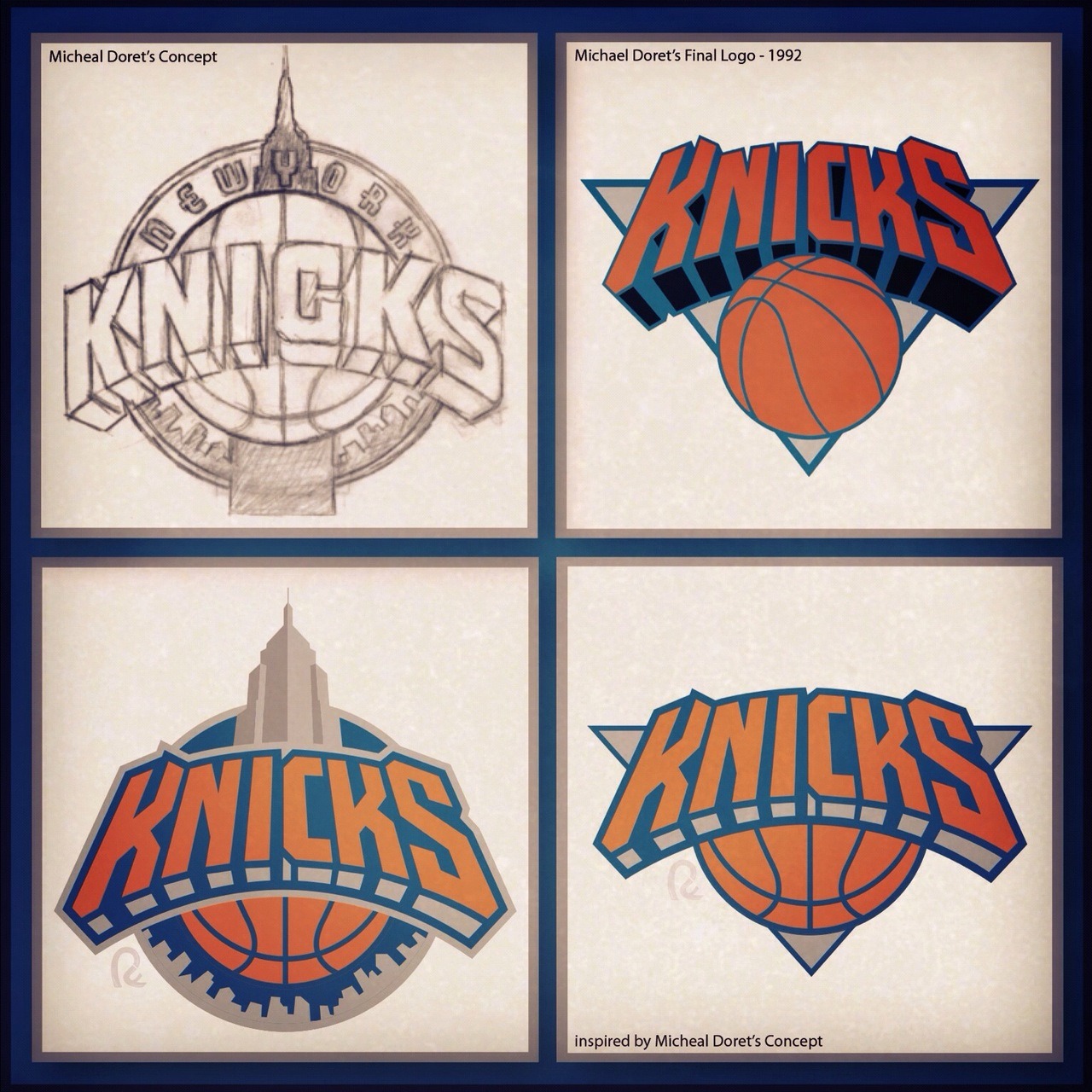
I honestly think they should have used the bottom left logo, and added NEW YORK to the top of the wordmark.


moocow007 wrote:I've been a fan of the Knicks since the early 70's and never liked the logo. Ever. Let's put it this way, if I were picking teams based purely on logo, the Knicks would be at the bottom of the pile. Honestly. It looks like something that a semi disinterested 16 year old put together in art class.
Here's the 2015-2016 official NBA logos for each team (several teams sporting new designs).
Try hard to imagine that you don't know that the Knicks logo is the logo of the team that you love. What order would you put the logos in in (best being 1 and worst being 30)? Please also try to force yourself not to hate on logo's of specific teams that Knick fans just have a problem with and/or dislike (i.e. Raptors, Nets, Heat, etc.). Honestly.
Team logos at the bottom IMO? Heat, Knicks, Lakers, Blazers and (probably) Bulls. The one's that basically haven't been touched or "modernized" in decades.


X-Man Cometh wrote:I think the biggest problem with our logo is the lack of a defined shape.
Maybe a lack of harmony between the triangle in the back and the shape o the letters.
I'd personally like a circular logo, like the Hawks or 76ers, using the Empire State theme.
Enviado do meu iPhone usando o RealGM Forums


El Poochio wrote:I didnt read that shİt but I think our name, colours, and our logo have been the best part of our team for some time now

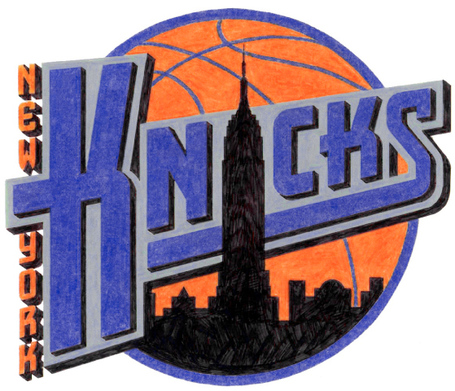


JohnStarksTheDunk wrote:Not sure if anyone has seen this fan-designed concept:
The bottom of the building looks weird, but lining up the letter "i" with Central Park is pretty clever. However, it's probably not a good idea to use the shape of Manhattan in a logo, after the Nets kept trying to represent us only as the Manhattan Knicks.
Entire branding/concept here, with more pics:
https://www.behance.net/gallery/21976791/New-York-Knicks-identity-concept


moocow007 wrote:JohnStarksTheDunk wrote:Not sure if anyone has seen this fan-designed concept:
The bottom of the building looks weird, but lining up the letter "i" with Central Park is pretty clever. However, it's probably not a good idea to use the shape of Manhattan in a logo, after the Nets kept trying to represent us only as the Manhattan Knicks.
Entire branding/concept here, with more pics:
https://www.behance.net/gallery/21976791/New-York-Knicks-identity-concept
Not a fan of the idea of combining the silhouettes of the empire state building and the island of Manhattan. Makes it looks like some weird combination of a syringe and an erect penis. The Knicks are supposed to represent NYC, not just Manhattan so having that shape there is limiting. It almost would be better to just keep everything else and drop the building/island "thing". The design has the looks of a minimalistic approach...so might as well go full minimal and just have the basketball and the words New York Knicks.
GONYK wrote:moocow007 wrote:JohnStarksTheDunk wrote:Not sure if anyone has seen this fan-designed concept:
The bottom of the building looks weird, but lining up the letter "i" with Central Park is pretty clever. However, it's probably not a good idea to use the shape of Manhattan in a logo, after the Nets kept trying to represent us only as the Manhattan Knicks.
Entire branding/concept here, with more pics:
https://www.behance.net/gallery/21976791/New-York-Knicks-identity-concept
Not a fan of the idea of combining the silhouettes of the empire state building and the island of Manhattan. Makes it looks like some weird combination of a syringe and an erect penis. The Knicks are supposed to represent NYC, not just Manhattan so having that shape there is limiting. It almost would be better to just keep everything else and drop the building/island "thing". The design has the looks of a minimalistic approach...so might as well go full minimal and just have the basketball and the words New York Knicks.
That is EXACTLY what I thought
moocow007 wrote:What makes any logo concept difficult to do is that the word "Knicks" is a shortened version of the word "Knickerbockers" (which is what the team was called originally). A "Knickerbocker" is basically a style of pants worn by (mostly) Dutch settlers which ends right below the knees. Similar styles of a "knickerbocker" was popular in the 1920's, especially in golf (and that some baseball players nowadays sport).
So a logo based on a pair of pants would be very difficult. Even if someone can come up with a visually pleasing design, the notion of a team logo based on a pair of pants probably won't go off well in terms of marketing to the usual age range that feeds the merchandising beast.
NOTE: Even though the Knicks weren't named after a style of pants (I believe they were named after a rather famous baseball team in NY from the 1850's who themselves were named after the engine company that one of the founders of the team respected) it's just not a easy thing to base a logo off of.


Guano wrote:Fourni3r forgetting he has Bob cousy handles
Woodsanity wrote:Imagine trusting a team with World B Flat on it without Lebron keeping him in check.
