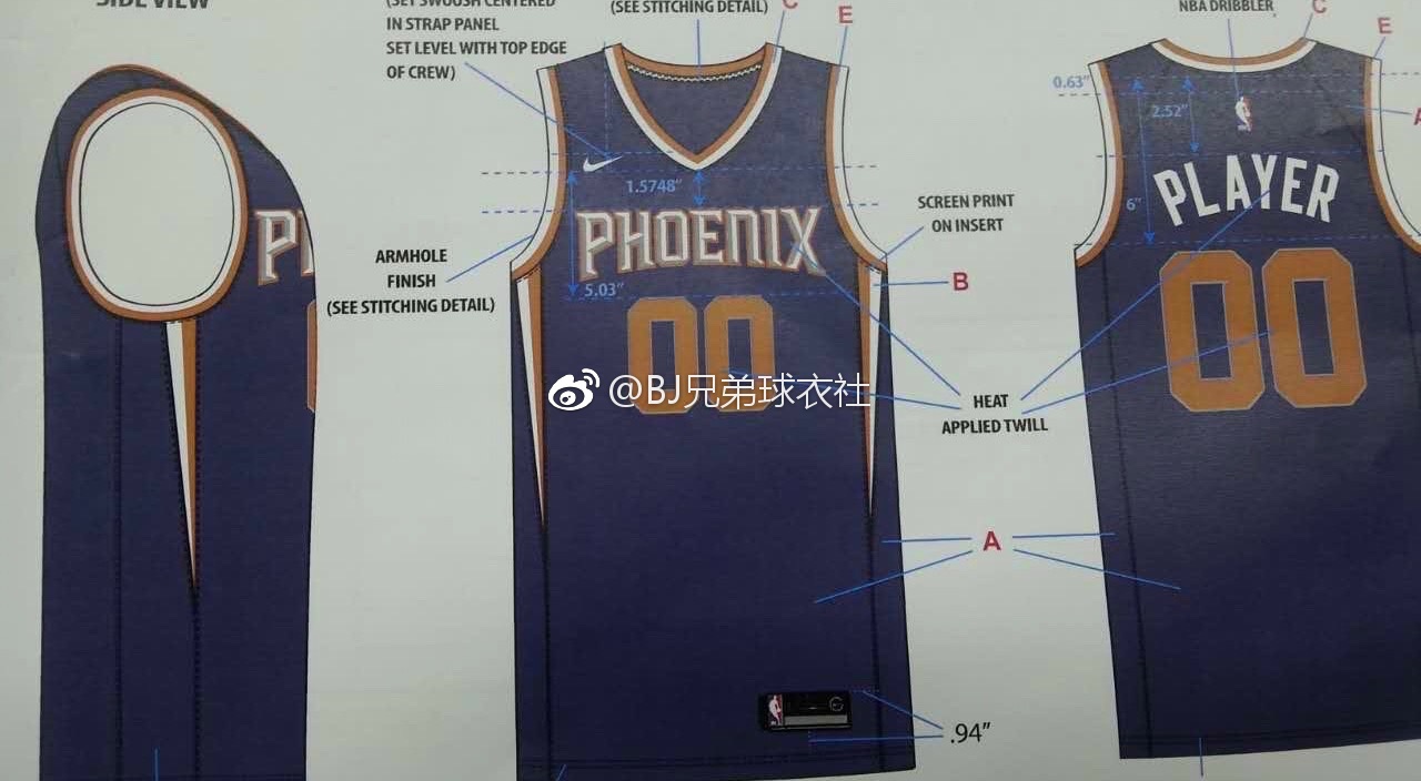
The leaked Canadian version of 2K18 has Derozan on the cover....wearing the exact jersey that was published in the same catalog right next to the Suns one.


Moderators: bwgood77, lilfishi22, Qwigglez


1UPZ wrote:Looks like Knicks jersey if you squint your eyes... That white orange next to each other is so not suns in my eyes... Black Orange Purple Grey White in that order of sequence looks Suns ish

1UPZ wrote:Looks like Knicks jersey if you squint your eyes... That white orange next to each other is so not suns in my eyes... Black Orange Purple Grey White in that order of sequence looks Suns ish


Scubetrolis wrote:Our jerseys always frustrate me. Our 90s jerseys are one of the best jerseys of all time, just go back to those. The ones we have now are fine..but these look so boring

Kerrsed wrote:
Sreister wrote:Kerrsed wrote:
That looks better than the potato pictures we've seen so far. I feel like they just can't get it right yet. The slanted top from last years top needs to go along with the shorts of these new Nike ones.
That being said, I don't HATE them. But it's not right yet. Love the shorts though, might have to get a pair.
Kerrsed wrote:

sunsbum wrote:gross. those jerseys are awful. The short bands look like ****. The other ones leaked are way better.
Jdiddy701 wrote:sunsbum wrote:gross. those jerseys are awful. The short bands look like ****. The other ones leaked are way better.
Most Nike jerseys have short bands, which is nice, in my opinion. Nash era jerseys with the thick bands were disgusting. Happy Nike is back!
Sent from my iPhone using RealGM mobile app


