


2017/2018 Jerseys
Moderators: bwgood77, lilfishi22, Qwigglez

Re: New Jersey?
-
ATTL

- Retired Mod

- Posts: 16,624
- And1: 8,483
- Joined: Aug 24, 2003
- Location: Moms basement
-


Re: New Jersey?
-
sunsbum

- Lead Assistant
- Posts: 4,539
- And1: 5,396
- Joined: May 16, 2007
- Location: Portland
-


Re: New Jersey?
Looking at what I've seen from the rest of the league, I really like them. So far I'd put ours and the wolves as the best in terms of new design. I will admit though, overall the league is at an all time low in jersey creativity. I've seen tens of millions of better mock ups just on the suns boards alone that are better than what gets out there.
"Mannnnn I’m like the guy that pissed this whole board off saying literally all year no Mikal, no Mikal in the KD trade."
Re: New Jersey?
-
bwgood77

- Global Mod

- Posts: 98,137
- And1: 61,000
- Joined: Feb 06, 2009
- Location: Austin
- Contact:
-


Re: New Jersey?
The middle purple one looks nice there. Much better than the picture with JJ wearing 22. Much brighter better purple and orange. I don't like the faded look in the JJ pic.
Thought that purple one looks a little different in the video too.
Re: New Jersey?
-
thamadkant

- Suns Forum Picker of Cherries
- Posts: 16,916
- And1: 8,599
- Joined: Jan 06, 2007
-
Re: New Jersey?
The old school one at the end is GREAT!
Now they need the Black 93 version modernized.
Re: New Jersey?
-
thamadkant
- Suns Forum Picker of Cherries
- Posts: 16,916
- And1: 8,599
- Joined: Jan 06, 2007
-
Re: New Jersey?
The ones released on Suns.com...
I like the styling as in the side sweeping shapes and the short sun rays, but the "SUNS" font is too close together... up close the SUNS and PHOENIX logos look nice with the multi colors and detail in them... but far away, the words become cluttered together.
More spacing or remove the outlines to improve contrast of the label logos from the background.
Re: New Jersey?
-
ATTL
- Retired Mod
- Posts: 16,624
- And1: 8,483
- Joined: Aug 24, 2003
- Location: Moms basement
-
Re: New Jersey?
I was going through the released jerseys for all teams, so far only the warriors have a logo on their jersey? Why are they making everyone look the same except for colors?
Re: New Jersey?
-
sunsbum
- Lead Assistant
- Posts: 4,539
- And1: 5,396
- Joined: May 16, 2007
- Location: Portland
-
Re: New Jersey?
ATTL wrote:I was going through the released jerseys for all teams, so far only the warriors have a logo on their jersey? Why are they making everyone look the same except for colors?
I think they are going for the euro look for some reason. I hate it.
"Mannnnn I’m like the guy that pissed this whole board off saying literally all year no Mikal, no Mikal in the KD trade."
Re: New Jersey?
-
pepperdinedevil
- Freshman
- Posts: 50
- And1: 5
- Joined: Jun 23, 2009
Re: New Jersey?
ATTL wrote:I was going through the released jerseys for all teams, so far only the warriors have a logo on their jersey? Why are they making everyone look the same except for colors?
People keep saying this and I don't get it at all. Outside of the Dubs and Jazz, what teams previously had logos on the chest of their primary jerseys? Third and fourth sets of some teams had them, but beyond that I don't really know what the fuss is about. It's like people have been looking at wild fan concepts all offseason and have forgotten what jerseys actually looked like prior to Nike.
Re: New Jersey?
-
Kerrsed

- Retired Mod
- Posts: 29,876
- And1: 16,578
- Joined: Mar 31, 2009
- Location: Land of the Internet Memes
- Contact:
-

Re: New Jersey?
bwgood77 wrote:
The middle purple one looks nice there. Much better than the picture with JJ wearing 22. Much brighter better purple and orange. I don't like the faded look in the JJ pic.
Thought that purple one looks a little different in the video too.
Its because those are the fan made ones that were released over the past few days. Look at the shorts.
Its #DUMPSTERFIRE SEASON! #TeamTRAINWRECK -KERRSED- The Mod, The Myth, The Legend

Re: New Jersey?
-
sunskerr

- General Manager
- Posts: 9,758
- And1: 5,962
- Joined: Feb 20, 2010
-
Re: New Jersey?
I really liked how the last ones were modernized versions of our 90s jerseys. So, given that these are like an updated Nash-era jersey, I also like it. That being said, these newest ones are very plain and there's nothing unique at all going on with them. The previous one had some character with the slanted words and sun streaks.
I feel like these jerseys should have been revealed a few years later, since we barely got to get used to our previous ones. Perhaps when we've begun to make the playoffs would have been better timing. Then it becomes sort of a call back to our most recent era of relevance (the Nash years) and sort of a "do one better/redeem the Nash Suns" uniform.
I feel like these jerseys should have been revealed a few years later, since we barely got to get used to our previous ones. Perhaps when we've begun to make the playoffs would have been better timing. Then it becomes sort of a call back to our most recent era of relevance (the Nash years) and sort of a "do one better/redeem the Nash Suns" uniform.
Re: New Jersey?
-
Kerrsed
- Retired Mod
- Posts: 29,876
- And1: 16,578
- Joined: Mar 31, 2009
- Location: Land of the Internet Memes
- Contact:
-
Re: New Jersey?
I think our last uniforms set a record for quickest time in-between redesigns. They only lasted what, 2 seasons? Im going to try to buy a few, as those "Throwbacks" will be worth a lot of money someday.
Its #DUMPSTERFIRE SEASON! #TeamTRAINWRECK -KERRSED- The Mod, The Myth, The Legend
Re: New Jersey?
-
TASTIC

- Retired Mod
- Posts: 18,414
- And1: 2,426
- Joined: May 17, 2004
- Location: New Zealand
-

Re: New Jersey?
I like them.
They're better than what we have, which I'm fine with.
That weird shoulder-blade thing though...that's weird and seems like change for change's sake...
They're better than what we have, which I'm fine with.
That weird shoulder-blade thing though...that's weird and seems like change for change's sake...
Re: New Jersey?
-
Kerrsed
- Retired Mod
- Posts: 29,876
- And1: 16,578
- Joined: Mar 31, 2009
- Location: Land of the Internet Memes
- Contact:
-
Re: New Jersey?
TASTIC wrote:I like them.
They're better than what we have, which I'm fine with.
That weird shoulder-blade thing though...that's weird and seems like change for change's sake...
Its supposed to add greater room for full shoulder rotation. Looks like it would, less restrictive.
Its #DUMPSTERFIRE SEASON! #TeamTRAINWRECK -KERRSED- The Mod, The Myth, The Legend
Re: New Jersey?
-
jeff2020
- Senior
- Posts: 664
- And1: 350
- Joined: Feb 21, 2015
-


Re: New Jersey?
Just bring back the white, purple and black jerseys from the Barkley, kj, majerle era Suns and everyone is happy. These new Nike jerseys are terrible. I could have designed those. No creativity what so ever.
Re: New Jersey?
-
ShawnBronald

- Sixth Man
- Posts: 1,955
- And1: 365
- Joined: Feb 16, 2009
Re: New Jersey?
sunskerr wrote:I really liked how the last ones were modernized versions of our 90s jerseys. So, given that these are like an updated Nash-era jersey, I also like it. That being said, these newest ones are very plain and there's nothing unique at all going on with them. The previous one had some character with the slanted words and sun streaks.
I feel like these jerseys should have been revealed a few years later, since we barely got to get used to our previous ones. Perhaps when we've begun to make the playoffs would have been better timing. Then it becomes sort of a call back to our most recent era of relevance (the Nash years) and sort of a "do one better/redeem the Nash Suns" uniform.
I'd say these are more of an updated 1968-1991 jersey. They really don't resemble the Nash-era jerseys at all.


V.S.

jeff2020 wrote:Just bring back the white, purple and black jerseys from the Barkley, kj, majerle era Suns and everyone is happy. These new Nike jerseys are terrible. I could have designed those. No creativity what so ever.
Wouldn't bringing back an old jersey also show no creativity?
Re: New Jersey?
-
jeff2020
- Senior
- Posts: 664
- And1: 350
- Joined: Feb 21, 2015
-
Re: New Jersey?
ShawnBronald wrote:sunskerr wrote:I really liked how the last ones were modernized versions of our 90s jerseys. So, given that these are like an updated Nash-era jersey, I also like it. That being said, these newest ones are very plain and there's nothing unique at all going on with them. The previous one had some character with the slanted words and sun streaks.
I feel like these jerseys should have been revealed a few years later, since we barely got to get used to our previous ones. Perhaps when we've begun to make the playoffs would have been better timing. Then it becomes sort of a call back to our most recent era of relevance (the Nash years) and sort of a "do one better/redeem the Nash Suns" uniform.
I'd say these are more of an updated 1968-1991 jersey. They really don't resemble the Nash-era jerseys at all.
V.S.jeff2020 wrote:Just bring back the white, purple and black jerseys from the Barkley, kj, majerle era Suns and everyone is happy. These new Nike jerseys are terrible. I could have designed those. No creativity what so ever.
Wouldn't bringing back an old jersey also show no creativity?
Haha fair point. I guess what I'm saying is I wish we never changed. Some things just can't be improved and those 90s Barkley era suns jerseys can't be. Best jersey of all time in my opinion
Re: New Jersey?
-
sunskerr
- General Manager
- Posts: 9,758
- And1: 5,962
- Joined: Feb 20, 2010
-
Re: New Jersey?
ShawnBronald wrote:sunskerr wrote:I really liked how the last ones were modernized versions of our 90s jerseys. So, given that these are like an updated Nash-era jersey, I also like it. That being said, these newest ones are very plain and there's nothing unique at all going on with them. The previous one had some character with the slanted words and sun streaks.
I feel like these jerseys should have been revealed a few years later, since we barely got to get used to our previous ones. Perhaps when we've begun to make the playoffs would have been better timing. Then it becomes sort of a call back to our most recent era of relevance (the Nash years) and sort of a "do one better/redeem the Nash Suns" uniform.
I'd say these are more of an updated 1968-1991 jersey. They really don't resemble the Nash-era jerseys at all.
Although saying they don't resemble the Nash jerseys at all is quite the exaggeration, yeah they definitely have a resemblance to those older jerseys.
Re: New Jersey?
-
ShawnBronald
- Sixth Man
- Posts: 1,955
- And1: 365
- Joined: Feb 16, 2009
Re: New Jersey?
sunskerr wrote:ShawnBronald wrote:sunskerr wrote:I really liked how the last ones were modernized versions of our 90s jerseys. So, given that these are like an updated Nash-era jersey, I also like it. That being said, these newest ones are very plain and there's nothing unique at all going on with them. The previous one had some character with the slanted words and sun streaks.
I feel like these jerseys should have been revealed a few years later, since we barely got to get used to our previous ones. Perhaps when we've begun to make the playoffs would have been better timing. Then it becomes sort of a call back to our most recent era of relevance (the Nash years) and sort of a "do one better/redeem the Nash Suns" uniform.
I'd say these are more of an updated 1968-1991 jersey. They really don't resemble the Nash-era jerseys at all.
Although saying they don't resemble the Nash jerseys at all is quite the exaggeration, yeah they definitely have a resemblance to those older jerseys.
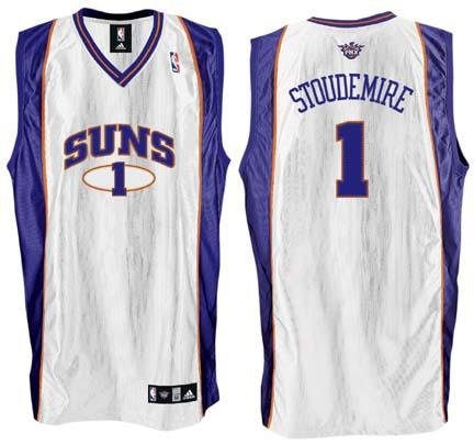
Other than them both being Suns' jerseys that include the team's name, player's name and a number, I honestly don't see a resemblance to the Nash-era jerseys. The collar stripes are nothing alike, the number on the Nash-era jersey has a ring around it, there's a large gray area going down the sides and the name/number colors are all the same. Out of curiosity, what about the two jerseys are similar to you?
Re: New Jersey?
-
DaleyBlind
- Veteran
- Posts: 2,646
- And1: 1,832
- Joined: Oct 11, 2014
- Location: Sydney
-


Re: New Jersey?
At certain angles I like them, but at other angles they look disgusting. Think the number is too big as well