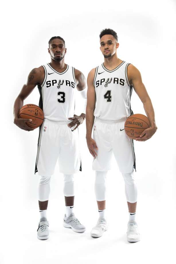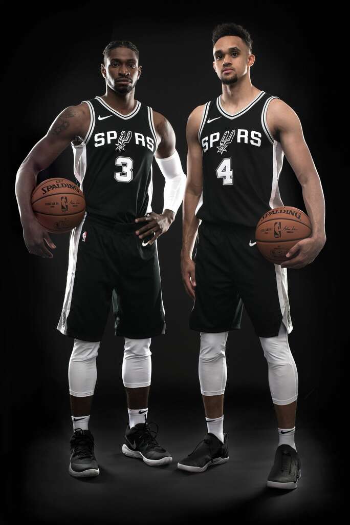

No real drastic changes (as expected) it's still clean, simple and still one of the best in the league in my opinion.
Moderator: G R E Y


@bruce_arthur "And finally, as a whore." RT @docfunk "Here is what LeBron looks like as a Knick, a Fireman, an Astronaut..."


UDRIH14 wrote:i hate the nike logo, when u look at the jersey..the nike logo stands out more then the team name logo on the shirt...
then u have the stupid logos on the waistline...i would move it to the corner towards the knees...
as for the spur logo on top of the number, whether thats bad photoshop skills, that needs to be aligned properly cause the spur logo is not lined up in the middle with the number...
everybody knows its nike jerseys, why they have to make it too obvious?
@bruce_arthur "And finally, as a whore." RT @docfunk "Here is what LeBron looks like as a Knick, a Fireman, an Astronaut..."


