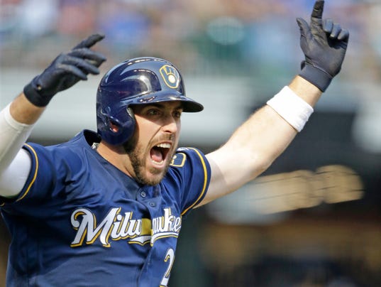


First, what happened to the ball and glove/dark blue uniforms they wore the past two years? In 2016, they wore them 91 times (which was great), but last year they wore them only 30 times. They've yet to wear them this year.
So, what's the deal? Remember, these are the only unis that have "Milwaukee" across the chest instead of "Brewers." Not to mention that they just look better. I've never been a fan of the glittery gold trim on the normal jerseys, so the dark blue and YELLOW trim is way more aesthetically pleasing, as far as I'm concerned. And of course the ball and glove logo is simply leaps and bounds better than the generic "M" logo. So again, why are they using this jersey/hat combination less and less?
Also, while I'm thankful I've seen less of (and hopefully the last of) that god awful gold jersey they used to run out there quite often, I must say I miss the old school royal blue jerseys and ball/glove hats with yellow faceplates. They didn't use these very often (and not at all last year), but I loved them. Traditional team colors that just popped on-screen, and I would imagine in-person as well. They used them in 2014 and 2016 and that's it.
Here are the two uniforms I'm speaking of....