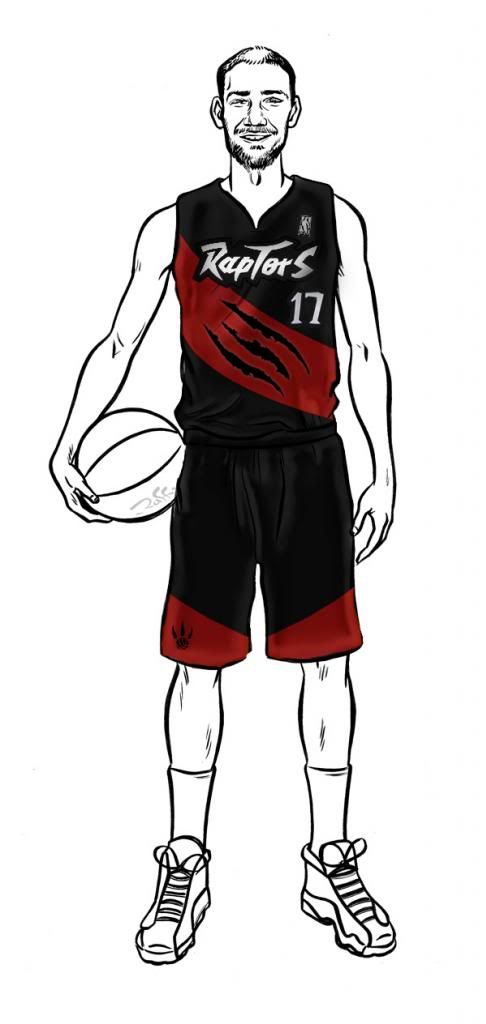
Here are some thoughts:
- Maybe try a couple more fonts for the name and number
- Try the number in a white outline
- The kerning on Toronto feels a little too tight. I would give it a bit of breathing room.
- I like how the head of the raptor sneeks in there. Try and see if you can do a bit of a customized wordmark between the name and that logo. For example: The bottom left side of the head and neck don't feel necessary, the head coming over the type is really the cool part. Try moving the icon more to the right so it sits somewhere above the 'OR' and don't let it peak through the letters at the bottom, just try the head alone (with a bit of the neck next to it) peeking over the type. The little pieces that sneak through the bottom make it look messy.
- Did you design/create the white one? If you did I would mimic how the logo was treated on the shorts, and go with just the type as is for "TORONTO'. If you didn't... you shouldn't be copying it at all

love the logo