


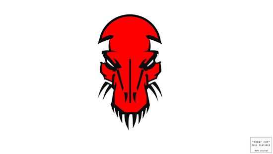
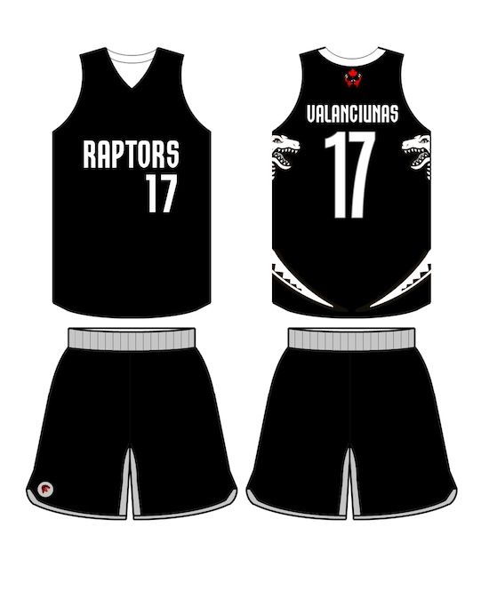
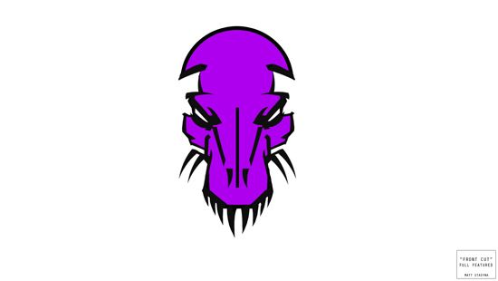
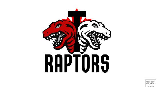
Just wanted to share some early logo concepts I had.
This is just a first draft from my first session and I'll be doing more custom Husky/Raptor drawings whenever I have free time coming up.
(When I'm done I'll drop them in this thread)
I'm not married to any of these, but just wanted to throw them out into the community for a new perspective to the team's colours.
Like 'em, hate 'em, take a look!
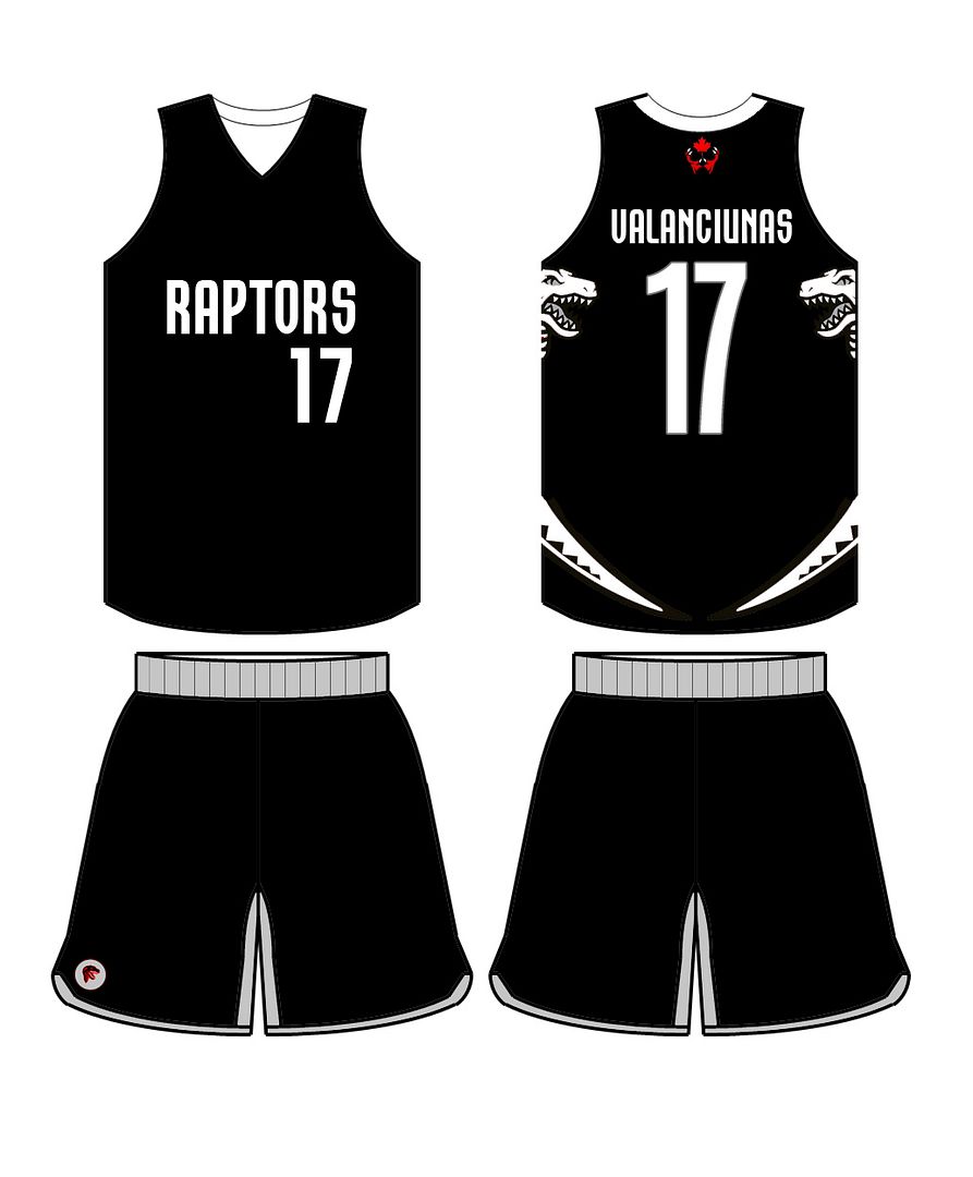
XL: http://imageshack.us/a/img37/2206/fierc ... ptfull.jpg
XL: http://i750.photobucket.com/albums/xx14 ... aptors.jpg
XL: http://imageshack.us/a/img24/85/fiercer ... ptpurp.jpg

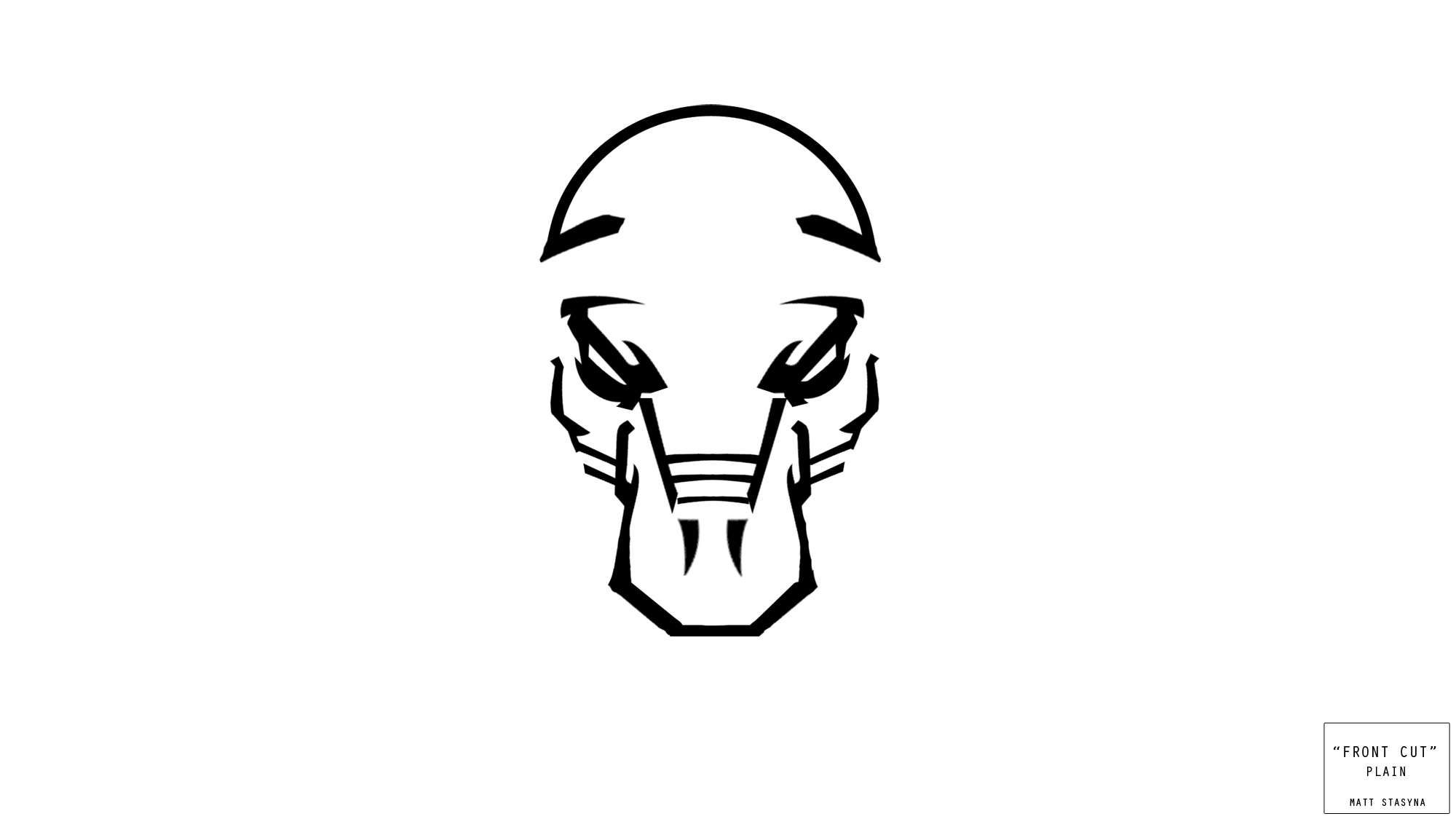
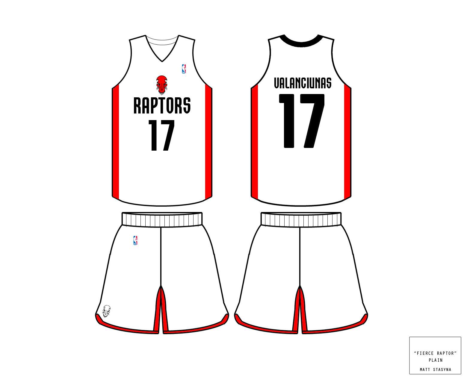
XL: http://imageshack.us/a/img593/8938/frontcutplain.jpg
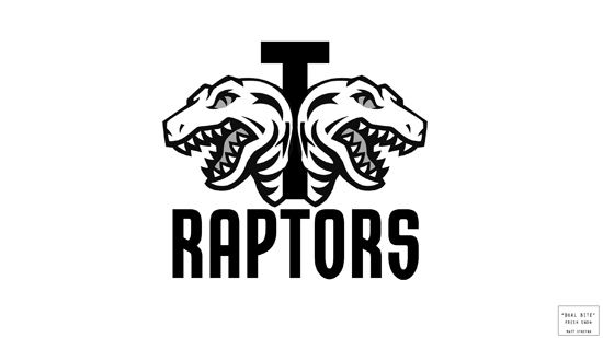
XL: http://imageshack.us/a/img850/664/dualb ... atured.jpg
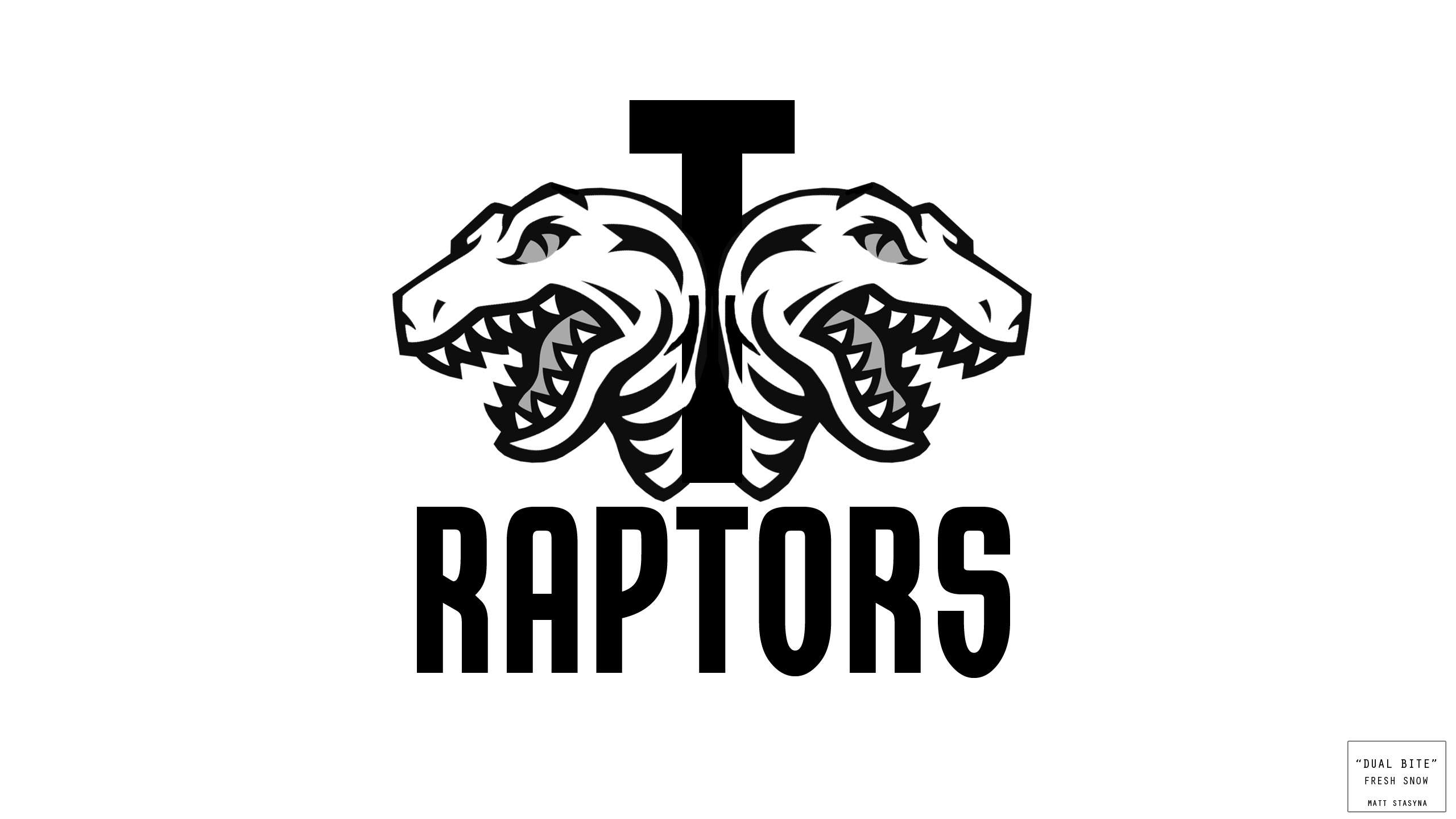
XL: http://imageshack.us/a/img822/9633/dual ... shsnow.jpg
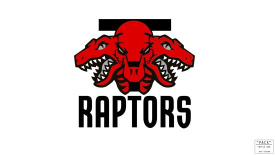
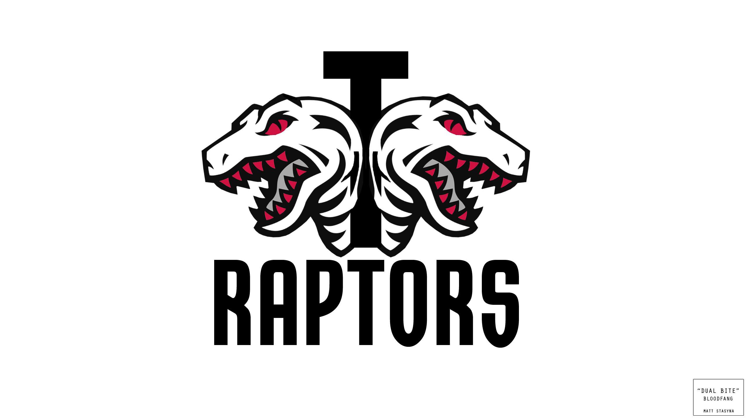
XL: http://imageshack.us/a/img580/9627/trip ... plered.jpg
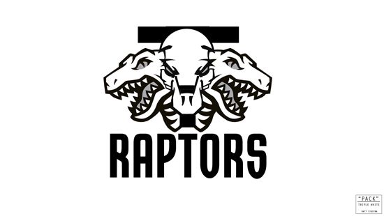
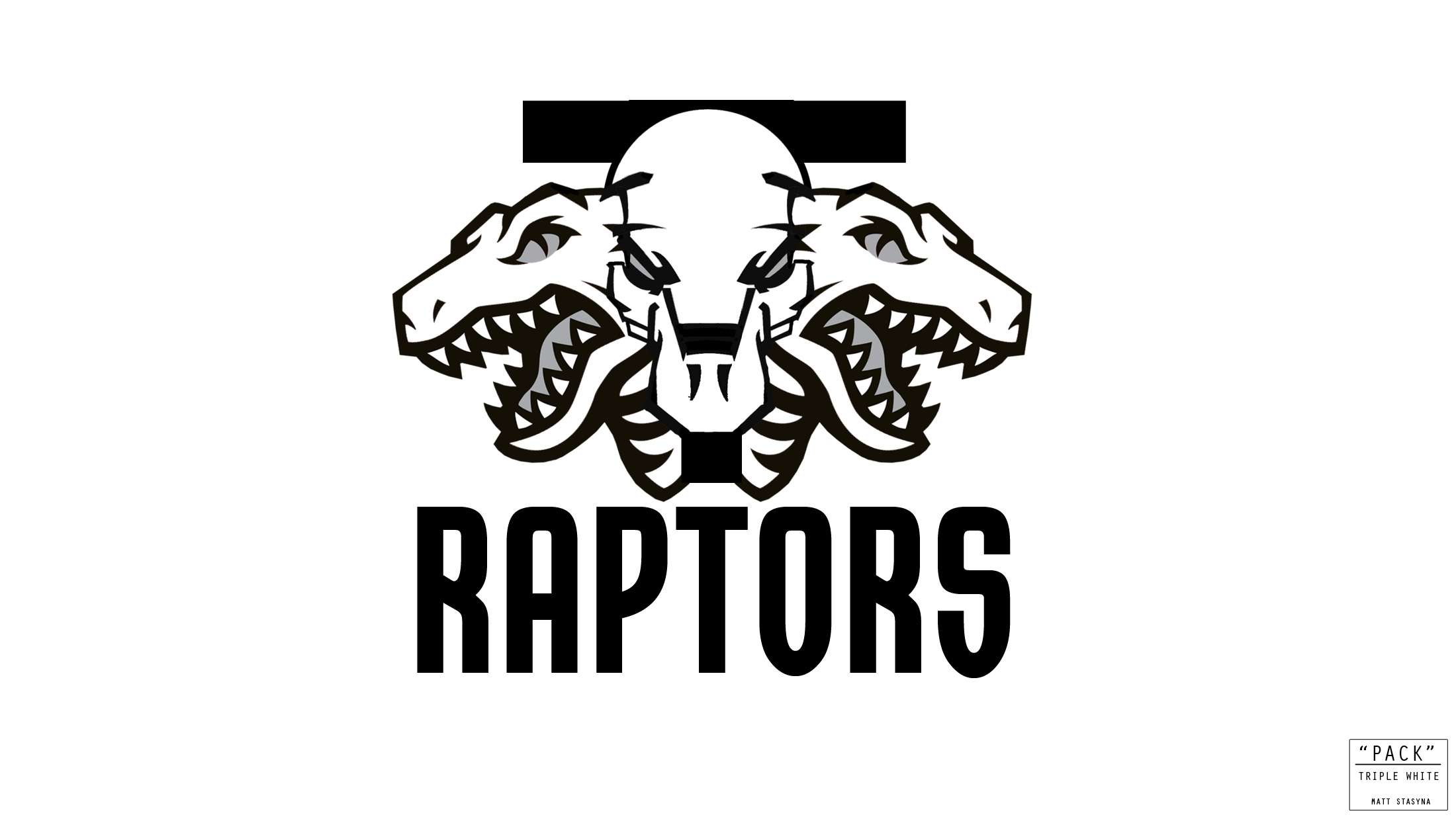
XL: http://imageshack.us/a/img547/2259/trip ... ewhite.jpg

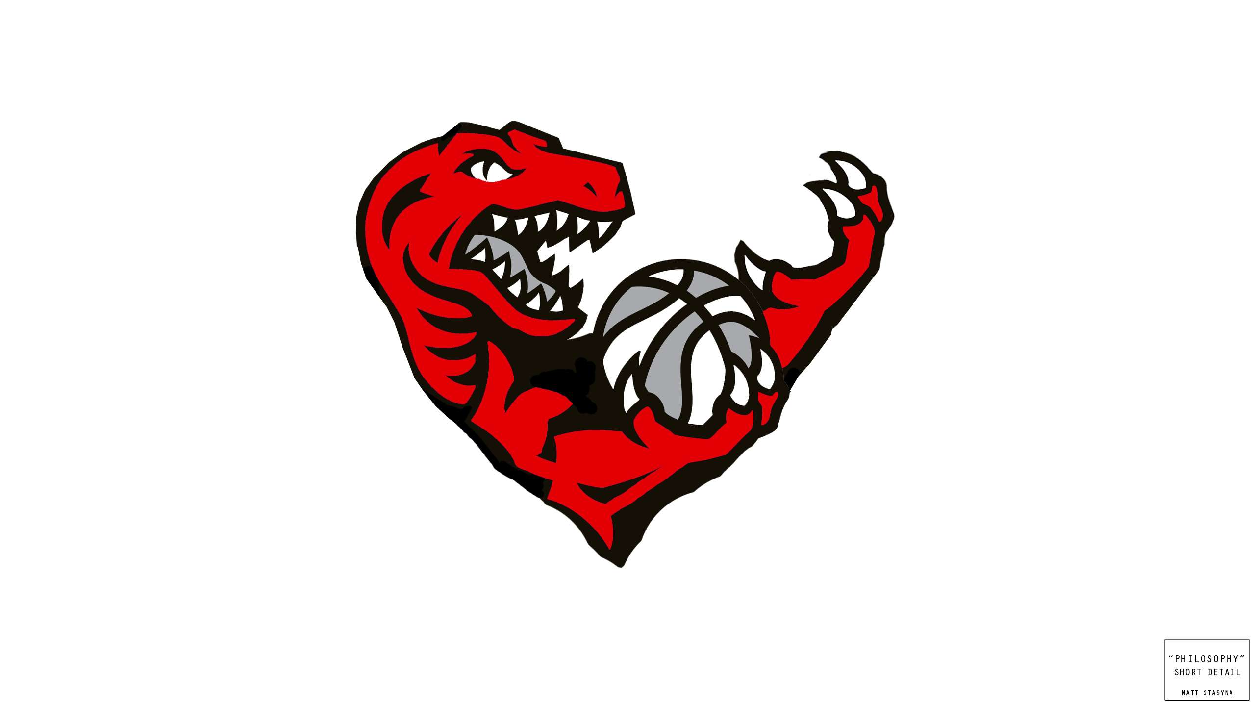
XL: http://imageshack.us/a/img708/8602/phil ... rtdeta.jpg

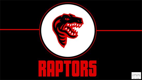
XL: http://imageshack.us/a/img211/2320/flas ... tnight.jpg
XL: http://imageshack.us/a/img402/5835/flas ... andred.jpg
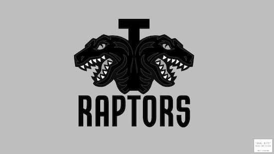
XL: http://imageshack.us/a/img526/7324/dual ... nblack.jpg
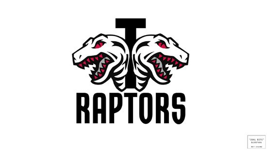
XL: http://imageshack.us/a/img14/1268/dualbitebloodbite.jpg

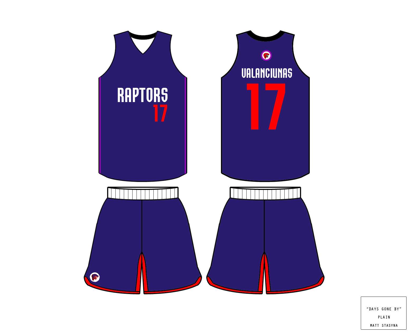
XL: http://imageshack.us/a/img402/1200/days ... fourth.jpg

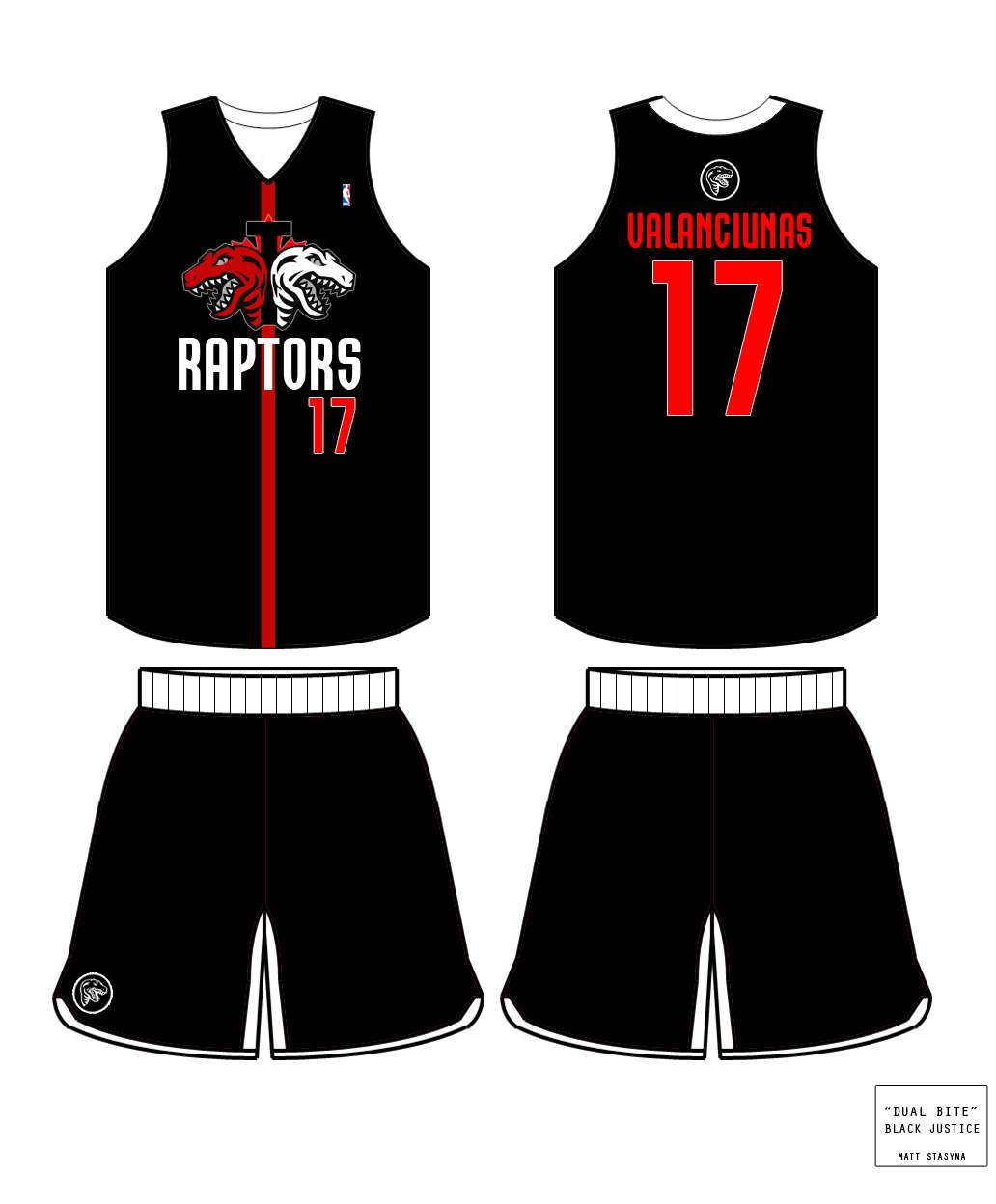
XL: http://imageshack.us/a/img854/5408/dual ... ackjus.jpg

XL: http://imageshack.us/a/img690/8592/fier ... thjers.jpg

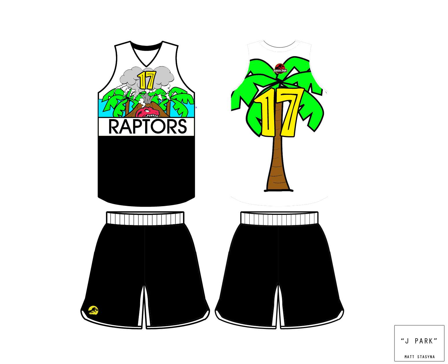
XL: http://imageshack.us/a/img90/4179/jurra ... hjerse.jpg
Rough Stuff:
XL: http://imageshack.us/a/img197/2986/inte ... rlarge.jpg


